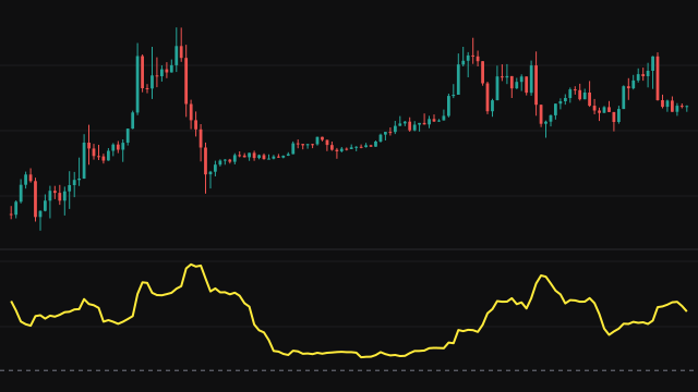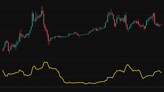
Huber Loss measures how far the source has strayed from its exponential moving average, using a penalty that treats small and large gaps differently. On each bar the error is the source minus the average. While the size of that error is at or below Delta, the penalty is half the error squared. Beyond Delta the penalty grows only in proportion to the error: Delta times the size of the error, minus half of Delta squared.
The average is an exponential mean of the period, seeded with the simple average of its first period values, and it is drawn on the price chart. The penalties are then averaged over the last period bars, counting only bars that have a penalty, so the pane line starts on the same bar as the average.
Because large errors are penalised linearly, a single violent bar moves the reading far less than it would move a mean squared error.
How to read Huber Loss (HUBER)
A low reading means price has been hugging its average; a rising reading means it has been pulling away from it, either in a trend or in a burst of volatility. Spikes in the pane mark stretches where price ran far from the average line drawn on the chart.
Delta is in price units, so its meaning depends on the instrument. On an instrument that trades in the thousands, almost every gap is larger than the default Delta and the reading behaves like a scaled average absolute error. Raise Delta toward a typical bar range to bring the squared part into play.
Settings
- Source
- The price series compared with its own exponential average.
- Period
- The length of the exponential average and of the window the penalties are averaged over. A longer period gives a slower reference and a smoother reading.
- Delta
- The error size, in price units, where the penalty switches from squared to linear. A larger value treats more gaps as small ones.
Frequently asked questions
Why use Huber loss instead of squared error?
Squared error lets one very large gap dominate the average. The Huber penalty grows only linearly past Delta, so the reading reflects typical behaviour more than single outliers.
What is the line on the price chart?
It is the exponential average the errors are measured from, drawn on the price pane so you can see the gaps the pane is measuring.
Why does the reading look like an absolute error on my chart?
Delta is in price units. When nearly every gap is bigger than Delta, every penalty is on the linear side, so the result is close to Delta times the average absolute gap.