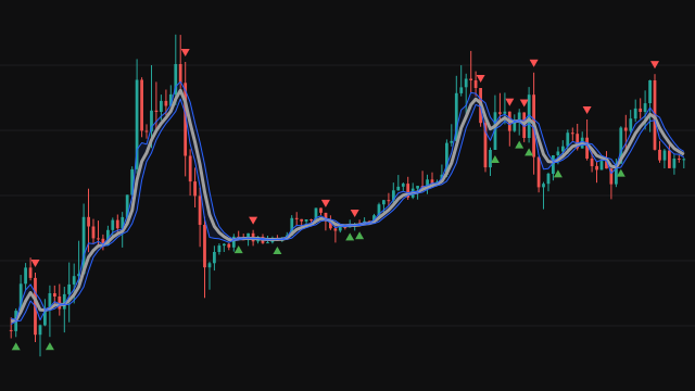
This version of TTM Trend draws a short exponential moving average of the source, the typical price by default, seeded with the first bar's source so it answers from the first bar. The line is green while the average rises, red while it falls and a faded gray when it is flat, which is always the case on the first bar.
The optional ribbon around it is built from the slope. On each bar the change in the average is taken as a percentage of the previous value, and the ribbon extends that percentage of the current average above and below it. The ribbon lines are drawn faint and the space between them lightly shaded, so an accelerating move reads as a widening ribbon without hiding the candles.
A small triangle is placed on each bar where the slope changes direction, below the bar for an upturn and above it for a downturn.
How to read TTM Trend
Follow the colour for the short-term drift and the triangles for the turns. A ribbon that widens over several bars shows a move gaining speed; one that narrows to almost nothing shows the move fading, which is often where the next triangle appears.
With a default length of six bars the line is quick, so in sideways markets it changes colour often and many triangles are noise. Its marks are most useful when they agree with a trend read from a slower measure, as a way to time entries rather than to decide direction.
Settings
- Period
- The length of the exponential average. A longer period gives fewer colour changes and more lag.
- Source
- The price series the average is computed from.
- Show Trend Strength %
- Draws or hides the ribbon around the line. The line and the triangles stay the same either way.
Frequently asked questions
How does this differ from the other TTM Trend entry?
The calculation is the same. This one draws the ribbon fainter in a lighter blue and fades the gray of a flat slope, so it sits more quietly over the candles.
What does a wide ribbon mean?
The average moved a lot on that bar relative to its previous value. The ribbon width is that step, as a percentage, applied to the current average.
Why does the line start gray?
On the first bar the average equals the source, so it has no slope yet, and a flat slope is drawn in faded gray.