Interactive Charts with Plotly
Zoomable candlestick charts with volume and multi-pane indicators.
- ·Candlestick chart
- ·Volume sub-pane
- ·Indicator overlays
- ·RSI/MACD panes
- ·Range slider
- ·Export to HTML
In the last chapter you drew charts with Matplotlib - clean, fast, and perfect for a report or a backtest summary. But there's a moment every trader knows: you spot something interesting on a chart and you want to get closer. Zoom into that one week. Hover over a candle to read its exact high. Hide the volume for a second to see the price action better. Matplotlib can't do any of that once the image is saved - it's a photograph. What we want now is a living chart you can poke at with your mouse.
That's Plotly. It builds charts that run in a web browser, so they're interactive by default: zoom, pan, hover tooltips, a legend you can click to toggle lines on and off. The same chart that prints to a static image for this page becomes fully interactive the moment you open it in a browser. In this chapter we'll build the chart every trader reaches for first - the candlestick - and then layer on volume, moving averages, and the indicator panes (RSI, MACD) that turn a price chart into a trading dashboard.
Plotly is a charting library, not part of the trading SDK. Add it once with uv add plotly. To save a chart as a static image (a PNG), Plotly needs a small helper engine called kaleido - add it with uv add kaleido. Every example here saves a PNG so you can see the result on this page, and the interactive version is one fig.write_html(...) away.
The anatomy of a Plotly chart
Three ideas carry you through the whole chapter, so let's name them up front:
- A figure (
fig) is the whole chart - the canvas plus everything on it. - A trace is one thing drawn on that canvas: a candlestick series, a line, a set of bars. A figure can hold many traces stacked on top of each other.
- The layout is the styling around the data: the title, the axes, whether a range slider shows.
You build a figure, add one or more traces, tweak the layout, and then either save it or show it. That's the entire rhythm. Here it is at its simplest - a candlestick chart of Reliance.
# A basic interactive candlestick chart with Plotly, saved as a PNG.
# A CATEGORY x-axis spaces candles evenly, so weekends/holidays leave no gaps.
import os
from datetime import datetime, timedelta
from pathlib import Path

import plotly.graph_objects as go
from openalgo import api

client = api(
    api_key=os.getenv("OPENALGO_API_KEY", "your_api_key_here"),
    host=os.getenv("OPENALGO_HOST", "http://127.0.0.1:5000"),
)

end = datetime.now().strftime("%Y-%m-%d")
start = (datetime.now() - timedelta(days=90)).strftime("%Y-%m-%d")
df = client.history(symbol="RELIANCE", exchange="NSE", interval="D", start_date=start, end_date=end)
cat = df.index.strftime("%d %b")  # use dates as categories, not a time axis

fig = go.Figure(go.Candlestick(x=cat, open=df["open"], high=df["high"],
                               low=df["low"], close=df["close"]))
fig.update_layout(title="RELIANCE daily candles", xaxis_rangeslider_visible=False)
fig.update_xaxes(type="category", nticks=12, tickangle=-45)

out = Path(__file__).with_suffix(".png")
fig.write_image(str(out), width=900, height=500)
print(f"Plotted {len(df)} candles")
print(f"Saved {out.name}")Plotted 59 candles Saved 01_candlestick.png
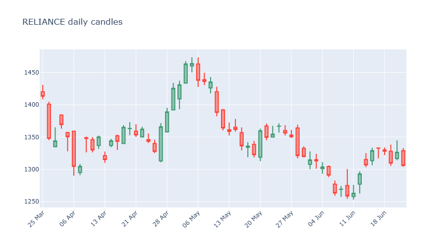
A candlestick packs four numbers into one shape: the open, high, low and close of a period. The thick "body" runs from open to close; the thin "wicks" reach to the high and low. By convention a close above the open is drawn one colour (an up day) and a close below it another (a down day). We feed go.Candlestick four columns from the history DataFrame - open, high, low, close - and Plotly draws the rest. Notice xaxis_rangeslider_visible=False: candlestick charts show a little range slider by default, and we'll switch it back on deliberately later.
import plotly.graph_objects as go is the standard way to bring in Plotly's chart objects, and almost everyone aliases it to go. When you see go.Candlestick, go.Scatter or go.Bar, that go is this import. go.Scatter is Plotly's line/marker trace - despite the name, it draws ordinary lines too.
Adding a volume pane underneath
Price tells you what happened; volume tells you how much conviction was behind it. A breakout on heavy volume is far more convincing than one on a quiet day. Traders almost always want both, and the clean way to show them is two stacked panes that share the same time axis: price on top, volume bars below.
For that we need make_subplots, a helper that carves the figure into a grid of rows. We make two rows, give the price pane 70% of the height and volume 30%, and tell them to share the x-axis so zooming one zooms both.
# Candles on top, volume bars below: the classic two-pane layout with make_subplots.
# A category x-axis keeps both panes gap-free and aligned.
import os
from datetime import datetime, timedelta
from pathlib import Path

import plotly.graph_objects as go
from openalgo import api
from plotly.subplots import make_subplots

client = api(
    api_key=os.getenv("OPENALGO_API_KEY", "your_api_key_here"),
    host=os.getenv("OPENALGO_HOST", "http://127.0.0.1:5000"),
)

end = datetime.now().strftime("%Y-%m-%d")
start = (datetime.now() - timedelta(days=90)).strftime("%Y-%m-%d")
df = client.history(symbol="SBIN", exchange="NSE", interval="D", start_date=start, end_date=end)
cat = df.index.strftime("%d %b")

fig = make_subplots(rows=2, cols=1, shared_xaxes=True, row_heights=[0.7, 0.3],
                    vertical_spacing=0.03)
fig.add_trace(go.Candlestick(x=cat, open=df["open"], high=df["high"],
                             low=df["low"], close=df["close"], name="Price"), row=1, col=1)
fig.add_trace(go.Bar(x=cat, y=df["volume"], name="Volume"), row=2, col=1)
fig.update_layout(title="SBIN price and volume", xaxis_rangeslider_visible=False)
fig.update_xaxes(type="category", nticks=12, tickangle=-45)

out = Path(__file__).with_suffix(".png")
fig.write_image(str(out), width=900, height=600)
print(f"Saved {out.name}")Saved 02_candles_volume.png
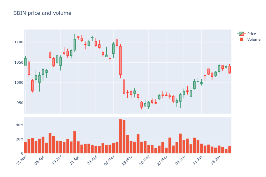
The new pieces: make_subplots(rows=2, cols=1, ...) creates the two stacked panes, shared_xaxes=True links their time axes, and row_heights=[0.7, 0.3] sets the split. When we add a trace we now say which row it belongs to with row=1, col=1 (price) or row=2, col=1 (volume). Everything else is the same figure-and-trace rhythm.
Overlaying moving averages
An overlay is a line drawn on top of the price, in the same pane, because it lives in the same units (rupees). Moving averages are the classic example. A simple moving average (SMA) is just the average close over the last N days - it smooths out the noise so the trend is easier to see. An exponential moving average (EMA) does the same but weights recent days more heavily, so it reacts faster to a turn. We compute both with the SDK's indicator helpers and add each as its own go.Scatter line.
# Overlay a 20-day SMA and a 20-day EMA on the candles to see trend.
import os
from datetime import datetime, timedelta
from pathlib import Path

import plotly.graph_objects as go
from openalgo import api, ta

client = api(
    api_key=os.getenv("OPENALGO_API_KEY", "your_api_key_here"),
    host=os.getenv("OPENALGO_HOST", "http://127.0.0.1:5000"),
)

end = datetime.now().strftime("%Y-%m-%d")
start = (datetime.now() - timedelta(days=150)).strftime("%Y-%m-%d")
df = client.history(symbol="INFY", exchange="NSE", interval="D", start_date=start, end_date=end)
cat = df.index.strftime("%d %b")

df["SMA20"] = ta.sma(df["close"], 20)
df["EMA20"] = ta.ema(df["close"], 20)

fig = go.Figure()
fig.add_trace(go.Candlestick(x=cat, open=df["open"], high=df["high"],
                             low=df["low"], close=df["close"], name="Price"))
fig.add_trace(go.Scatter(x=cat, y=df["SMA20"], name="SMA 20", line=dict(color="orange")))
fig.add_trace(go.Scatter(x=cat, y=df["EMA20"], name="EMA 20", line=dict(color="blue")))
fig.update_layout(title="INFY with SMA and EMA", xaxis_rangeslider_visible=False)
fig.update_xaxes(type="category", nticks=12, tickangle=-45)

out = Path(__file__).with_suffix(".png")
fig.write_image(str(out), width=900, height=500)
print(f"Saved {out.name}")Saved 03_ma_overlay.png
We pull the indicators straight from the SDK: from openalgo import api, ta, then ta.sma(df["close"], 20) and ta.ema(df["close"], 20). Both return a pandas Series that lines up with our dates, so we drop each into a go.Scatter trace. Because they share the price pane, we don't pass a row - they sit right on the candles. Where the EMA (blue) pulls away from the SMA (orange), price is moving quickly; where they hug, the market is drifting.
Indicators from openalgo.ta come in three shapes, and mixing them up is the most common beginner error. Most - sma, ema, rsi, atr - return a single pandas Series. A few - macd, bbands, supertrend - return a tuple of several Series, which you unpack on the left like macd_line, signal_line, hist = ta.macd(...). We'll use both shapes in this chapter, so watch for the difference.
A dedicated RSI pane
Some indicators don't belong on the price pane at all, because they live in their own units. The Relative Strength Index (RSI) is one: it's a momentum gauge that always sits between 0 and 100, measuring how strong recent gains are versus recent losses. Readings above 70 are often called "overbought" and below 30 "oversold". You can't draw a 0-100 line meaningfully on a price axis that runs in the thousands - so RSI gets its own pane beneath the price, with reference lines at 70 and 30.
# Price on top, a dedicated RSI pane below with 70/30 reference lines.
import os
from datetime import datetime, timedelta
from pathlib import Path

import plotly.graph_objects as go
from openalgo import api, ta
from plotly.subplots import make_subplots

client = api(
    api_key=os.getenv("OPENALGO_API_KEY", "your_api_key_here"),
    host=os.getenv("OPENALGO_HOST", "http://127.0.0.1:5000"),
)

end = datetime.now().strftime("%Y-%m-%d")
start = (datetime.now() - timedelta(days=150)).strftime("%Y-%m-%d")
df = client.history(symbol="TCS", exchange="NSE", interval="D", start_date=start, end_date=end)
df["RSI"] = ta.rsi(df["close"], 14)
cat = df.index.strftime("%d %b")

fig = make_subplots(rows=2, cols=1, shared_xaxes=True, row_heights=[0.7, 0.3],
                    vertical_spacing=0.04)
fig.add_trace(go.Candlestick(x=cat, open=df["open"], high=df["high"],
                             low=df["low"], close=df["close"], name="Price"), row=1, col=1)
fig.add_trace(go.Scatter(x=cat, y=df["RSI"], name="RSI 14", line=dict(color="purple")), row=2, col=1)
fig.add_hline(y=70, line_dash="dash", line_color="red", row=2, col=1)
fig.add_hline(y=30, line_dash="dash", line_color="green", row=2, col=1)
fig.update_layout(title="TCS price with RSI pane", xaxis_rangeslider_visible=False)
fig.update_xaxes(type="category", nticks=12, tickangle=-45)

out = Path(__file__).with_suffix(".png")
fig.write_image(str(out), width=900, height=600)
print(f"Saved {out.name}")Saved 04_rsi_pane.png
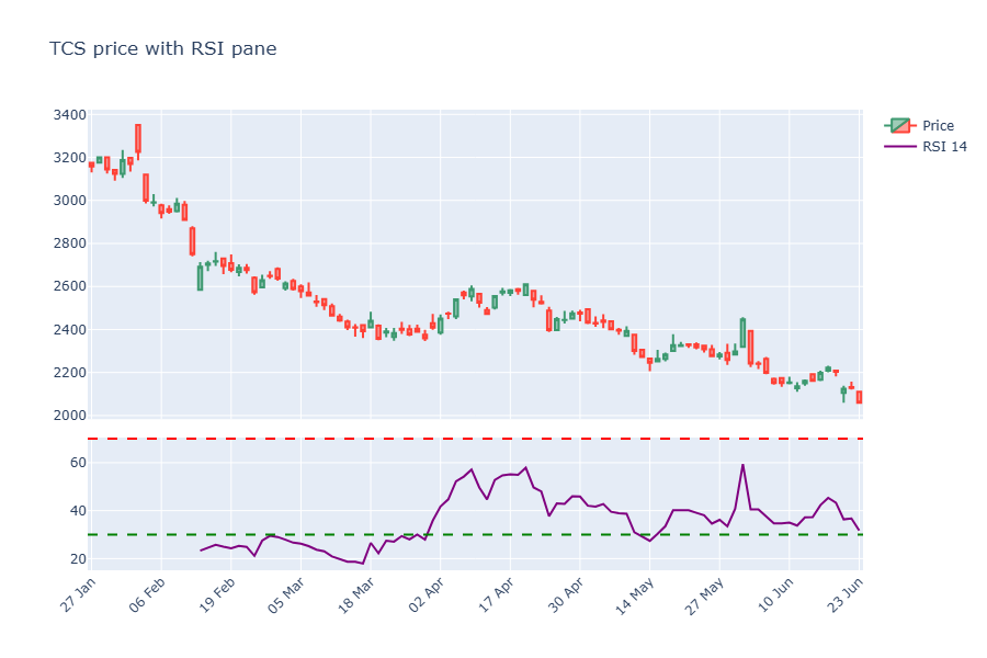
Same two-row subplot idea as the volume chart, but the bottom pane now holds an RSI line. The new trick is fig.add_hline(y=70, ...) - a horizontal line drawn across a specific pane (note the row=2, col=1). Two of them mark the overbought and oversold thresholds, so your eye can instantly judge where momentum stands.
A MACD pane
The MACD (Moving Average Convergence Divergence) is momentum told as the gap between a fast and a slow EMA. It comes as three pieces: the MACD line itself, a signal line (a smoothed version of it), and a histogram showing the distance between the two. When the histogram flips from negative to positive, the fast average has just crossed above the slow one - a common momentum trigger. This is our first tuple-returning indicator.
# MACD in its own pane: line, signal, and a coloured histogram. ta.macd returns a tuple.
import os
from datetime import datetime, timedelta
from pathlib import Path

import plotly.graph_objects as go
from openalgo import api, ta
from plotly.subplots import make_subplots

client = api(
    api_key=os.getenv("OPENALGO_API_KEY", "your_api_key_here"),
    host=os.getenv("OPENALGO_HOST", "http://127.0.0.1:5000"),
)

end = datetime.now().strftime("%Y-%m-%d")
start = (datetime.now() - timedelta(days=200)).strftime("%Y-%m-%d")
df = client.history(symbol="HDFCBANK", exchange="NSE", interval="D", start_date=start, end_date=end)
cat = df.index.strftime("%d %b")

macd_line, signal_line, hist = ta.macd(df["close"], fast_period=12, slow_period=26, signal_period=9)
colors = ["green" if v >= 0 else "red" for v in hist]

fig = make_subplots(rows=2, cols=1, shared_xaxes=True, row_heights=[0.65, 0.35],
                    vertical_spacing=0.04)
fig.add_trace(go.Scatter(x=cat, y=df["close"], name="Close"), row=1, col=1)
fig.add_trace(go.Bar(x=cat, y=hist, name="Histogram", marker_color=colors), row=2, col=1)
fig.add_trace(go.Scatter(x=cat, y=macd_line, name="MACD", line=dict(color="blue")), row=2, col=1)
fig.add_trace(go.Scatter(x=cat, y=signal_line, name="Signal", line=dict(color="orange")), row=2, col=1)
fig.update_layout(title="HDFCBANK with MACD pane")
fig.update_xaxes(type="category", nticks=12, tickangle=-45)

out = Path(__file__).with_suffix(".png")
fig.write_image(str(out), width=900, height=600)
print(f"Saved {out.name}")Saved 05_macd_pane.png
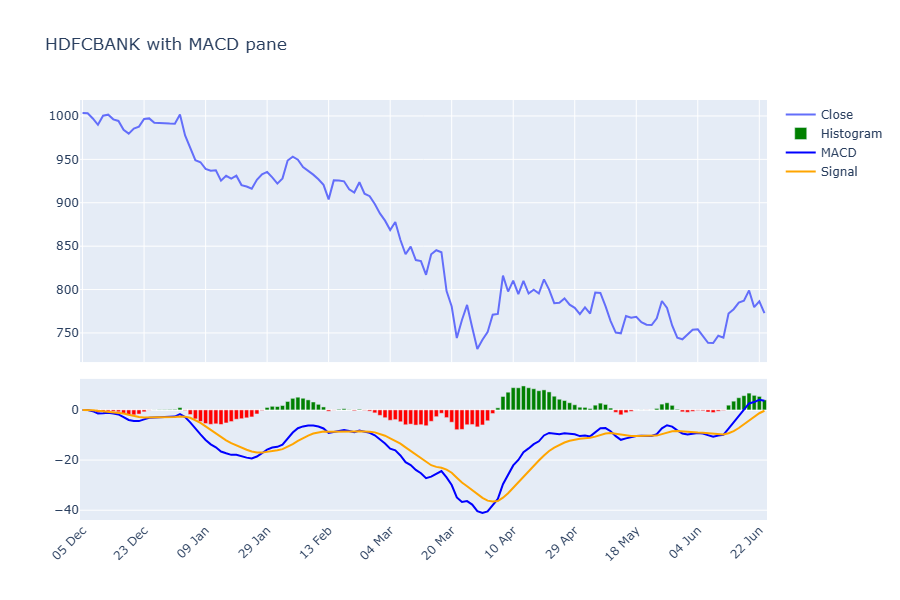
Read the unpacking line carefully: macd_line, signal_line, hist = ta.macd(df["close"], ...). One call hands back three Series at once, and we catch all three. We colour the histogram bars green when positive and red when negative with a one-line list comprehension - exactly the kind of compact transform we met back in the Python chapter. The MACD and signal lines go on top as scatter traces, so the whole momentum story sits in one tidy pane below the price.
Turning on the range slider
Remember how we kept switching the range slider off? Here's why it's worth knowing about. The range slider is a miniature chart strip beneath the main one with draggable handles - grab them and you zoom the main chart to any window without losing sight of the whole picture. It's genuinely useful on a long contract like a NIFTY future, where you might want to focus on the last few weeks.
# A range slider lets you drag-zoom a date window, great for a NIFTY futures contract.
import os
from datetime import datetime, timedelta
from pathlib import Path

import plotly.graph_objects as go
from openalgo import api

client = api(
    api_key=os.getenv("OPENALGO_API_KEY", "your_api_key_here"),
    host=os.getenv("OPENALGO_HOST", "http://127.0.0.1:5000"),
)

end = datetime.now().strftime("%Y-%m-%d")
start = (datetime.now() - timedelta(days=90)).strftime("%Y-%m-%d")
df = client.history(symbol="NIFTY30JUN26FUT", exchange="NFO", interval="D", start_date=start, end_date=end)
cat = df.index.strftime("%d %b")

fig = go.Figure(go.Candlestick(x=cat, open=df["open"], high=df["high"],
                               low=df["low"], close=df["close"]))
# Turn the range slider ON (it is off in earlier examples).
fig.update_layout(title="NIFTY future with range slider", xaxis_rangeslider_visible=True)
fig.update_xaxes(type="category", nticks=12, tickangle=-45)

out = Path(__file__).with_suffix(".png")
fig.write_image(str(out), width=900, height=550)
print(f"Saved {out.name}")Saved 06_range_slider.png
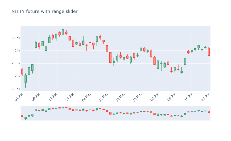
The only change from our very first chart is xaxis_rangeslider_visible=True. We've also switched the instrument to NIFTY30JUN26FUT on the NFO exchange - a futures contract - to show that everything you've learned works identically across exchanges. Same client.history, same go.Candlestick, just a different symbol.
A static PNG can't show off interactivity - the saved image of a range-slider chart just looks like a chart with a strip at the bottom. The magic only appears in a browser. That's exactly what the next example is for.
Exporting an interactive chart to HTML
A PNG is a snapshot. To hand someone the real interactive chart - one they can zoom, pan and hover without installing anything - you export it to a standalone HTML file with fig.write_html(...). The result is a single self-contained file that opens in any browser, online or off. This is how you share a chart with a colleague, or pin one to a dashboard.
# Export a fully interactive chart to a standalone .html file you can open in any browser.
import os
from datetime import datetime, timedelta
from pathlib import Path

import plotly.graph_objects as go
from openalgo import api

client = api(
    api_key=os.getenv("OPENALGO_API_KEY", "your_api_key_here"),
    host=os.getenv("OPENALGO_HOST", "http://127.0.0.1:5000"),
)

end = datetime.now().strftime("%Y-%m-%d")
start = (datetime.now() - timedelta(days=90)).strftime("%Y-%m-%d")
df = client.history(symbol="ICICIBANK", exchange="NSE", interval="D", start_date=start, end_date=end)
cat = df.index.strftime("%d %b")

fig = go.Figure(go.Candlestick(x=cat, open=df["open"], high=df["high"],
                               low=df["low"], close=df["close"]))
fig.update_layout(title="ICICIBANK interactive export", xaxis_rangeslider_visible=False)
fig.update_xaxes(type="category", nticks=12, tickangle=-45)

# write_html makes a self-contained file: zoom, pan and hover all work offline.
html_out = Path(__file__).with_name("icicibank_chart.html")
fig.write_html(str(html_out))
print(f"Saved {html_out.name} ({html_out.stat().st_size // 1024} KB)")

# Also save a PNG so the portal can embed a preview.
png_out = Path(__file__).with_suffix(".png")
fig.write_image(str(png_out), width=900, height=500)
print(f"Saved {png_out.name}")Saved icicibank_chart.html (4745 KB) Saved 07_export_html.png
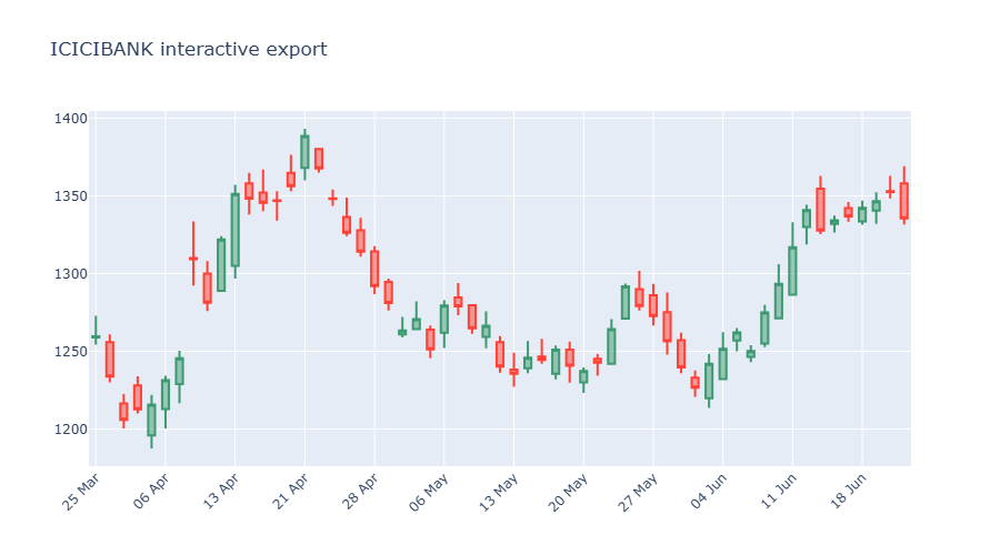
One figure, two outputs: fig.write_html("...html") writes the fully interactive version, and fig.write_image("...png") saves the static preview for this page. Open the .html file in a browser and you'll find the zoom, pan and hover tooltips all alive. The HTML file is a few megabytes because it bundles the Plotly engine inside it - that's the price of being self-contained.
Putting it all together: a three-pane dashboard
Now we combine everything into the chart a trader would actually keep on screen: candles with an EMA overlay on top, volume in the middle, and RSI at the bottom - three panes sharing one time axis. To prove the technique is exchange-agnostic, we'll build it on an MCX commodity, the GOLDM future.
# A three-pane "trader's dashboard": candles + EMA, volume, and RSI in one figure.
import os
from datetime import datetime, timedelta
from pathlib import Path

import plotly.graph_objects as go
from openalgo import api, ta
from plotly.subplots import make_subplots

client = api(
    api_key=os.getenv("OPENALGO_API_KEY", "your_api_key_here"),
    host=os.getenv("OPENALGO_HOST", "http://127.0.0.1:5000"),
)

end = datetime.now().strftime("%Y-%m-%d")
start = (datetime.now() - timedelta(days=180)).strftime("%Y-%m-%d")
df = client.history(symbol="GOLDM03JUL26FUT", exchange="MCX", interval="D", start_date=start, end_date=end)
df["EMA20"] = ta.ema(df["close"], 20)
df["RSI"] = ta.rsi(df["close"], 14)
cat = df.index.strftime("%d %b")

fig = make_subplots(rows=3, cols=1, shared_xaxes=True, row_heights=[0.55, 0.2, 0.25],
                    vertical_spacing=0.03)
fig.add_trace(go.Candlestick(x=cat, open=df["open"], high=df["high"],
                             low=df["low"], close=df["close"], name="Price"), row=1, col=1)
fig.add_trace(go.Scatter(x=cat, y=df["EMA20"], name="EMA 20", line=dict(color="blue")), row=1, col=1)
fig.add_trace(go.Bar(x=cat, y=df["volume"], name="Volume"), row=2, col=1)
fig.add_trace(go.Scatter(x=cat, y=df["RSI"], name="RSI 14", line=dict(color="purple")), row=3, col=1)
fig.add_hline(y=70, line_dash="dash", line_color="red", row=3, col=1)
fig.add_hline(y=30, line_dash="dash", line_color="green", row=3, col=1)
fig.update_layout(title="GOLDM future dashboard", xaxis_rangeslider_visible=False, showlegend=False)
fig.update_xaxes(type="category", nticks=12, tickangle=-45)

out = Path(__file__).with_suffix(".png")
fig.write_image(str(out), width=900, height=750)
print(f"Saved {out.name}")Saved 08_full_dashboard.png
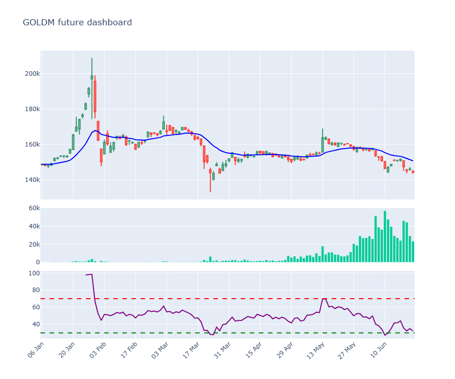
It's just the pieces you've already met, stacked: make_subplots(rows=3, ...) with custom row_heights, candles plus an EMA line in row 1, volume bars in row 2, and the RSI line with its 70/30 guides in row 3. We set showlegend=False to keep a busy chart clean. This single figure is a complete market cockpit - and you built every part of it in this chapter.
Try it yourself
- In the moving-average overlay, change the SMA from 20 to 50 days and add a second, faster EMA (say 9). Where do the lines cross?
- Open the exported HTML file from the export example in your browser and try the zoom, pan and hover. Then change the symbol to a stock you follow and re-run it.
- In the three-pane dashboard, swap the GOLDM future for
BANKNIFTY30JUN26FUTonNFOand see the same cockpit rebuild itself.
Recap
- A Plotly chart is a figure holding one or more traces, wrapped in a layout - build, add, style, save.
go.Candlestickneeds theopen,high,low,closecolumns;go.Scatterdraws lines andgo.Bardraws bars.make_subplotsstacks panes that share a time axis - use it for volume, RSI and MACD beneath the price.- Overlays (moving averages) sit in the price pane; bounded indicators (RSI, MACD) get their own pane with
add_hlineguides. taindicators return a Series, except a few likemacdthat return a tuple you unpack.fig.write_image(...)saves a static PNG (needs kaleido);fig.write_html(...)exports the fully interactive chart.
These charts are interactive, but they still live in a script you re-run by hand. Next we make them clickable for anyone - a real web app with input boxes, dropdowns and live data, built in pure Python with Streamlit.