Dates & Time Series
Pandas was built for time series. Use a datetime index to resample daily bars to weekly and compute rolling averages.
- ·The datetime index
- ·Selecting by date
- ·Resampling timeframes
- ·Rolling windows
- ·Shifting for returns
- ·Time-series gotchas
Market data has a superpower that most data lacks: it's ordered in time. Yesterday comes before today; this week rolls into next. pandas was built for exactly this, and once your DataFrame has a proper datetime index, a whole set of time-aware tools unlocks - selecting a month by name, squeezing daily bars into weekly ones, and computing the moving averages every chart in the world displays. This is where pandas stops feeling like a spreadsheet and starts feeling like a quant tool.
The datetime index
Because we loaded our CSV with parse_dates=True, its index is a DatetimeIndex - and that lets you select by date in wonderfully natural ways:
import pandas as pd

df = pd.read_csv("reliance_6mo.csv", index_col="Date", parse_dates=True)

print("Index type:", type(df.index).__name__)        # DatetimeIndex
print("First date:", df.index[0].date(), " Last:", df.index[-1].date())
print()

# Select a whole month just by naming it - the datetime index makes this work.
may = df.loc["2026-05", "Close"]
print("May closes:", may.size, "days")
print("May range :", round(may.min(), 2), "to", round(may.max(), 2))
print()

# Or pick a date range with a slice.
window = df.loc["2026-06-01":"2026-06-10", "Close"]
print("Early June closes:")
print(window.round(2))Index type: DatetimeIndex First date: 2025-12-24 Last: 2026-06-24 May closes: 21 days May range : 1315.12 to 1456.86 Early June closes: Date 2026-06-01 1313.92 2026-06-02 1308.55 2026-06-03 1307.16 2026-06-04 1297.70 2026-06-05 1291.00 2026-06-08 1263.30 2026-06-09 1269.20 2026-06-10 1258.80 Name: Close, dtype: float64
df.loc["2026-05"] returns all of May - pandas understands "2026-05" means the whole month. And df.loc["2026-06-01":"2026-06-10"] slices a date range. No filtering, no comparisons - just name the period you want. That convenience only works because the index knows it holds dates.
A DatetimeIndex lets you select by time directly: df.loc["2026-05"] for a whole month, df.loc["2026-05":"2026-06"] for a range. Always load time series with parse_dates=True so the index is dates, not text.
Resampling: changing the time frame
Resampling converts data from one frequency to another - daily bars into weekly or monthly ones. You pick the new frequency and how to summarise each period:
import pandas as pd

df = pd.read_csv("reliance_6mo.csv", index_col="Date", parse_dates=True)
close = df["Close"]

# Resample changes the time frame. "W" = weekly, "ME" = month-end.
weekly = close.resample("W").last()           # the last close of each week
monthly = close.resample("ME").agg(["first", "last", "max", "min"])

print("Daily points  :", close.size)
print("Weekly points :", weekly.size)
print()
print("Monthly summary (first / last / high / low):")
print(monthly.round(2).tail(4))Daily points : 124
Weekly points : 27
Monthly summary (first / last / high / low):
first last max min
Date
2026-03-31 1351.75 1337.71 1417.45 1337.71
2026-04-30 1362.90 1424.22 1424.22 1298.60
2026-05-31 1424.22 1315.12 1456.86 1315.12
2026-06-30 1313.92 1313.60 1332.70 1258.80close.resample("W").last() collapses 124 daily points into 27 weekly ones, keeping each week's final close. And resample("ME").agg([...]) builds a monthly summary - first, last, high and low - which is exactly how a monthly candlestick is born from daily data.
The frequency codes are short and there are many: "W" weekly, "ME" month-end, "QE" quarter-end, "B" business day, even "h" hourly and "min" for minutes. pandas understands hundreds of them, so down-sampling a decade of data to monthly bars - or intraday ticks to 5-minute candles - is always one line.
Rolling windows: the moving average
A rolling window slides across the series, computing a statistic over the last N points at each step. The famous one is the moving average - rolling(20).mean() - which smooths daily noise into a trend line:
from pathlib import Path

import matplotlib

matplotlib.use("Agg")
import matplotlib.pyplot as plt
import pandas as pd
import seaborn as sns

df = pd.read_csv("reliance_6mo.csv", index_col="Date", parse_dates=True)
close = df["Close"]

# A rolling window: the 20-day moving average smooths out the daily noise.
sma20 = close.rolling(20).mean()

# shift(1) looks back one row - the basis of a return: today vs yesterday.
returns = (close / close.shift(1) - 1) * 100

print("Latest close      :", round(close.iloc[-1], 2))
print("20-day average    :", round(sma20.iloc[-1], 2))
print("Yesterday's return:", round(returns.iloc[-1], 2), "%")

sns.set_theme(style="whitegrid")
fig, ax = plt.subplots(figsize=(8, 4))
ax.plot(close.index, close, color="#9aa0c4", lw=1.2, label="Close")
ax.plot(sma20.index, sma20, color="#7c83ff", lw=2.0, label="20-day average")
ax.set_title("RELIANCE close with its 20-day moving average")
ax.set_ylabel("Price (Rs)")
ax.legend()

out = Path(__file__).with_suffix(".png")
plt.savefig(out, dpi=110, bbox_inches="tight")
print("Saved chart of", close.size, "days")Latest close : 1313.6 20-day average : 1304.04 Yesterday's return: 0.31 % Saved chart of 124 days
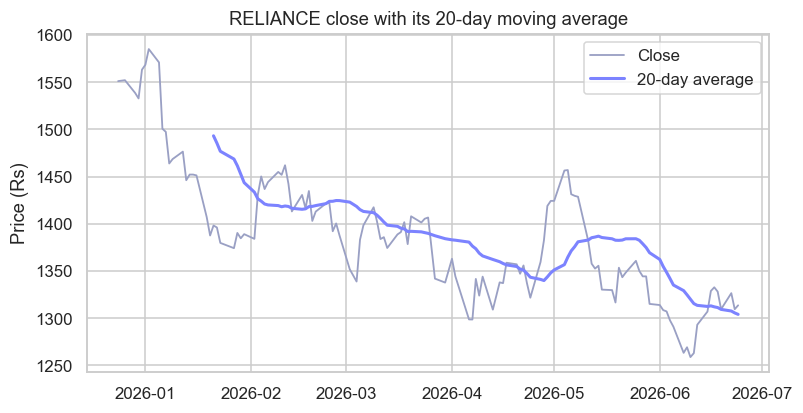
The chart shows it beautifully: the thin line is the daily close, jittery and nervous; the bold line is its 20-day average, calm and trend-revealing. The same idea powers the 50-day and 200-day averages every trader watches.
The moving average is one of the oldest tools in markets. Traders were computing them by hand - averaging the last few days' prices off the ticker tape - for the better part of a century, long before computers existed. It has survived every technological revolution since because it does one humble thing supremely well: it strips out the day-to-day noise to reveal the trend underneath. What took an analyst an afternoon with pencil and paper, rolling(20).mean() now does on a decade of data in a blink.
Shifting, and a time-series gotcha
The example also used shift(1), which slides the whole series down one row so each value lines up with the previous day. That's the engine of a return - close / close.shift(1) - 1 is literally "today over yesterday, minus one." Shifting is how you compare any value to its own past.
Two time-series traps to remember. First, a rolling(20) average has no value for the first 19 rows - there aren't yet 20 days to average, so those come back as NaN (that's why the bold line on the chart starts a little late). Second, always keep your data sorted by date; rolling windows, shifts and resampling all assume the rows are in time order, and silently give nonsense if they aren't.
Try it yourself
- Select just the month of April with
df.loc["2026-04", "Close"]and find its highest close. - Compute a
rolling(50).mean()as well, and note how much smoother (and later-starting) it is than the 20-day. - Resample the close to weekly highs with
close.resample("W").max(). How many weekly points do you get from 124 days?
Recap
- A
DatetimeIndexenables time-based selection:df.loc["2026-05"](a month) or a date-range slice. Load withparse_dates=True. resample("W"/"ME"/...)changes the time frame, summarising each period (.last(),.max(),.agg([...])).rolling(N).mean()computes a moving average - the classic trend-smoother - and the firstN-1values areNaN.shift(1)aligns each value with its previous one - the basis of returns.- Keep time series sorted by date, always.
You can now slice and reshape data across time. The last core pandas skill is summarising data across groups - "average return by month", "best day per stock". That's the group-by, and it's next.