Data Visualization
A chart is worth a thousand rows. Draw price lines, return histograms and clean seaborn charts that actually communicate.
- ·matplotlib basics
- ·Plotting a price line
- ·Histograms of returns
- ·Styling with seaborn
- ·Labels & titles
- ·Saving a figure
A table of a thousand prices tells you almost nothing at a glance; a single chart of them tells you the whole story in a second. Visualization is where data analysis lands - where a trend, a crash, or a fat tail becomes instantly obvious. This is the capstone of Module 4, and fittingly it's wall-to-wall charts. You've already seen plots appear throughout; now we'll understand how they're built, and learn the handful of moves that cover almost everything you'll want to draw.
matplotlib: figure and axes
Every chart in this course is drawn by matplotlib (with seaborn making it pretty). The one pattern to internalise is fig, ax = plt.subplots(): it gives you a Figure (the whole canvas) and an Axes (the plot area you draw on), and you build the chart by calling methods on ax:
from pathlib import Path

import matplotlib

matplotlib.use("Agg")
import matplotlib.pyplot as plt
import pandas as pd
import seaborn as sns

df = pd.read_csv("reliance_6mo.csv", index_col="Date", parse_dates=True)

sns.set_theme(style="whitegrid")             # seaborn styles the whole figure
fig, ax = plt.subplots(figsize=(8, 4))       # one Figure, one Axes (ax)
ax.plot(df.index, df["Close"], color="#7c83ff", lw=1.8, label="Close")
ax.set_title("RELIANCE - daily close, last 6 months")
ax.set_xlabel("Date")
ax.set_ylabel("Price (Rs)")
ax.legend()

out = Path(__file__).with_suffix(".png")
plt.savefig(out, dpi=110, bbox_inches="tight")
print("Saved", out.name, "-", len(df), "points")Saved 01_price_line.png - 124 points
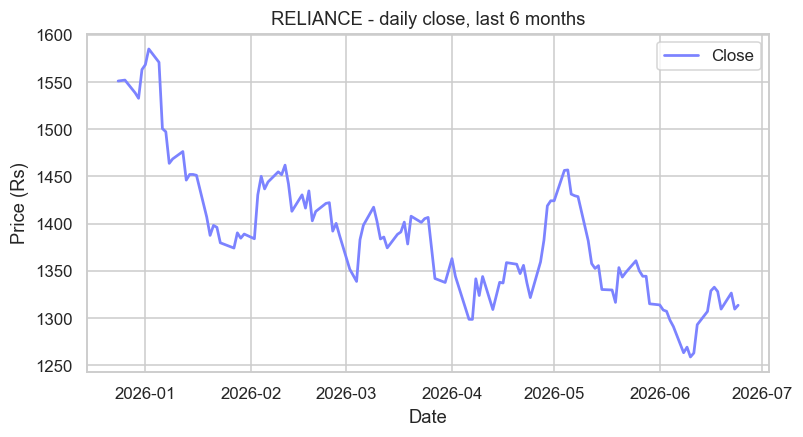
ax.plot(x, y) draws the line; ax.set_title, ax.set_xlabel, ax.set_ylabel label it; ax.legend() adds the key; and plt.savefig(...) writes it to a file. That's the skeleton of every chart you'll build.
Start every chart with fig, ax = plt.subplots() - a Figure (canvas) and an Axes (ax, the plot area). Draw with ax.plot/bar/hist, label with ax.set_title/set_xlabel/set_ylabel, add ax.legend(), and save with plt.savefig(file, dpi=110, bbox_inches="tight").
The shape of returns: histograms
A line shows price over time; a histogram shows the distribution - how often moves of each size happen. It's the single most revealing chart in finance, because it exposes risk that a price line hides:
from pathlib import Path

import matplotlib

matplotlib.use("Agg")
import matplotlib.pyplot as plt
import pandas as pd
import seaborn as sns

df = pd.read_csv("reliance_6mo.csv", index_col="Date", parse_dates=True)
ret = (df["Close"].pct_change() * 100).dropna()

# A histogram shows the SHAPE of the returns - how often each size of move happens.
sns.set_theme(style="whitegrid")
fig, ax = plt.subplots(figsize=(8, 4))
sns.histplot(ret, bins=25, kde=True, color="#7c83ff", ax=ax)
ax.axvline(0, color="#888", ls="--", lw=1)
ax.set_title("RELIANCE - distribution of daily returns")
ax.set_xlabel("Daily return (%)")

out = Path(__file__).with_suffix(".png")
plt.savefig(out, dpi=110, bbox_inches="tight")
print("Mean:", round(ret.mean(), 3), "% Std:", round(ret.std(), 3), "%")Mean: -0.124 % Std: 1.499 %
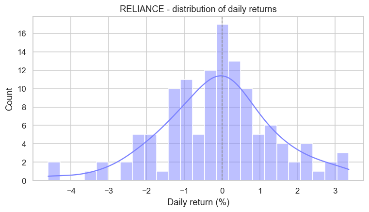
The bars pile up near zero (most days are quiet) and thin out toward the edges (big moves are rare) - but notice the bars way out at -4%: those "fat tails" are exactly the dangerous days a price chart glosses over. Here we used sns.histplot with kde=True, which adds a smooth curve over the bars.
seaborn is matplotlib in a nice suit. Seaborn is built on top of matplotlib - sns.set_theme() restyles every chart (the clean grid you've been seeing), and functions like histplot make complex plots a one-liner. But it's still matplotlib underneath, so you can always reach for ax.set_title and friends to fine-tune. Use seaborn for quick, good-looking defaults; drop to matplotlib when you need precise control.
Comparing fairly: rebasing
To compare two stocks at different prices, plot them on the same chart - but first rebase each to start at 100, so you're comparing growth, not absolute rupees:
from pathlib import Path

import matplotlib

matplotlib.use("Agg")
import matplotlib.pyplot as plt
import seaborn as sns
import yfinance as yf

sns.set_theme(style="whitegrid")
fig, ax = plt.subplots(figsize=(8, 4))

# Rebase each stock to 100 so they start together - a fair growth comparison.
for ticker, color in [("AAPL", "#7c83ff"), ("MSFT", "#21c87a")]:
    close = yf.Ticker(ticker).history(period="6mo")["Close"]
    rebased = close / close.iloc[0] * 100
    ax.plot(rebased.index, rebased, lw=1.8, label=ticker, color=color)

ax.axhline(100, color="#888", ls="--", lw=1)
ax.set_title("Growth of 100 - AAPL vs MSFT, last 6 months")
ax.set_ylabel("Rebased to 100")
ax.legend()

out = Path(__file__).with_suffix(".png")
plt.savefig(out, dpi=110, bbox_inches="tight")
print("Compared 2 stocks, each rebased to 100")Compared 2 stocks, each rebased to 100
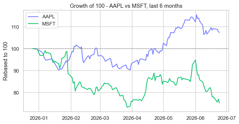
Calling ax.plot twice (once per stock) draws both lines on one Axes, and ax.legend() labels them. Dividing each series by its first value times 100 puts both at the same starting line - now the chart answers "which grew more?" cleanly, regardless of whether one trades at 290 and the other at 1300.
Many views at once: subplots
plt.subplots(1, 2) gives you two Axes side by side in one figure - perfect for showing price and its return distribution together:
from pathlib import Path

import matplotlib

matplotlib.use("Agg")
import matplotlib.pyplot as plt
import pandas as pd
import seaborn as sns

df = pd.read_csv("reliance_6mo.csv", index_col="Date", parse_dates=True)
ret = (df["Close"].pct_change() * 100).dropna()

# One figure can hold several Axes side by side - here, two views at once.
sns.set_theme(style="whitegrid")
fig, (ax_left, ax_right) = plt.subplots(1, 2, figsize=(10, 4))

ax_left.plot(df.index, df["Close"], color="#7c83ff", lw=1.6)
ax_left.set_title("Price over time")
ax_left.set_ylabel("Rs")

ax_right.hist(ret, bins=20, color="#21c87a", alpha=0.85)
ax_right.set_title("Spread of daily returns")
ax_right.set_xlabel("%")

fig.suptitle("RELIANCE - two views of the same data", fontsize=13)
out = Path(__file__).with_suffix(".png")
plt.savefig(out, dpi=110, bbox_inches="tight")
print("Saved a two-panel figure")Saved a two-panel figure
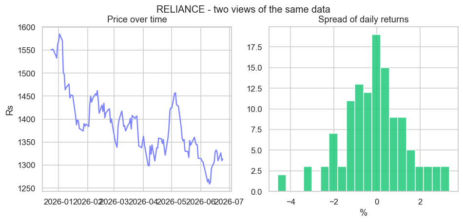
fig, (ax_left, ax_right) = plt.subplots(1, 2) hands back both Axes to draw on independently, and fig.suptitle adds one title over the whole figure. Grids of subplots are how dashboards and tear-sheets are built.
matplotlib was born in a neurobiology lab. It was created in 2003 by John D. Hunter, a neurobiologist who needed to visualise the brain signals of epilepsy patients and wanted free, MATLAB-quality plots inside Python. His side project became the foundation of scientific visualisation: two decades on, matplotlib renders everything from NASA Mars-rover telemetry to landmark physics results - and every chart in this course. Sadly Hunter died in 2012, but a tool used millions of times a day is a remarkable legacy.
A few styling habits
Charts that communicate share a few simple habits, all of which you've now seen:
- Always add a title and axis labels - an unlabelled chart is a puzzle.
- Add a legend the moment there's more than one line (
ax.legend()). - Save crisply with
dpi=110andbbox_inches="tight"so nothing is clipped. - Set the theme once with
sns.set_theme(style="whitegrid")for a clean, consistent look.
Try it yourself
- Re-make the price line in a different colour, and add a horizontal line at the average close with
ax.axhline(df["Close"].mean(), ls="--"). - Change the histogram to
bins=50. Does the shape get clearer or noisier? Why might too many bins mislead? - Add a third stock (say
"GOOGL") to the rebased comparison by extending the loop's list.
Recap
- Every chart starts with
fig, ax = plt.subplots()- a Figure (canvas) and an Axes (ax) you draw on. ax.plotfor lines,ax.barfor bars,hist/sns.histplotfor distributions; label withset_title/set_xlabel/set_ylabelandlegend().- seaborn styles and simplifies matplotlib; rebasing to 100 compares growth fairly; subplots put several charts in one figure.
- Save with
savefig(file, dpi=110, bbox_inches="tight")- and always label your axes.
That completes Module 4 - you can now load, clean, reshape, summarise and visualise real market data. You've quietly become dangerous with data. In the final module, Python for the Markets, we turn all of it on the markets themselves: the exchanges and symbols, OHLCV bars, live quotes over HTTP, and a closing look at returns, signals and performance. It begins with a map of the market landscape.