Grouping & Aggregation
Answer real questions of your data - average return by month, biggest day per stock - with the group-by pattern.
- ·Split-apply-combine
- ·groupby basics
- ·Aggregating with agg
- ·Grouping by month
- ·Multiple stocks
- ·Summary tables
So far you've worked on a whole column at a time. But the questions that really matter are often about groups: "what's the average return in each month?", "which weekday is best?", "how does each stock in my basket compare?" Answering these means splitting the data into groups, summarising each one, and stitching the answers back together. pandas does it in a single, elegant move - groupby - and it's the last core data skill before we make everything beautiful with charts.
Split-apply-combine
Every grouped calculation follows the same three-step dance: split the data into groups, apply a function to each group, and combine the results into a summary. Here it is finding the average return for each weekday:
import pandas as pd

df = pd.read_csv("reliance_6mo.csv", index_col="Date", parse_dates=True)
ret = df["Close"].pct_change() * 100

# Split the returns by weekday, then average each group - all in one line.
by_weekday = ret.groupby(df.index.day_name()).mean().round(3)

# Put the days back into calendar order for a tidy table.
order = ["Monday", "Tuesday", "Wednesday", "Thursday", "Friday"]
print("Average daily return by weekday (%):")
print(by_weekday.reindex(order))Average daily return by weekday (%): Date Monday -0.249 Tuesday -0.398 Wednesday 0.558 Thursday -0.403 Friday -0.187 Name: Close, dtype: float64
ret.groupby(df.index.day_name()) splits the returns into five weekday buckets; .mean() applies the average to each; pandas combines them into one tidy Series. The result is a genuine market question answered in a line - is there a "best" day to be long? (Treat such patterns with deep suspicion - six months is far too little to conclude anything - but the mechanics are exactly how real seasonality studies begin.)
df.groupby(key) splits rows into groups by some key, then you apply an aggregation (.mean(), .sum(), .count(), ...) which pandas combines into a summary. The key can be a column, or something derived from the index like df.index.month or df.index.day_name().
Aggregating with agg
Often you want several summaries per group at once - mean, volatility, best, worst. The .agg() method takes a list of functions and gives you a column for each:
import pandas as pd

df = pd.read_csv("reliance_6mo.csv", index_col="Date", parse_dates=True)
ret = (df["Close"].pct_change() * 100).dropna()

# Group by calendar month, then summarise each group with SEVERAL functions at once.
summary = ret.groupby(ret.index.to_period("M")).agg(["mean", "std", "min", "max"]).round(2)
summary.index = summary.index.strftime("%Y-%m")

print("Monthly return statistics (%):")
print(summary)Monthly return statistics (%):
mean std min max
Date
2025-12 0.20 1.25 -0.87 1.99
2026-01 -0.55 1.42 -4.47 1.17
2026-02 0.00 1.39 -2.21 3.36
2026-03 -0.18 1.75 -4.60 3.30
2026-04 0.33 1.87 -3.39 3.31
2026-05 -0.37 1.39 -3.27 2.80
2026-06 -0.00 1.13 -2.15 2.38One call produced a full monthly report card: the average return, its volatility (std), and the best and worst days of each month. This groupby(...).agg([...]) pattern - group by a period, summarise with several functions - is the backbone of nearly every performance report you'll ever build.
Across many stocks
Grouping shines when you compare instruments. Stack several stocks into one long table with a label column, then group by that label:
from pathlib import Path

import matplotlib

matplotlib.use("Agg")
import matplotlib.pyplot as plt
import pandas as pd
import seaborn as sns
import yfinance as yf

tickers = ["AAPL", "MSFT", "GOOGL", "AMZN"]

# Stack each stock's daily returns into one long table with a "Stock" label column.
frames = []
for t in tickers:
    r = yf.Ticker(t).history(period="3mo")["Close"].pct_change().dropna() * 100
    frames.append(pd.DataFrame({"Stock": t, "Return": r.values}))
data = pd.concat(frames)

# Group by stock: average return and its volatility (standard deviation).
stats = data.groupby("Stock")["Return"].agg(["mean", "std"]).round(3)
print(stats)

sns.set_theme(style="whitegrid")
fig, ax = plt.subplots(figsize=(7, 4))
ax.bar(stats.index, stats["std"], color="#7c83ff")
ax.set_title("Daily return volatility by stock - last 3 months")
ax.set_ylabel("Std dev of daily return (%)")
out = Path(__file__).with_suffix(".png")
plt.savefig(out, dpi=110, bbox_inches="tight")
print("Charted volatility for", len(tickers), "stocks")mean std Stock AAPL 0.252 1.466 AMZN 0.184 2.029 GOOGL 0.304 2.342 MSFT 0.001 2.097 Charted volatility for 4 stocks
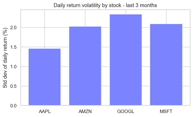
We pulled four US tech names, tagged each row with its Stock, then groupby("Stock") gave a clean side-by-side of average return and volatility - and the bar chart ranks them by how jumpy they've been. That long-format-then-group pattern is how you compare any basket, from a sector to a whole portfolio.
The pattern has a name - and a paper. "Split-apply-combine" was formally named by the statistician Hadley Wickham in a 2011 paper, but the idea is so fundamental it appears everywhere: it's the same logic as SQL's GROUP BY (which databases have used since the 1970s) and R's famous dplyr library. When you write df.groupby(...).mean(), you're using a strategy so universal that learning it once unlocks data tools across the entire industry.
Try it yourself
- Group the Reliance returns by month number with
ret.groupby(ret.index.month).mean(). Which month averaged best? - On the monthly
agg, add"count"to the function list to see how many trading days each month had. - In the multi-stock example, chart
stats["mean"]instead ofstats["std"]to rank the stocks by average return rather than volatility.
Recap
groupbyfollows split-apply-combine: split rows into groups, apply an aggregation, combine into a summary.- Group by a column or something derived from the index (
df.index.month,day_name()). .agg(["mean", "std", "min", "max"])computes several summaries per group at once - the heart of a report.- Stack instruments into a long table with a label column, then
groupbythe label to compare a whole basket.
You've now got the full data-analysis toolkit: load, clean, reshape across time, and summarise by group. There's one skill left to make it all land with people - turning tables of numbers into pictures that tell the story instantly. The final chapter of Module 4 is data visualization.