Pandas Series
A column of numbers with labels - a price series you can do real maths on, and the gateway into pandas.
- ·What a Series is
- ·Index & values
- ·Vectorised operations
- ·Computing returns
- ·Handy methods
- ·Series from a list
A NumPy array is fast, but it has no memory of what each number is - it's just 293.08 floating in position 7. Real market data always carries labels: this price belongs to this date; this value is AAPL's close. pandas adds exactly that - labels - on top of NumPy's speed. Its simplest structure is the Series: a single column of values, each tagged with an index. Get comfortable with the Series and the all-important DataFrame in the next chapter will feel obvious.
A Series: values with labels
A Series is an array plus an index - a label for each value. You can build one by hand, giving it values, an index, and even a name:
import pandas as pd

# A Series is values PLUS an index (labels). Here, closes labelled by weekday.
closes = pd.Series(
    [291.58, 295.63, 291.13, 296.42, 299.24],
    index=["Mon", "Tue", "Wed", "Thu", "Fri"],
    name="AAPL close",
)

print(closes)
print()
print("Wednesday  :", closes["Wed"])      # look up by label
print("Last value :", closes.iloc[-1])     # look up by position
print("Mean :", round(closes.mean(), 2))Mon 291.58 Tue 295.63 Wed 291.13 Thu 296.42 Fri 299.24 Name: AAPL close, dtype: float64 Wednesday : 291.13 Last value : 299.24 Mean : 294.8
Now you can fetch a value by its label (closes["Wed"]) or by position (closes.iloc[-1] for the last). That index is the whole point: it stays glued to the data through every operation, so your numbers never lose track of which date or stock they belong to.
A Series is a one-column, labelled array: values plus an index. Access by label with s["Wed"] or by position with s.iloc[-1]. The index travels with the data through every calculation.
Slicing a Series
You can take a range of a Series, just like a list - but with one twist worth knowing. Slice by position with .iloc[start:stop] (the stop is excluded, exactly like a list); slice by label with .loc["a":"b"] (and here the end label is included):
import pandas as pd

s = pd.Series([101, 103, 100, 104, 99],
              index=["Mon", "Tue", "Wed", "Thu", "Fri"], name="close")

# Position slicing - exactly like a list: [start:stop], the stop is EXCLUDED.
print("first 3 by position  :", list(s.iloc[0:3]))        # Mon, Tue, Wed

# Label slicing with .loc - here the end label IS included (a pandas twist!).
print("Tue..Thu by label    :", list(s.loc["Tue":"Thu"]))  # Tue, Wed, Thu

# Boolean slicing - keep only the values that pass a test.
print("above 101 (boolean) :", list(s[s > 101]))first 3 by position : [101, 103, 100] Tue..Thu by label : [103, 100, 104] above 101 (boolean) : [103, 104]
That difference catches everyone once: position slices exclude the end (iloc[0:3] gives 3 items), but label slices include it (loc["Tue":"Thu"] gives Tue, Wed and Thu). The reason is sensible - with labels you usually mean "everything from Tuesday to Thursday, inclusive." And boolean slicing - s[s > 101] - keeps only the values that pass a test, the same masking idea from NumPy.
Vectorised, and built for returns
A Series inherits all of NumPy's vectorised speed - and adds methods made for finance. The star is pct_change(), which computes period-over-period returns in a single call. Here it is on a real month of Apple closes straight from yfinance:
import yfinance as yf

# A real month of Apple closes - yfinance hands back a pandas Series.
closes = yf.Ticker("AAPL").history(period="1mo")["Close"].round(2)
closes.index = closes.index.date          # tidy the timestamp index to plain dates

# pct_change(): daily returns in a single method call - made for this.
returns = closes.pct_change() * 100

print("Last 5 daily returns (%):")
print(returns.tail(5).round(2))
print()
print("Average daily return:", round(returns.mean(), 3), "%")
print("Biggest move (abs) :", round(returns.abs().max(), 2), "%")Last 5 daily returns (%): 2026-06-17 -1.10 2026-06-18 0.70 2026-06-22 -0.34 2026-06-23 -0.91 2026-06-24 -0.41 Name: Close, dtype: float64 Average daily return: -0.242 % Biggest move (abs) : 3.64 %
One method call turned a month of prices into a month of daily returns - each still tagged with its trading date. (We tidied the index to plain dates with closes.index = closes.index.date, just for a cleaner display.) This is the everyday rhythm of quantitative work: load prices, call pct_change, analyse the returns.
A Series plots itself
Because a Series carries its index, it knows how to draw itself - call .plot() and the index becomes the x-axis automatically:
from pathlib import Path

import matplotlib

matplotlib.use("Agg")
import matplotlib.pyplot as plt
import seaborn as sns
import yfinance as yf

closes = yf.Ticker("AAPL").history(period="3mo")["Close"]

# A Series knows how to plot itself - the date index becomes the x-axis.
sns.set_theme(style="whitegrid")
fig, ax = plt.subplots(figsize=(8, 4))
closes.plot(ax=ax, color="#7c83ff", lw=1.8)
ax.set_title("AAPL daily close - last 3 months")
ax.set_ylabel("Price (USD)")
ax.set_xlabel("")

out = Path(__file__).with_suffix(".png")
plt.savefig(out, dpi=110, bbox_inches="tight")
print("Plotted", len(closes), "closing prices. Saved", out.name)
print("Range:", round(closes.min(), 2), "to", round(closes.max(), 2))Plotted 63 closing prices. Saved 03_chart.png Range: 246.4 to 315.2
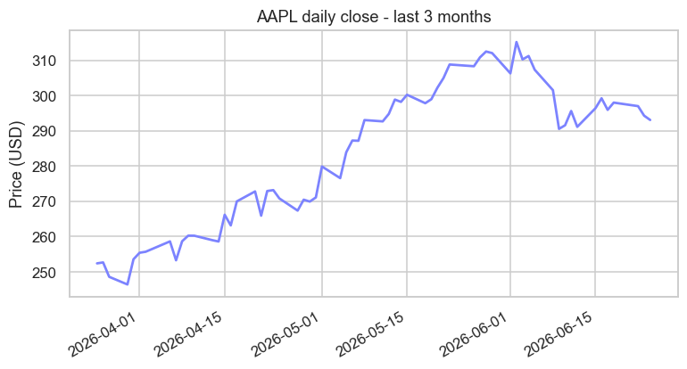
That's three months of real Apple closes, dates and all, from a single closes.plot(). The index did the hard part - placing each price at its correct date. We'll make charts properly pretty in Chapter 32, but it's worth seeing now just how little code stands between you and a real price chart.
pandas was inspired by a language built for statisticians. Its Series and DataFrame were modelled on the data structures of R, a language statisticians have used for decades. pandas' creator wanted R's elegant, label-aware way of handling data - but inside Python, with all its general-purpose power. He got it, and then some: today the flow often runs the other way, with analysts who might once have reached for R now opening a pandas notebook first.
More you can do with a Series
A Series carries dozens of one-call methods. Here's a tour of the ones you'll reach for most - running calculations, filtering, ranking, and transforming:
import pandas as pd

closes = pd.Series([101.2, 103.5, 99.8, 104.1, 98.5, 106.3],
                   index=["Mon", "Tue", "Wed", "Thu", "Fri", "Sat"], name="close")

# Running and lagged calculations.
print("running max   :", list(closes.cummax()))
print("day-on-day diff:", list(closes.diff().round(1)))
print("3-day average :", list(closes.rolling(3).mean().round(2)))

# Filtering and ranking.
print("above 100     :", list(closes[closes > 100]))
print("top 2 closes  :", list(closes.nlargest(2)))
print("between 99-104 :", list(closes[closes.between(99, 104)]))

# Transform each value with apply, then count the categories with value_counts.
direction = closes.diff().dropna().apply(lambda x: "up" if x > 0 else "down")
print("directions    :", list(direction))
print("up/down counts:", direction.value_counts().to_dict())running max : [101.2, 103.5, 103.5, 104.1, 104.1, 106.3]
day-on-day diff: [nan, 2.3, -3.7, 4.3, -5.6, 7.8]
3-day average : [nan, nan, 101.5, 102.47, 100.8, 102.97]
above 100 : [101.2, 103.5, 104.1, 106.3]
top 2 closes : [106.3, 104.1]
between 99-104 : [101.2, 103.5, 99.8]
directions : ['up', 'down', 'up', 'down', 'up']
up/down counts: {'up': 3, 'down': 2}Run down the output and you've met a small arsenal: cummax (the running high - a high-water mark), diff (day-on-day change), rolling(3).mean() (a moving average), nlargest (top-N ranking), between (a range filter), apply (run your own function on every value), and value_counts (tally up categories). Each is a single call doing what would otherwise be a loop. And notice apply with a lambda - a tiny throwaway function - lets you transform a whole Series with logic you write yourself.
apply is your escape hatch. When no built-in method does exactly what you want, series.apply(your_function) runs any function on every value. It's slower than a built-in (it's really a loop in disguise), so prefer a native method when one exists - but apply means you're never stuck.
A Series cheat-sheet
Know these exist; look up the details when you need them. Grouped by job:
- Peek:
.head(),.tail(),.sample(),.describe(),.value_counts() - Stats:
.mean(),.median(),.std(),.min(),.max(),.sum(),.quantile() - Running:
.cumsum(),.cumprod(),.cummax(),.rolling(n).mean(),.expanding().mean() - Change:
.pct_change(),.diff(),.shift()(lag),.clip(lo, hi)(cap to a range) - Filter & rank:
s[s > x](mask),.between(a, b),.nlargest(n),.nsmallest(n),.where(cond) - Transform:
.apply(func),.map(mapping),.round(),.astype(),.fillna(),.sort_values()
That's most of a working analyst's daily Series vocabulary - all on a single labelled column.
Try it yourself
- Build a Series of three symbols' prices indexed by symbol name, then fetch one by its label.
- On the Apple
closesSeries, call.describe()and read off the mean and the max. - Compute
closes.pct_change().add(1).cumprod()- the growth of 1 unit invested. What does the last value tell you about the month's total return?
Recap
- A Series is a labelled one-dimensional array: values plus an index that stays attached through every operation.
- Access by label (
s["Wed"]) or position (s.iloc[-1]); give it a name for clarity. - It's fully vectorised, with finance-ready methods - above all
.pct_change()for returns. - A Series plots itself with
.plot(), using its index as the x-axis.
A single labelled column is useful, but real market data is a table: date, open, high, low, close, volume - many columns side by side. Stack Series together and you get the structure at the very heart of data analysis: the DataFrame. It's next, and it's the big one.