Working with OHLCV Data
Open, high, low, close, volume - the five numbers behind every candle. Compute the range, body and returns from a real bar.
- ·What OHLCV means
- ·A candle, decoded
- ·Daily range & body
- ·Computing returns
- ·Up days vs down days
- ·From bars to insight
Zoom all the way in on any price chart and you reach the atom of market data: the bar, also called a candle. Five numbers - open, high, low, close, volume, or OHLCV - summarise everything that happened in a period, whether that's a day, an hour, or a minute. Every indicator, every signal, every chart you'll ever build is computed from these five numbers. Understand the bar deeply and the rest of trading data falls into place.
OHLCV: five numbers per bar
Each bar packs a whole period into five values. Let's decode the most recent day of Reliance:
import pandas as pd

df = pd.read_csv("reliance_6mo.csv", index_col="Date", parse_dates=True)
bar = df.iloc[-1]                          # the most recent day's bar

print("Date  :", df.index[-1].date())
print("Open  :", bar["Open"])
print("High  :", bar["High"])
print("Low   :", bar["Low"])
print("Close :", bar["Close"])
print("Volume:", f"{int(bar['Volume']):,}")
print()
print("Range  (high - low)  :", round(bar["High"] - bar["Low"], 2))
print("Body   (close - open):", round(bar["Close"] - bar["Open"], 2))
print("Day :", "UP" if bar["Close"] >= bar["Open"] else "DOWN")Date : 2026-06-24 Open : 1305.7 High : 1322.0 Low : 1297.5 Close : 1313.6 Volume: 11,030,917 Range (high - low) : 24.5 Body (close - open): 7.9 Day : UP
- Open - the first traded price of the period.
- High - the highest price reached.
- Low - the lowest price reached.
- Close - the last traded price (the most important single number).
- Volume - how many shares changed hands.
Drawn as a candlestick, those four prices become a shape you can read at a glance:
The body runs between open and close; the thin wicks (or shadows) stretch to the high and low. Green means the close beat the open (an up day); red means it didn't. One glance tells you the day's story.
A bar is OHLCV: Open, High, Low, Close, Volume. As a candle, the body = open-to-close and the wicks reach the high and low. Close is the headline price; green/red shows up or down.
Range, body, and direction
From OHLC you derive the numbers traders actually watch - and pandas computes them for the whole history at once:
import pandas as pd

df = pd.read_csv("reliance_6mo.csv", index_col="Date", parse_dates=True)

# Derive new columns from the OHLC - all vectorised, no loops.
df["Range"] = df["High"] - df["Low"]            # how far it travelled
df["Body"] = df["Close"] - df["Open"]           # net move, open to close
df["Return%"] = df["Close"].pct_change() * 100  # day-on-day return

up = (df["Close"] >= df["Open"]).sum()
down = (df["Close"] < df["Open"]).sum()
print(f"Trading days : {len(df)}")
print(f"Up days      : {up}")
print(f"Down days    : {down}")
print(f"Average range: {df['Range'].mean():.2f}")
print(f"Widest range : {df['Range'].max():.2f}  on {df['Range'].idxmax().date()}")
print()
print("Last 3 days (range, body, return):")
print(df[["Range", "Body", "Return%"]].tail(3).round(2))Trading days : 124
Up days : 60
Down days : 64
Average range: 27.61
Widest range : 72.37 on 2026-01-06
Last 3 days (range, body, return):
Range Body Return%
Date
2026-06-22 30.8 9.8 1.30
2026-06-23 29.0 -19.4 -1.28
2026-06-24 24.5 7.9 0.31- Range =
High - Low: how far price travelled - a simple volatility gauge. - Body =
Close - Open: the net move from open to close. - Return =
Close.pct_change(): day-on-day percentage change. - Up/down day:
Close >= Open. Over six months Reliance had 60 up days and 64 down - a near coin-flip, which is exactly what you'd expect.
These derived columns are the raw ingredients of every strategy: the moving averages, the signals, the risk measures all start here.
Drawing candles
A candlestick chart is just those rules applied to many bars - a wick line and a body rectangle per day, coloured by direction:
from pathlib import Path

import matplotlib

matplotlib.use("Agg")
import matplotlib.pyplot as plt
import pandas as pd
import seaborn as sns

df = pd.read_csv("reliance_6mo.csv", index_col="Date", parse_dates=True).tail(25)

# Draw each bar by hand: a thin wick (high-low) and a fat body (open-close).
sns.set_theme(style="whitegrid")
fig, ax = plt.subplots(figsize=(9, 4.5))
for i, (_, b) in enumerate(df.iterrows()):
    color = "#21c87a" if b["Close"] >= b["Open"] else "#e05a5a"
    ax.plot([i, i], [b["Low"], b["High"]], color=color, lw=1)              # wick
    low, high = sorted([b["Open"], b["Close"]])
    ax.add_patch(plt.Rectangle((i - 0.3, low), 0.6, max(high - low, 0.05), color=color))

ax.set_title("RELIANCE - last 25 daily candles (green up, red down)")
ax.set_ylabel("Price (Rs)")
ax.set_xticks([])

out = Path(__file__).with_suffix(".png")
plt.savefig(out, dpi=110, bbox_inches="tight")
print("Drew", len(df), "candles")Drew 25 candles
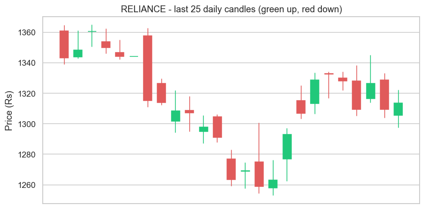
We built it from scratch with a loop, a line for each wick and a Rectangle for each body - so you can see there's no magic, just OHLC turned into shapes. (In real work you'd use a library like mplfinance, but drawing it once makes you understand it forever.)
Candlestick charts are three centuries old - and Japanese. The technique of drawing open, high, low and close as a body and wicks was developed by Japanese rice traders in the 1700s, and is often credited to a legendary trader named Munehisa Homma, who traded at the Dojima Rice Exchange in Osaka - the world's first organised futures market. Long before computers, charts, or pandas, traders had already invented the exact visual you just drew. Some ideas are simply too good to improve on.
From bars to insight
It's worth pausing on how much sits on this foundation. A moving average is just closes, averaged. A breakout is a close above a recent high. Volatility is the spread of ranges or returns. A signal is a rule over these columns. Everything in technical and quantitative analysis is a calculation on OHLCV - which means that, having mastered pandas in Module 4, you already have the tools to compute any of it.
Try it yourself
- Find the single biggest up day in the data by sorting on the
Bodycolumn descending. - Add a
Gapcolumn - today's open minus yesterday's close (df["Open"] - df["Close"].shift(1)) - and find the largest gap. - Change the candlestick chart to show the last 50 days instead of 25. Does the trend read more clearly?
Recap
- A bar is OHLCV: Open, High, Low, Close, Volume - five numbers summarising a period.
- As a candle: the body is open-to-close, the wicks reach high and low, green/red shows direction.
- Derive Range (
High-Low), Body (Close-Open), returns and up/down days - all vectorised over the whole history. - Every indicator and signal is a calculation on OHLCV - the foundation you already know how to work with.
So far every bar has come from a file or a delayed feed. To trade, you need data straight from the source, live. In the next chapter we make our first real call to a broker's API - fetching data over HTTP with OpenAlgo - and see live Indian market data arrive in Python.