Correlation Is Not Cointegration
The lesson almost everyone gets wrong, computed live on NSE data: the most correlated pairs need not be cointegrated, and a less correlated pair can be. Spurious regression and why correlation traders blow up.
- ·Correlation vs cointegration
- ·Most correlated is not cointegrated
- ·The corr-vs-coint scatter
- ·Spurious regression
- ·A Monte Carlo of nonsense
- ·Window sensitivity
Every blown-up pairs book starts the same way. Someone runs a correlation screen, finds two names that move together like twins, shorts the expensive one against the cheap one, and waits for the gap to close. It does not. The gap widens. They average down. It widens more. Eventually the desk pulls the position, and the post-mortem reads the same every time: the pair decorrelated. It never did. The correlation was real the whole way down. It was simply never the thing that makes a spread come back. This is the hinge of the entire course. If you keep one idea from it, keep this: correlation is not cointegration, and confusing the two is how statistical-arbitrage traders die.
The mistake almost everyone makes
Correlation answers a short-term question: did these two names move in the same direction on the same days? It is measured on returns (the daily percentage changes), it always lands between minus one and plus one, and it is genuinely useful for one thing only - building a hedge that does not jump around day to day. What it cannot tell you is whether the gap between two prices will ever come back. Two stocks can post a +0.8 return correlation for a decade while their price ratio drifts steadily from 1.0 to 3.0 and never returns. Every daily wiggle agrees, yet the long-run levels walk away from each other forever.
Cointegration answers the question you actually care about: is there a specific combination of these two prices that stays tied to an average? It is measured on price levels (log levels, to be exact). A "yes" means the spread - what's left after you subtract one stock (scaled by a hedge ratio) from the other - is stationary: it wanders away from an average and keeps getting pulled back. That average is the only thing a pairs trade leans on. No stationary spread, no reversion, no trade - however gorgeous the correlation looks on the screen.
These are not two flavours of the same statistic. They are different questions about different objects: one about how returns move together in the short run, the other about whether price levels stay tied over the long run. Mix them up - measure correlation and assume you have found a reverting spread - and you have made the single most expensive error in the field.
Two definitions, kept honest
The picture above is the whole chapter in one frame. On the left, two prices that are highly correlated day to day but whose gap has no anchor: it widens and keeps widening. On the right, two prices that still wander like random walks, but with a spring between them - every time the gap stretches, something pulls it back to the average. Only the right-hand gap is tradable. Correlation cannot tell these two pictures apart, because the daily co-movement looks identical in both. Cointegration is the test that can, because it asks the one question that separates them: is the spread stationary?
Correlation gives you a comfortable hedge, but it is not a reversion signal. The reversion signal is cointegration - a stationary spread with an average it returns to. A correlation screen finds pairs that trended together. Only a cointegration test finds pairs whose gap comes back. Build your screen on the wrong one and you will keep picking pairs with no anchor.
The headline table: where the ranking breaks down
Enough theory. Here are both statistics computed directly on real NSE names over the window 2016-01-01 to 2026-06-25 - roughly 2,470 trading days per pair, each tested on its own overlapping history. Correlation is measured on log returns. Cointegration is the Engle-Granger p-value on log price levels. A small p-value here means cointegrated, because the test starts from the assumption of no cointegration and a small p is the evidence against it. The table is sorted by correlation, so watch the verdict column as your eye travels down.
| Pair | Sector | Return corr | Coint p | Verdict |
|---|---|---|---|---|
| TATASTEEL / JSWSTEEL | same | 0.76 | 0.204 | no - drifts |
| TCS / INFY | same | 0.67 | 0.062 | borderline |
| HDFCBANK / ICICIBANK | same | 0.62 | 0.337 | no - drifts |
| KOTAKBANK / HDFCBANK | same | 0.60 | 0.001 | cointegrated |
| HCLTECH / WIPRO | same | 0.57 | 0.301 | no - drifts |
| MARUTI / M&M | same | 0.53 | 0.000 | cointegrated |
| MARUTI / ICICIBANK | cross | 0.46 | 0.277 | no - drifts |
| TCS / HDFCBANK | cross | 0.26 | 0.388 | no - drifts |
| INFY / TATASTEEL | cross | 0.26 | 0.842 | no - drifts |
| WIPRO / MARUTI | cross | 0.24 | 0.791 | no - drifts |
Read the top row and the bottom of the same-sector block together, because that single comparison is the entire lesson. The most correlated pair in the table, TATASTEEL / JSWSTEEL at +0.76, is not cointegrated - its Engle-Granger p-value is 0.204, a flat "no, this spread drifts." Meanwhile MARUTI / M&M, with a much weaker +0.53 correlation, is firmly cointegrated at p = 0.000, and KOTAKBANK / HDFCBANK joins it at p = 0.001. A trader who ranked these pairs by correlation and traded the top of the list would have picked the steel pair - the one with no anchor - and skipped the two pairs that actually mean-revert. The correlation ranking and the cointegration ranking are simply not the same list.
In this window only 2 of the 6 same-sector pairs are cointegrated at the 5% level, and 0 of the 4 deliberately cross-sector "fake" pairs are. That is the one comforting result: pairs with no economic reason to be tied together correctly fail the test. Now watch the difference on real prices - the most-correlated-but-not-cointegrated pair against a genuine one.
# See it: the most-correlated-but-not-cointegrated pair vs a genuinely cointegrated one.
notc_pair  = tuple(res[res.coint_p >= 0.10].sort_values("ret_corr", ascending=False).iloc[0][["A", "B"]])
coint_pair = tuple(res.sort_values("coint_p").iloc[0][["A", "B"]])

def ols_spread(a, b):
    sub = pd.concat([lp[a], lp[b]], axis=1).dropna(); sub.columns = ["a", "b"]
    m = sm.OLS(sub["a"], sm.add_constant(sub["b"])).fit()
    resid = sub["a"] - m.predict(sm.add_constant(sub["b"]))   # the cointegrating spread
    return resid

fig, axes = plt.subplots(2, 2, figsize=(13, 7.6))
for j, (pair, tag, col) in enumerate([(notc_pair, "correlated, NOT cointegrated", C["red"]),
                                       (coint_pair, "cointegrated", C["green"])]):
    a, b = pair
    sub = px[[a, b]].dropna()
    reb = sub / sub.iloc[0] * 100
    ax = axes[0, j]
    ax.plot(reb.index, reb[a], color=C["blue"],  lw=1.4, label=a)
    ax.plot(reb.index, reb[b], color=C["amber"], lw=1.4, label=b)
    ax.set_title(f"{a} vs {b}  -  {tag}", color=col)
    ax.legend(fontsize=8, loc="upper left"); ax.set_ylabel("rebased to 100")

    sp = ols_spread(a, b)
    z  = (sp - sp.mean()) / sp.std()
    axb = axes[1, j]
    axb.plot(z.index, z.values, color=col, lw=1.0)
    axb.axhline(0, color=C["grey"], lw=1)
    for k in (2, -2):
        axb.axhline(k, color=C["grey"], ls="--", lw=0.8)
    axb.fill_between(z.index, -2, 2, color=C["grey"], alpha=0.08)
    axb.set_title(f"spread z-score (OLS residual)  -  range {z.min():.1f} to {z.max():.1f}")
    axb.set_ylabel("z")
plt.tight_layout(); plt.show()

print(f"Not-cointegrated pair {notc_pair}: the spread wanders to extreme z and stays there - no anchor to trade.")
print(f"Cointegrated pair {coint_pair}: the spread keeps snapping back through zero - that is the edge.")Not-cointegrated pair ('TATASTEEL', 'JSWSTEEL'): the spread wanders to extreme z and stays there - no anchor to trade.
Cointegrated pair ('MARUTI', 'M&M'): the spread keeps snapping back through zero - that is the edge.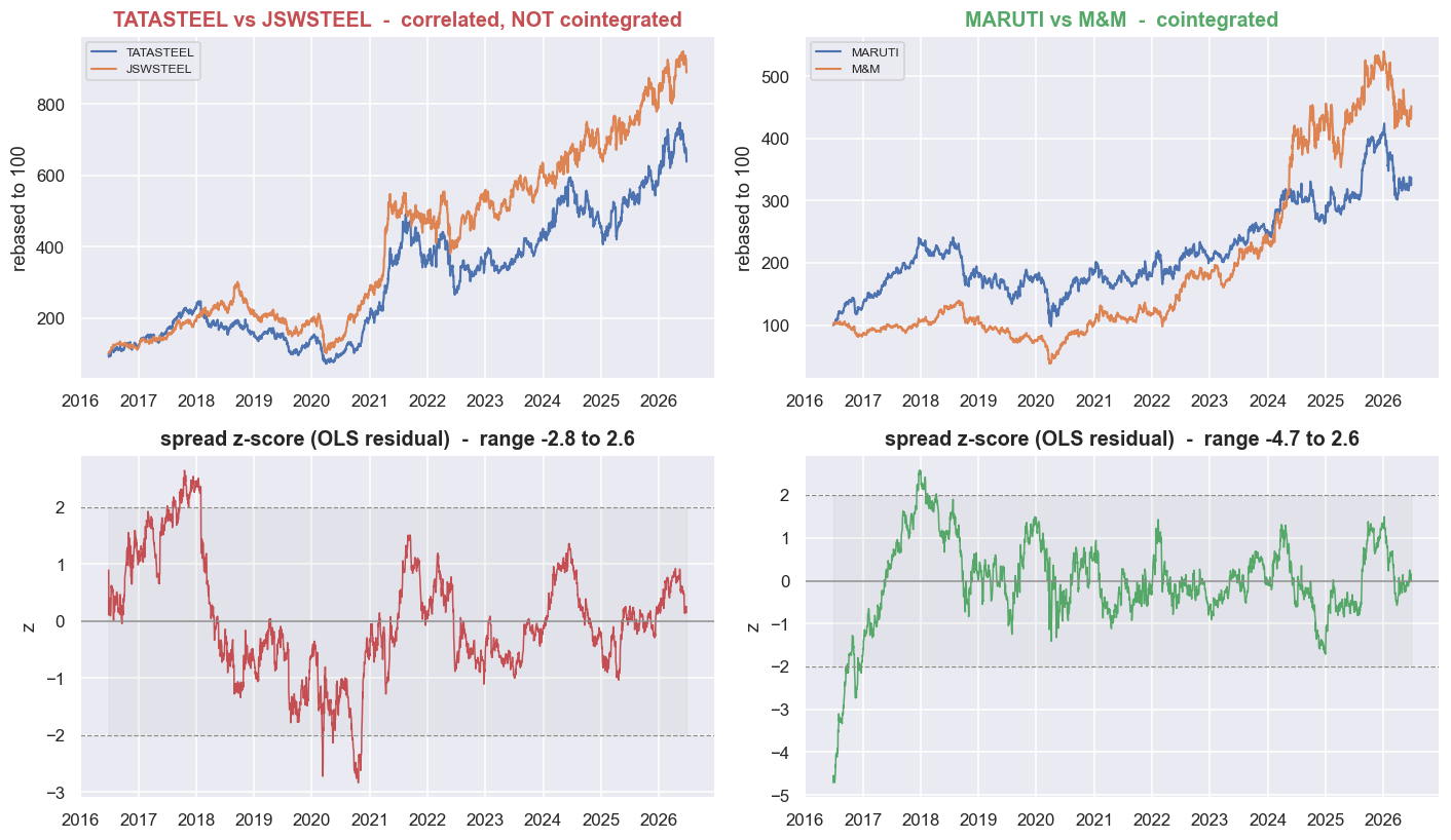
In the top row, both pairs are rebased to 100 and both look like textbook "they move together." The difference shows up in the bottom row - the spread drawn as a z-score, which is just how many standard deviations the spread sits from its own average right now. (The spread itself is the leftover, or residual, from an OLS regression - the standard line of best fit - of one leg on the other.) TATASTEEL / JSWSTEEL wanders out to an extreme and stays there: there is nothing to trade, no level it returns to. MARUTI / M&M keeps crossing back through zero. That crossing - and only that crossing - is the edge.
Correlation tells you almost nothing about cointegration
One pair could be a fluke, so widen the net. Below are the same two statistics over a 13-name set spanning IT, Banks, Metals and Auto: return correlation on the left, cointegration p-value on the right.
# Two heatmaps side by side, over a curated 13-name set spanning IT / Banks / Metals / Auto.
HN = ["TCS","INFY","HCLTECH","WIPRO","HDFCBANK","ICICIBANK","KOTAKBANK","AXISBANK",
      "TATASTEEL","JSWSTEEL","HINDALCO","MARUTI","M&M"]
sub_r = rets[HN].dropna()
sub_l = lp[HN].dropna()
corrM = sub_r.corr()
pM = pd.DataFrame(np.nan, index=HN, columns=HN)
for i, a in enumerate(HN):
    for b in HN[i+1:]:
        p = coint(sub_l[a], sub_l[b])[1]
        pM.loc[a, b] = pM.loc[b, a] = p
np.fill_diagonal(pM.values, 0.0)

mask = np.triu(np.ones_like(corrM, dtype=bool), k=1)
fig, ax = plt.subplots(1, 2, figsize=(15, 6.4))
sns.heatmap(corrM, mask=mask, ax=ax[0], cmap="mako", vmin=0, vmax=1,
            annot=True, fmt=".2f", annot_kws={"size": 7}, cbar_kws={"shrink": .8},
            linewidths=.5, linecolor="#0d1117")
ax[0].set_title("Return correlation  (bright = move together)")
sns.heatmap(pM, mask=mask, ax=ax[1], cmap="rocket_r", vmin=0, vmax=1,
            annot=True, fmt=".2f", annot_kws={"size": 7}, cbar_kws={"shrink": .8},
            linewidths=.5, linecolor="#0d1117")
ax[1].set_title("Cointegration p-value  (bright = cointegrated, p<0.05)")
plt.tight_layout(); plt.show()
print("The bright sector blocks on the left (high correlation) do NOT line up with the bright cells")
print("on the right (low coint p). Correlation clusters by sector; cointegration does not.")The bright sector blocks on the left (high correlation) do NOT line up with the bright cells on the right (low coint p). Correlation clusters by sector; cointegration does not.
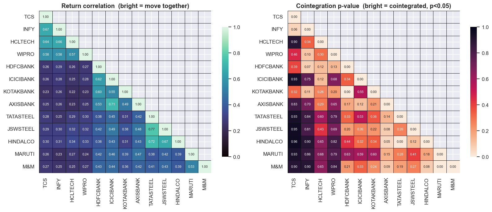
The correlation map on the left lights up in clean sector blocks - the IT names move together, the banks move together, the metals move together, exactly as economic intuition says they should. The cointegration map on the right is patchy and stubbornly refuses to fill in those same blocks. The bright (correlated) cells and the bright (cointegrated) cells do not line up. If correlation predicted cointegration, the two pictures would look the same. They look nothing alike, because they measure genuinely different things.
To turn "they look different" into a number, plot every same-sector pair in the universe - correlation on the x-axis, cointegration p-value on the y-axis. If correlation predicted cointegration, the cloud of points would slope down to the right: higher correlation, lower p. It does not slope at all.
# The scatter that kills the myth: correlation (x) vs coint p-value (y), all same-sector pairs.
from scipy.stats import spearmanr
pts = []
for sec, names in SECTORS.items():
    names = [s for s in names if s in px.columns]
    for a, b in itertools.combinations(names, 2):
        c, p, n = pair_stats(a, b)
        if n >= 750:                      # need ~3y of overlap for the test to mean anything
            pts.append(dict(pair=f"{a}/{b}", sector=sec, corr=c, p=p, n=n,
                            coint=(p < 0.05)))
sc = pd.DataFrame(pts)
rho, prho = spearmanr(sc["corr"], sc["p"])

fig, ax = plt.subplots(figsize=(11.5, 6.2))
sns.scatterplot(data=sc, x="corr", y="p", hue="coint", style="coint", s=90,
                palette={True: C["green"], False: C["grey"]}, ax=ax)
ax.axhline(0.05, color=C["red"], ls="--", lw=1.2)
ax.text(sc["corr"].min(), 0.065, "p = 0.05 (cointegrated below this line)", color=C["red"], fontsize=9)
# label the extremes so the point is unmissable
for _, r in sc.sort_values("corr", ascending=False).head(3).iterrows():
    ax.annotate(r["pair"], (r["corr"], r["p"]), fontsize=8, color=C["amber"],
                xytext=(4, 4), textcoords="offset points")
for _, r in sc[sc.coint].sort_values("corr").head(2).iterrows():
    ax.annotate(r["pair"], (r["corr"], r["p"]), fontsize=8, color=C["green"],
                xytext=(4, -10), textcoords="offset points")
ax.set_title(f"Same-sector pairs: correlation tells you almost nothing about cointegration "
             f"(this window)\nSpearman(corr, p) = {rho:+.2f}, n = {len(sc)} pairs")
ax.set_xlabel("return correlation"); ax.set_ylabel("Engle-Granger coint p-value")
ax.legend(title="cointegrated (p<0.05)", loc="upper left")
plt.tight_layout(); plt.show()
print(f"{len(sc)} same-sector pairs tested. Cointegrated at 5%: {sc.coint.sum()}.")
print(f"Spearman rank corr between correlation and coint p-value = {rho:+.2f} (p={prho:.2f}).")
print("Near zero: a higher correlation does NOT push the cointegration p-value down. They are different questions.")75 same-sector pairs tested. Cointegrated at 5%: 11. Spearman rank corr between correlation and coint p-value = -0.04 (p=0.75). Near zero: a higher correlation does NOT push the cointegration p-value down. They are different questions.
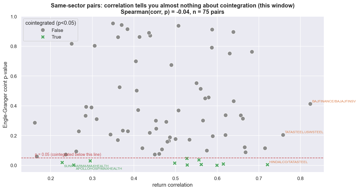
Across 75 same-sector pairs, only 11 are cointegrated at 5%, and the Spearman rank correlation between return correlation and the cointegration p-value is -0.04 (p = 0.75). Spearman just measures whether one ranking tracks the other; at -0.04 it is indistinguishable from zero. Let that land. Knowing how correlated two stocks are tells you essentially nothing about whether their spread mean-reverts. The most popular screen in pairs trading - sort by correlation, trade the top - has almost zero predictive power for the only property that makes a pair tradable.
Use correlation for what it is good at and nothing more. It is a fine secondary filter once you already have a cointegrated spread - a higher-correlation hedge moves around less day to day and is more comfortable to hold. But it must never be your primary screen. Screen on cointegration first. Then rank the survivors on correlation, half-life (how long a deviation takes to shrink by half) and cost.
Why correlation lures traders to their death
There is a reason correlation and regression are so seductive on price data. It is worth seeing the machinery directly, because it is the engine under every spurious "pair." (Spurious just means a relationship that looks real but is not.)
Take two completely independent random walks - two prices where each next value is just the last value plus random noise, with no link whatsoever between them - and regress one on the other. Standard statistics says you should find a "significant" relationship about 5% of the time. On trending, non-stationary data you do not. You find it almost always. Here is the Monte Carlo - a large repeated simulation - over 3,000 such pairs.
# Spurious regression Monte Carlo: regress INDEPENDENT random walks on each other.
rng = np.random.default_rng(7)
N, T = 3000, 500
tstat = np.empty(N); r2 = np.empty(N); pval = np.empty(N)
for i in range(N):
    x = np.cumsum(rng.standard_normal(T))     # random walk 1
    y = np.cumsum(rng.standard_normal(T))     # random walk 2 - totally unrelated
    m = sm.OLS(y, sm.add_constant(x)).fit()
    tstat[i] = m.tvalues[1]; r2[i] = m.rsquared; pval[i] = m.pvalues[1]

frac_sig = (np.abs(tstat) > 1.96).mean()
frac_r2  = (r2 > 0.5).mean()

fig, ax = plt.subplots(1, 2, figsize=(13, 4.8))
sns.histplot(tstat, bins=60, color=C["purple"], ax=ax[0])
for k in (-1.96, 1.96):
    ax[0].axvline(k, color=C["red"], ls="--", lw=1.2)
ax[0].set_title(f"t-stat of the slope ({N} unrelated random-walk pairs)\n"
                f"|t| > 1.96 in {frac_sig*100:.0f}% of cases - 'significant' is the DEFAULT")
ax[0].set_xlabel("t-statistic")
sns.histplot(r2, bins=50, color=C["teal"], ax=ax[1])
ax[1].axvline(0.5, color=C["red"], ls="--", lw=1.2)
ax[1].set_title(f"R-squared of the same regressions\n"
                f"R-squared > 0.5 in {frac_r2*100:.0f}% of cases - on pure noise")
ax[1].set_xlabel("R-squared")
plt.tight_layout(); plt.show()

print(f"Out of {N} pairs of INDEPENDENT random walks (seeded):")
print(f"  'statistically significant' slope (|t|>1.96): {frac_sig*100:.1f}%   (a correct test would give ~5%)")
print(f"  R-squared above 0.5                         : {frac_r2*100:.1f}%")
print(f"  median |t-stat|                             : {np.median(np.abs(tstat)):.1f}")
print("This is why a correlation/regression screen on raw prices invents relationships. Cointegration is the antidote.")Out of 3000 pairs of INDEPENDENT random walks (seeded): 'statistically significant' slope (|t|>1.96): 90.1% (a correct test would give ~5%) R-squared above 0.5 : 16.6% median |t-stat| : 10.0 This is why a correlation/regression screen on raw prices invents relationships. Cointegration is the antidote.
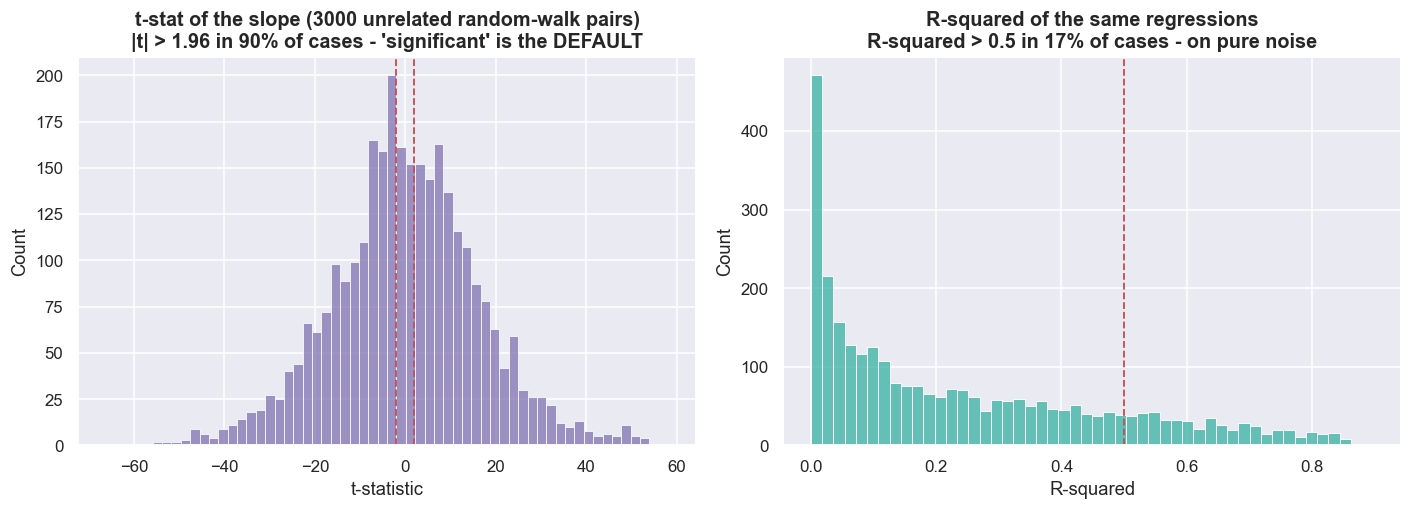
Out of 3,000 pairs of independent random walks, the regression slope looks "statistically significant" (|t| > 1.96) in 90.1% of cases - against the ~5% a correct test would deliver - with a median |t-statistic| of 10.0, and the R-squared exceeds 0.5 in 16.6% of runs on pure noise. This is the Granger-Newbold (1974) spurious-regression result, and it is the deep reason correlation is so dangerous on prices. Ordinary least squares assumes stationary, well-behaved inputs. Feed it two trending series and it hands you a confident, completely fictitious relationship. A correlation or regression screen run on raw price levels is, quite literally, a machine for inventing pairs that were never tied together.
A high t-statistic or a high R-squared on price levels is not evidence of a relationship. On trending data it is the default, even between things that have nothing to do with each other. Never trust a regression on non-stationary series. The right test for this question checks whether the residual spread is stationary: cointegration. That is why the field runs cointegration tests instead of correlations on price levels. But cointegration is not a lie detector either - it is still sample-dependent, and regime changes, short samples, multiple testing and structural breaks can all fool it, so any positive must be confirmed out of sample.
The intuition, in plain words
Strip away the econometrics and it comes down to three sentences.
- Correlation measures whether two names move together on the same days. It is a short-horizon statistic built on returns. It can be coincidence, it drifts over time, and two strongly correlated prices can separate and never come back together.
- Cointegration measures whether a specific combination of the two prices stays tied to an average over the long run - whether the spread is stationary. That average is the magnet a pairs trade leans on. No stationary spread, no reversion, no trade.
- Why the difference is lethal. A correlation-only screen picks pairs that trended together, which on non-stationary prices is mostly luck - the 90% from the histogram above. You enter expecting reversion, the spread keeps widening, and you average down into a position with no anchor. That is the classic blow-up, and it traces straight back to confusing these two ideas.
Check yourself
1. Two stocks have a daily-return correlation of 0.9. Does that make their spread tradable?
No. Correlation says they tend to move on the same days. It says nothing about whether the gap between their prices stays bounded. A high-correlation pair can still have a spread that drifts off and never comes back.
2. What is a spurious regression, and why is it so common on price levels?
It is a regression that reports a strong, "significant" relationship between two series that are actually unrelated. Ordinary least squares assumes stationary inputs; feed it two trending random walks and it finds a confident, fictitious link - here in about 90% of runs on pure noise.
3. What does a cointegration test check that a correlation does not?
Whether the spread - the residual after hedging one stock against the other - is stationary, i.e. whether the gap actually comes home. That is the property a pairs trade needs; correlation is necessary but nowhere near sufficient.
Where this breaks
The honest caveats matter as much as the result, because every number above is provisional.
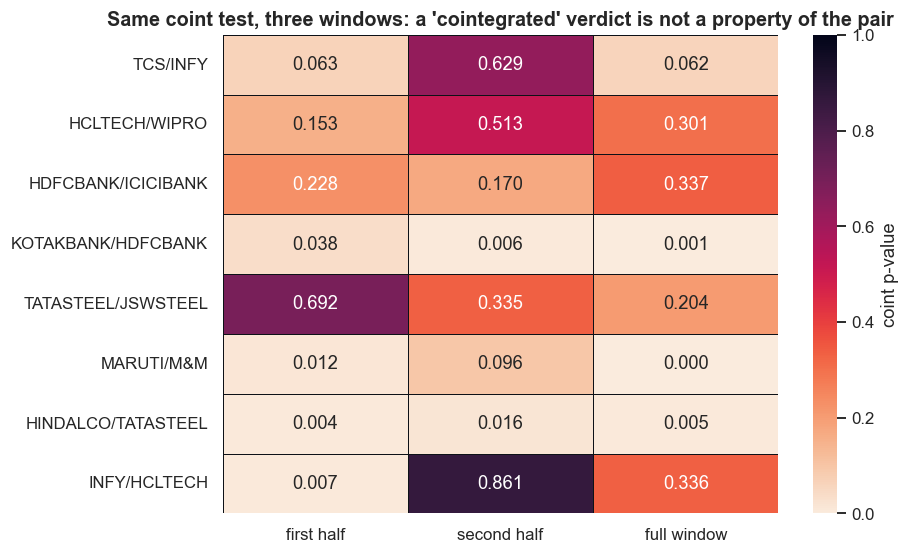
- Sample-window sensitivity is the big one. Every verdict in this chapter is true only in this window. Split each pair's history in half, re-run the identical test, and the labels flip. MARUTI / M&M goes from p = 0.012 in the first half to p = 0.096 in the second - cointegrated, then no longer. INFY / HCLTECH swings from p = 0.007 to p = 0.861, a complete reversal. Cointegration is not a permanent stamp on a pair; it is a statement about one particular stretch of data.
# Verdicts move with the window. Split each pair's overlap in half and re-test.
def split_pvals(a, b):
    sub = pd.concat([lp[a], lp[b]], axis=1).dropna(); sub.columns = ["a", "b"]
    mid = sub.index[len(sub) // 2]
    full   = coint(sub["a"], sub["b"])[1]
    first  = coint(sub.loc[:mid, "a"],  sub.loc[:mid, "b"])[1]
    second = coint(sub.loc[mid:, "a"],  sub.loc[mid:, "b"])[1]
    return first, second, full

wp = SAME_SECTOR_PAIRS + [("HINDALCO","TATASTEEL"), ("INFY","HCLTECH")]
W = pd.DataFrame({f"{a}/{b}": split_pvals(a, b) for a, b in wp},
                 index=["first half", "second half", "full window"]).T

fig, ax = plt.subplots(figsize=(8.6, 5.2))
sns.heatmap(W, annot=True, fmt=".3f", cmap="rocket_r", vmin=0, vmax=1,
            linewidths=.6, linecolor="#0d1117", cbar_kws={"label": "coint p-value"}, ax=ax)
ax.set_title("Same coint test, three windows: a 'cointegrated' verdict is not a property of the pair")
plt.tight_layout(); plt.show()

flips = []
for (a, b) in wp:
    f, s, _ = split_pvals(a, b)
    if (f < 0.05) != (s < 0.05):
        flips.append((f"{a}/{b}", f, s))
print("Verdict FLIPS between the two halves (cointegrated in one, not the other):")
for name, f, s in flips:
    print(f"  {name:20s} first half p={f:.3f}  ->  second half p={s:.3f}")
if not flips:
    print("  (none flipped this run - but with different windows they will)")
print("\nEvery 'cointegrated' label in this series is true ONLY in its window. There is no permanent tether.")Verdict FLIPS between the two halves (cointegrated in one, not the other): MARUTI/M&M first half p=0.012 -> second half p=0.096 INFY/HCLTECH first half p=0.007 -> second half p=0.861 Every 'cointegrated' label in this series is true ONLY in its window. There is no permanent tether.
Multiple testing (a preview of what's next). We scanned 75 same-sector pairs and 11 came back "cointegrated." When you run that many tests, a handful pass at p < 0.05 by chance alone - the same false-discovery trap the spurious-regression Monte Carlo warns about. A low p-value pulled from a big scan is a hypothesis, not a discovery. The next chapter puts numbers on how many spurious "cointegrated" pairs to expect from pure noise, and how the Bonferroni and FDR corrections claw it back.
The Engle-Granger test is itself fragile. It assumes a single, fixed hedge ratio (how many units of one leg you trade against the other) over the whole window, it is sensitive to which leg you put on the left-hand side of the regression, and it loses power against structural breaks. Later chapters replace the fixed ratio with one that is first diagnosed from the residuals and then updated as new prices arrive.
A tether is still not an edge. Even a genuinely, stably cointegrated pair only becomes tradable after you account for costs, borrow and short availability, half-life, and out-of-sample survival. Correlation versus cointegration is the entry exam, not the finish line.
Real-life implementation note. Everything here uses real adjusted equity closing prices to learn the statistics. Trading a cointegrated spread means shorting one leg, and in Indian markets that needs a real vehicle - intraday square-off, borrowed stock, or a stock-futures proxy. Each choice changes costs, margin, borrow availability, taxes and slippage. A statistical tether existing is not the same as a tradable edge existing. The gap between the two is the rest of this course.