The Data Layer and Its Biases
Most stat-arb results die from data problems before they die from bad statistics. The aligned price panel, liquidity filters, survivorship and symbol-change bias, and adjusted versus tradable close.
- ·The aligned price panel
- ·Liquidity filters
- ·Survivorship bias
- ·Symbol changes and new listings
- ·Adjusted vs tradable close
- ·Naming the limitations
A statistical-arbitrage book has two ways to die, and only one of them is famous. The famous death is a bad model: a spread that looked stationary in-sample - on the data you built it with - and then wandered off the moment real money touched it. The quieter death, which kills far more research before it ever reaches a model, is the data layer underneath. A misaligned date, a symbol that quietly changed names, a backtest filled at a price nobody could have traded, a universe that silently leaves out everything that went to zero - none of these throw an error. They just hand you a Sharpe ratio - return divided by risk, where higher is better - that is too good, and let you find out the truth in production. This chapter builds the data layer the whole module leans on, and names every bias in it out loud, because an honest expert spends more time distrusting the panel than admiring the strategy.
The aligned price panel
Everything downstream reads off one object: an aligned panel of daily closing prices, with one row per trading day and one column per symbol. In this data window that panel is 3,195 trading days by 50 names, spanning 2016-01-01 to 2026-06-25, with the NIFTY index carried alongside as a market factor. All 50 of 50 names load; anything that fails is printed, never quietly dropped. That single table is the base for every cointegration test, every spread, and every z-score (how many standard deviations the spread is from its own average right now, the entry and exit gauge) in the chapters that follow. That is exactly why an error here is the most dangerous one you can make. It feeds into every statistic at once, and it does so without a single warning.
The trap hides in the word aligned. Real names do not all start trading on the same day, and the exchange calendar has holidays and half-days that not every symbol follows the same way. Build the panel on the union of all dates, and the ragged edges show up as NaNs (missing values). Reach for a blind dropna() to tidy them up, and you have quietly shrunk your sample to the overlap of all of them - often without noticing how much you threw away, or which name forced the cut.
The aligned panel is the single base for the whole module. Get it wrong and every cointegration test, spread and z-score is wrong together, silently. Treat building the panel with more suspicion than the strategy itself - that is where expert time actually pays off.
The real bar: years of history per name
Before any pair test, ask the unglamorous question: how much history does each name actually have? Ranking the first valid date in each column gives the honest answer.
first_valid = px.apply(lambda s: s.first_valid_index())
hist_years = ((px.index.max() - first_valid).dt.days / 365.25).sort_values()
fig, ax = plt.subplots(figsize=(11, 9))
sns.barplot(x=hist_years.values, y=hist_years.index, hue=hist_years.index, palette='crest', legend=False, ax=ax)
ax.set_title('Years of daily history available per name'); ax.set_xlabel('years'); ax.set_ylabel('')
plt.tight_layout(); plt.show()
print('shortest histories:'); print(hist_years.head(5).round(1))shortest histories: JIOFIN 2.8 ETERNAL 4.9 MAXHEALTH 5.8 HDFCLIFE 8.6 SBILIFE 8.7 dtype: float64
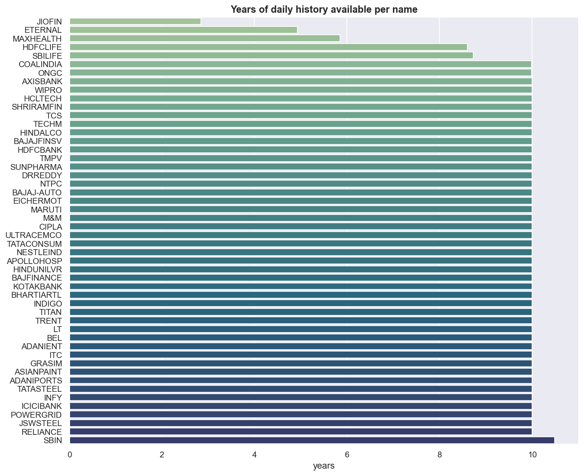
Most of the universe carries the full ~10.5 years, but the short tail is the part that matters: JIOFIN at 2.8 years, ETERNAL at 4.9, MAXHEALTH at 5.8, HDFCLIFE at 8.6, SBILIFE at 8.7. These are not rounding noise; they decide what you can test. A cointegration relationship wants a long overlap that spans several market regimes. If you insist on a rectangular panel with no NaNs, the newest listing caps the shared window for every pair it touches - pair anything with JIOFIN and your usable sample collapses to about 700 trading days. A relationship that holds over 700 days, through basically one market regime, can very easily be a coincidence dressed up as structure.
The other direction is no safer. Drop the short-history names to keep a long window, and you have quietly picked the oldest, most-established large caps - a survivorship-flavoured bias before you have run a single statistic. There is no free choice here. You pick which bias you accept, and you write it down.
2.8 years is roughly 700 observations covering one regime. The Engle-Granger and Johansen tests (Johansen finds stationary combinations among several stocks at once) will happily hand back a "significant" result on a window that short. Significance over a single regime is not evidence of a tradable, lasting relationship - it is the most common way a stat-arb backtest lies to its author.
The liquidity filter: richest vs thinnest
Statistical arbitrage lives or dies on being able to trade both legs cheaply. Rank the universe by average daily traded value - close times volume, averaged over the trailing 365 days, in rupees crore - and you get the order of how expensive each name is to trade.
vol = {}
for s in UNIVERSE:
    try:
        d = load(s); vol[s] = (d['close'] * d['volume']).last('365D').mean()
    except Exception as e:
        print('skip', s, e)
adv = (pd.Series(vol) / 1e7).sort_values(ascending=False)   # in Rs crore/day
fig, ax = plt.subplots(figsize=(11, 9))
sns.barplot(x=adv.values, y=adv.index, hue=adv.index, palette='flare', legend=False, ax=ax)
ax.set_title('Average daily traded value, last year (Rs crore)'); ax.set_xlabel('Rs crore / day'); ax.set_ylabel('')
plt.tight_layout(); plt.show()
print('thinnest 5 (handle with care):'); print(adv.tail(5).round(0))thinnest 5 (handle with care): GRASIM 203.0 SBILIFE 198.0 JSWSTEEL 198.0 NESTLEIND 185.0 TATACONSUM 164.0 dtype: float64
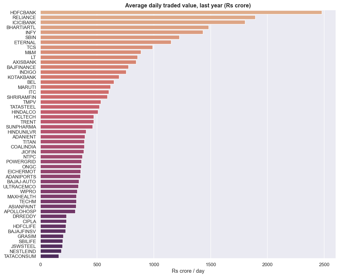
Here is the brutally honest part of this window. The thinnest five names are GRASIM at Rs 203 crore/day, SBILIFE and JSWSTEEL at Rs 198 crore, NESTLEIND at Rs 185 crore, and TATACONSUM at Rs 164 crore. The thinnest name in the whole universe still trades more than a hundred and sixty crore rupees a day. There is no truly illiquid name on this list - it is fifty large caps. So in this window the liquidity filter is discipline, not rescue: it tells you which pairs will cost more in spread, not which pairs you cannot trade at all. The real liquidity trap - a backtest that fills at a printed close no one could actually have traded - bites hardest in a wider mid- and small-cap universe, which is exactly the universe a hungry researcher is tempted to reach for to find more pairs.
A pair is only as liquid as its thinner leg. The cheaper-to-trade side does not subsidise the expensive one. The thin side sets the spread and impact you pay on the whole position. Rank by traded value and feed that in as a cost input to pair selection, not as a footnote after the fact.
Co-movement is necessary, not sufficient
Rebasing each name to 100 at the start of the window shows, at a glance, how members of a sector move together. This is the visual intuition behind the whole module - and also its single most seductive trap.
fig, axes = plt.subplots(2, 2, figsize=(12, 8))
for ax, sec in zip(axes.ravel(), ['Banks','IT','Metals','Energy']):
    sub = px[[s for s in SECTORS[sec] if s in px.columns]].dropna()
    reb = sub / sub.iloc[0] * 100
    for col in reb.columns:
        ax.plot(reb.index, reb[col], label=col, lw=1.4)
    ax.set_title(f'{sec}: rebased to 100'); ax.legend(fontsize=8, loc='upper left')
plt.tight_layout(); plt.show()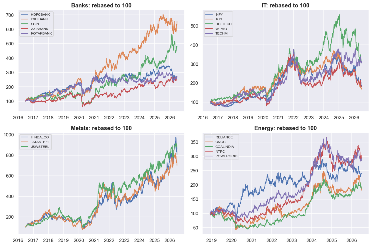
The bank lines move together; the IT lines move together; metals and energy each cluster. The eye reads "these belong in a pair," and the wallet gets ready to pay. But shared movement is just correlation, and correlation is necessary but nowhere near enough for a tradable spread. A whole sector can drift upward together - both legs riding the same market beta - while a long/short pair built on them mean-reverts around nothing you can profit from, or worse, the spread itself trends and never comes back. Two lines climbing side by side share a direction. That is not the same as a spread whose level stays within a band. The gap between those two ideas is the whole reason the cointegration machinery exists, and it is where most pairs that "look obvious" on a rebased chart die.
Correlation describes returns moving together day to day. Cointegration describes the level of a spread staying within a band over time. You can have high correlation with a spread that drifts away forever, and modest correlation with a beautifully stationary spread. The chart shows the first; only a stationarity test shows the second.
Adjusted prices measure, tradable prices fill
The closes in this panel are adjusted for splits and dividends, which is the right choice for measuring a relationship. Adjustment removes the artificial cliffs a split or large dividend would otherwise punch into the series, so the spread reflects economics rather than corporate-action bookkeeping. But you can never trade at an adjusted price. The fill happens on the raw tradable close, which still carries the jump. A corporate action can shift a hedge ratio overnight, so the ratio you estimated last week may be stale the morning after an ex-date.
Every backtest in this module trades adjusted closes, for cleanliness. That is a deliberate, disclosed simplification. Real fills land on raw prices, with a spread and market impact on top, and squaring the two is work that has to happen before a relationship becomes a position.
Survivorship and the symbol-change trap
This panel is today's large-cap members, looking backward - and that single sentence hides two biases an expert never skips. First, survivorship. Names that were dropped from the index, merged away, or delisted are simply absent. That absence is not neutral; it is optimistic, because the names that fell out are mostly the ones that did badly. A backtest run on survivors flatters every statistic it touches. Second, the symbol-change trap. A company that demerged, merged, or rebranded reappears under a new ticker with a chopped-off history - several of the short-history names above are partly this artifact. A naive loader either drops the past entirely or, worse, stitches two different companies into one continuous series and calls it a price.
A true point-in-time universe would rebuild index membership as it changed over time and keep the delisted names alongside the survivors. That is out of scope for this module. So the honest move is not to pretend the bias is gone, but to state it plainly and keep it in view whenever a result looks suspiciously clean.
Where this breaks
- Survivorship and point-in-time bias. The panel is current members looking backward. Dropped, merged and delisted names are absent, and their absence flatters every statistic. We name it; we do not correct it here.
- Symbol changes. Demergers, mergers and rebrands leave broken histories under new tickers. The short-history tail (JIOFIN, ETERNAL and friends) is partly this, and a careless loader can stitch two different companies into one series.
- Short histories cap the trustworthy window. A rectangular panel is only as long as its newest listing. 2.8 years through one regime is not enough to trust a cointegration result, however significant it prints.
- Stale or thin prints. This universe is uniformly liquid, so the liquidity filter is discipline rather than rescue - but in any wider universe, low-volume names carry prices you could not actually trade, and the filter is a partial defence, not a cure.
- Adjusted prices hide the real fill. The module models adjusted closes but, in reality, fills on raw prices with a spread and impact on top. The gap is widest exactly at corporate actions, where hedge ratios also move.
With the data layer built and its limits stated, the next chapter draws the line that the rebased sector charts only hint at: the difference between a statistical relationship you can see and a tradable edge you can actually hold - before we touch a single strategy.