Payoff at Expiry vs Live P&L Before Expiry
The most misunderstood idea in options. A payoff diagram shows your result at expiry, not your profit today. Learn why an option's price moves before expiry with volatility, time decay and delta, so the chart and your screen disagree.
- ·What a payoff diagram really shows
- ·Why it is not today's P&L
- ·Delta, the price-now effect
- ·Theta, the daily bleed
- ·Vega, the volatility effect
- ·Why you can be right and still lose
You buy the RELIANCE 1320 call, convinced the stock is heading up. The next morning RELIANCE does rise, from 1318 to 1325, exactly the direction you bet on. You open your trading screen expecting a profit, and instead the position shows a small loss. Nothing is broken. You have just met the single most important and most misunderstood idea in option trading: the picture you studied before the trade, the payoff diagram, describes expiry day, not today. The result it promised lives on 28 July. The number on your screen this morning is a different thing entirely, driven by forces the payoff diagram never showed you. This chapter is about that gap, because understanding it is what separates a trader who knows what they own from one who is constantly, painfully surprised.
A payoff diagram is a picture of one day
Every payoff diagram you have seen in this course, the long call, the long put, the short call, shows your profit or loss at expiry, plotted against where the underlying finishes. It assumes one specific thing: that you hold the option all the way to the last day and let it settle for pure intrinsic value.
That assumption is doing a lot of quiet work. On expiry day there is no time-value left, so the option is worth exactly its intrinsic value, and the payoff is a clean bent line, flat where the option finishes worthless, then sloping once it finishes in-the-money. The long call payoff, for instance, is flat at a loss of the premium, about Rs 15,590 a lot, for any finish at or below 1320, and it climbs from there, breaking even at 1351 and profiting above.
But here is the thing. That diagram says nothing about what your option is worth on any of the thirty-something days before expiry. It is a photograph of the finish line, not a film of the race. And your money is in the race the whole way.
A payoff diagram shows your profit or loss at expiry, assuming you hold to the last day. It is not a picture of your profit or loss today. The result it promises only fully arrives when time-value has melted to zero on expiry day.
The two lines: the finish and today
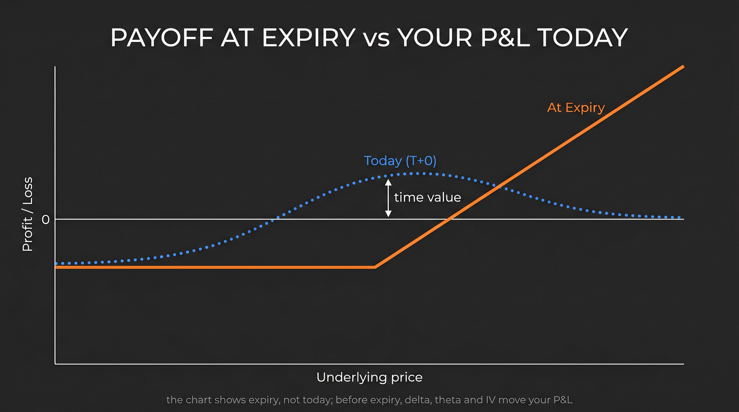
This is why the payoff charts in this course are drawn with two lines, not one. Look closely at the long call below.
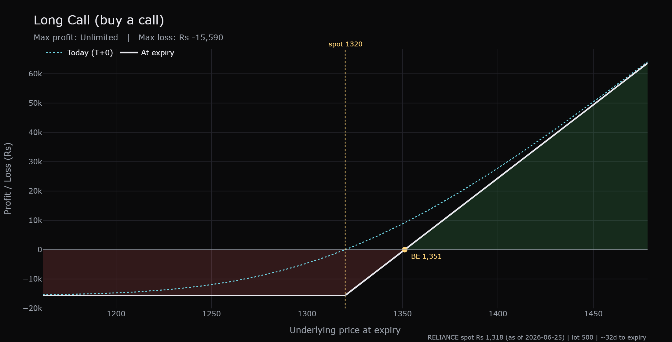
The solid line is the payoff at expiry, the clean bent shape we just described, flat to the left and rising to the right of the strike. The dotted line is the value of the very same option today, with all its remaining time still attached. Notice three things about that dotted line.
First, the dotted today curve sits above the solid expiry line almost everywhere. That vertical gap between them is time-value, the hope premium still priced into the option because expiry has not yet arrived. With about thirty-two days left, the gap is wide.
Second, the dotted curve is smooth and rounded, not sharply bent. Before expiry an option does not flip cleanly from worthless to valuable at the strike; it bends gently, because there is still time for the stock to travel.
Third, and most important, the two lines are not the same line. Your profit or loss today is read off the dotted curve. Your profit or loss at expiry is read off the solid line. Confusing the two is the root of more beginner pain than almost anything else in options.
The solid line and the dotted curve on a payoff chart are two different things. The dotted curve is what your option is worth now; the solid line is what it will be worth at expiry. The space between them is the time-value that has yet to melt away.
What drives the dotted line: four forces
If the dotted today curve is what your screen actually shows, then you need to know what moves it. Before expiry, an option's price is pushed around by four forces, and only the first one is the simple directional bet you thought you were making.
- Delta is how much the option's price moves for each one rupee move in the stock right now. An at-the-money call has a delta around one half, meaning it gains only about fifty paise for each one rupee RELIANCE rises, not a full rupee. So a small move up earns you less than beginners expect.
- Theta is the daily time-decay bleed. Every day that passes, the option quietly loses a little time-value, even if the stock does nothing. Theta works against you as a buyer, all day, every day, and it bites hardest in the final weeks.
- Vega is the option's sensitivity to a change in implied volatility, the market's expectation of how much the stock will move. If that expectation falls, the premium deflates, even if the stock sits still. A drop in implied volatility can quietly drain a buyer's option.
- Liquidity and the spread is the cost of getting in and out. You buy at the ask and sell at the bid, and the gap between them, the spread, is an immediate cost baked into your position from the first second. On an illiquid strike it can be large.
The payoff diagram's solid line knows about none of these. It is a pure expiry picture. The dotted today curve, and your screen, feel all four every minute the market is open.
The only force a payoff diagram captures is direction at expiry. Before expiry, theta is bleeding your premium daily, a fall in implied volatility can shrink it, delta means a small move pays less than the move suggests, and the spread costs you on entry and exit. These are why your today P&L lags the payoff.
"I was right on direction but still lost money"
Now the puzzle from the opening makes sense. Let us walk the worked example carefully.
You buy the RELIANCE 1320 call for about Rs 31 a share, Rs 15,590 a lot, with RELIANCE at 1318 and about thirty-two days to expiry. Overnight the stock rises to 1325. You were right. So why the loss?
- Delta only gave you part of the move. With a delta near one half, a seven rupee rise in RELIANCE lifts the call's value by only about three and a half rupees, not seven.
- Theta took a day's rent. One day passed, so the option shed a slice of time-value. That decay pulls in the opposite direction to your small gain.
- The spread already cost you. You bought at the ask, and to value the position now you look at the bid, which is a little lower. That gap was a cost you paid the instant you entered.
Add it up. A small directional gain, only partly captured by delta, can easily be smaller than one day of theta plus the spread you crossed. The net is a position that is slightly red even though the stock moved your way. You were right on direction and still down money. The market did not cheat you; the payoff diagram simply never promised you a profit today. It promised a profit at expiry, and only if RELIANCE clears 1351.
This is the experience that breaks new buyers. They confuse being right about direction with being in profit, and the two are not the same until expiry, and not even then unless the move is big enough to clear the strike plus the premium.
RELIANCE rises from 1318 to 1325 the day after you buy the 1320 call. Delta hands you only about half of that seven rupee move, theta quietly removes a day of time-value, and the bid you would sell at sits below the ask you bought at. The result on your screen is a small loss, on a day the stock went exactly your way.
The gap closes as expiry nears
There is a comforting symmetry hidden in all this. The dotted today curve does not stay above the solid line forever. As the days pass and time-value melts, the dotted curve sinks steadily toward the solid expiry line. On the morning of 28 July, with no time left, the two lines have become one. The hope premium is fully gone, and your option is worth exactly its intrinsic value, the solid line, no more.
That is why the same move is worth different amounts at different times. A jump to 1360 with thirty days left lifts the rounded today curve nicely, because there is still time-value on top. The same 1360 with one hour left sits almost exactly on the solid line, worth its bare intrinsic value of forty rupees and nothing more. Time is not a backdrop to an option trade. It is one of the prices.
When you read a payoff diagram before a trade, find both lines. The solid line tells you the outcome if you hold to expiry. The dotted curve tells you roughly what your screen will show in the days before. Plan for both, because your money sits on the dotted curve long before you ever reach the solid line.
Reading your own screen honestly
So how should a beginner use all this? Three habits help.
First, treat the payoff diagram as your expiry plan, not your daily scoreboard. It answers the question, where do I stand if I hold to 28 July, at each possible price. It does not answer, what will my screen say tomorrow.
Second, respect the four forces before you enter. Ask how much the stock must move, and how soon, to beat the daily theta bleed and clear the breakeven of 1351. If the honest answer is a big, fast move, know that you are fighting time decay every day you wait.
Third, separate two questions that beginners fuse into one: was I right about direction, and am I in profit. Before expiry those can disagree completely, because delta, theta, vega and the spread sit between a correct call and a green screen. A trader who keeps the two questions apart stops being surprised, and starts managing the trade that actually exists rather than the one the payoff diagram seemed to promise.
The payoff diagram is still a wonderful tool. It is the clearest single picture of what an option can do. Just remember what it is a picture of, the last day, with all the hope burned off. Everything before that day, the part where your money actually lives, is the rounded today curve, shaped by delta, theta, implied volatility and the spread. Learn to hold both pictures in your head at once, and the day the stock rises while your option falls will no longer confuse you. It will simply make sense.