Bollinger Bands, ATR and Volatility
Volatility is just how much price jumps around, and it is measurable. Learn Bollinger Bands and the squeeze, the ATR you will size stops with, and the Keltner and Donchian channels, all on real charts.
- ·What volatility means for your risk
- ·Bollinger Bands and the squeeze
- ·Why a band touch is not a signal
- ·ATR: the trader's ruler for stops
- ·Keltner and Donchian channels
- ·Volatility expands and contracts
Some days a stock barely moves; some days it lurches around like a small boat in a storm. That restlessness has a name, volatility, which simply means how much price jumps around. Volatility is not good or bad on its own, but it is measurable, and once you can measure it you can do two things every serious trader has to do: spot when a quiet stock is about to wake up, and size your safety net so it is neither too tight nor too loose. This chapter is about the tools that put a number on movement itself.
The first of those tools, Bollinger Bands, does something humbler and more honest than most indicators. It does not try to tell you which way price is going. It tells you how much price is moving, by wrapping a moving average in two elastic lines that breathe in and out, squeezing tight when a stock goes quiet and flaring wide when it gets loud. The trap is that those outer lines look like buy and sell signals. The upper line seems to scream too high, sell; the lower line seems to whisper too low, buy. Sixteen years of Nifty 50 data says that reading is wrong. A close above the upper band still returned +0.58% over the next 10 days, positive, not negative. The bands measure volatility. They do not measure direction. Confuse the two and you will sell every winner the moment it gets strong.
What the bands actually are
Bollinger Bands, created by John Bollinger in the 1980s, are three lines drawn on top of price:
- A middle band, usually a 20-day simple moving average, the same smoothed trend line you met in the moving-averages chapter.
- An upper band, the middle band plus two standard deviations of price.
- A lower band, the middle band minus two standard deviations of price.
Standard deviation sounds technical, but it is just a measure of how spread out recent prices have been. When a stock has been swinging hard, the spread is large, so the bands sit far apart. When a stock drifts sideways in a tight range, the spread shrinks and the bands close in. The width of the channel is the volatility, drawn to scale. You can literally see how excited a stock is by how wide its bands have opened.
That two standard deviation default is not magic. If price moves were perfectly random and bell shaped, roughly 95% of closes would fall inside two standard deviations. Markets are not perfectly random, but the rule of thumb survives: most days, price lives inside the bands, and the band edges mark where price is statistically stretched, not where it is finished.
OpenAlgo's library can calculate the three bands for you from a stock's closing prices, using a 20-day average and two standard deviations, so you never work the maths by hand.
The middle band is the trend; the gap between the outer bands is the volatility. Bollinger Bands are two tools in one, a moving average you already understand plus a live volatility gauge wrapped around it. Read them as a condition, never as a command.
The squeeze: when quiet precedes loud
The most useful thing the bands tell you is when they get narrow. A squeeze is a stretch where volatility has collapsed, the bands pinch together because recent closes have barely moved. Quiet markets do not stay quiet forever. Pressure builds, and when it releases the move that follows is often sharp. The squeeze does not tell you which direction the release will go, only that the calm is unusual and a bigger move is statistically overdue.
You can spot a squeeze by eye, but the precise way to measure it is bandwidth, the distance between the outer bands expressed as a fraction of the middle band. A small bandwidth number means a tight coil. On the chart below, BEL's bandwidth compressed to roughly 4.7% on 4 September 2024, an unusually tight squeeze after a long quiet stretch, before the bands expanded again as the next move developed.
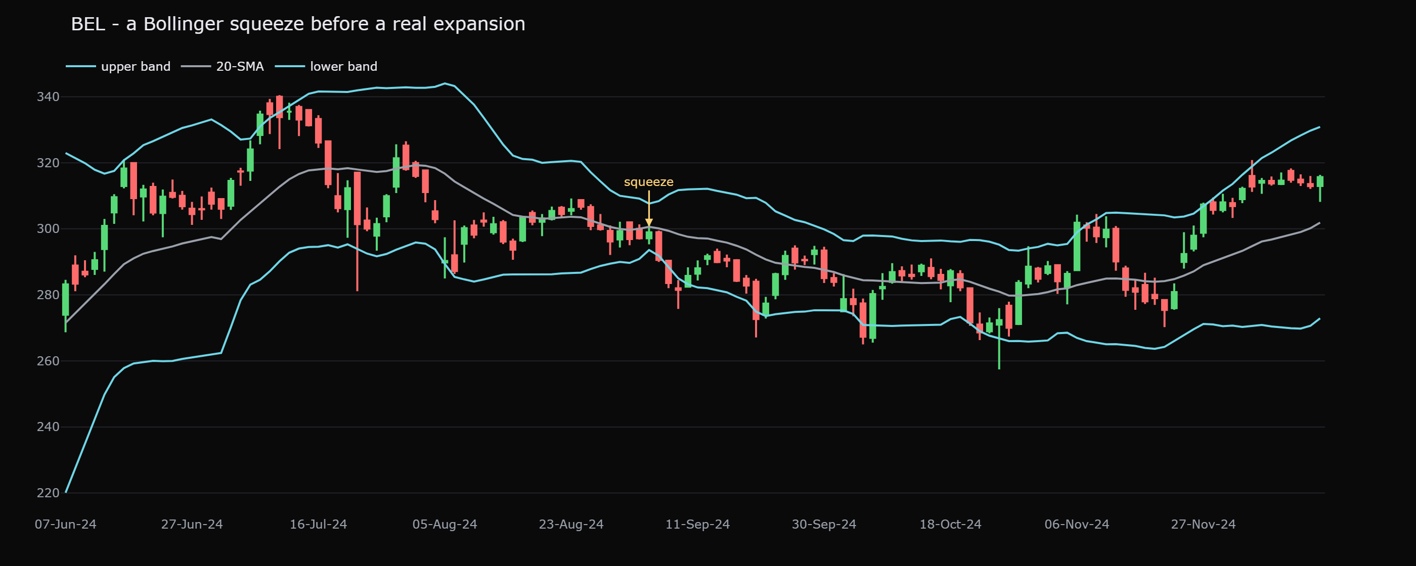
Notice what the squeeze did not do: it did not point up or down. It said this stock is unusually quiet, and quiet does not last. That is genuinely useful, it tells you when to pay attention, but it is only half a trade. You still need price itself, or another tool, to tell you which way to lean.
A squeeze is a statement about volatility, not direction. The bands can pinch tight and then break down just as easily as up. Traders who assume a squeeze always resolves upward are reading a direction that is simply not there.
Walking the band
Here is where most beginners go wrong. In a strong trend, price does not politely return to the middle after touching an outer band. It clings to the band and rides it, a behaviour traders call walking the band. In a powerful uptrend a stock can close near or above the upper band day after day, because the trend is so strong that two standard deviations above average keeps getting redefined upward.
If your rule is sell when price touches the upper band, walking the band is the rule that destroys you. You would have sold the strongest part of the strongest moves, again and again, while the stock kept climbing. The band touch was not an exit signal. It was the signature of strength.
Price touching the upper band is not a sell signal, and price touching the lower band is not a buy signal. In a trend, repeated touches of one band confirm the trend's power, the opposite of a reversal. Treating a band touch as a fade is one of the most expensive beginner mistakes in technical analysis.
Why a band touch is not a signal
We can put a number on this. Across the Nifty 50 over 16 years, days where price closed above the upper band went on to return +0.58% over the next 10 days, positive, and almost exactly in line with the average day inside an existing uptrend. A close outside the upper band gave you no edge in either direction. It was certainly not the reliable top the textbook picture implies. Compare it to the course baseline, where any random Nifty 50 day has averaged about +1.48% over the next 20 days. If the bands gave away free sell signals, the forward return after an upper-band close would be sharply negative. It is not.
On BEL's chart, watch what happens after the September 2024 squeeze resolves. As the move gets going, price repeatedly pushes the upper band rather than collapsing off it. Anyone who shorted the first upper-band tag because the textbook said overbought was fighting the very strength the band was advertising. The band edge marked conviction, not exhaustion.
ATR: the ruler you size stops with
Bollinger Bands answer how stretched is price right now. The Average True Range, or ATR, answers a closely related question in plain rupees: how far does this stock typically travel in a single day? It was built by Welles Wilder, the same engineer who later gave us the strength tools in the next chapter, and it has become the trader's ruler for measuring movement.
The idea behind it is gentle. On most days a stock's range is just its high minus its low. But sometimes a stock gaps, opening far from yesterday's close, and a simple high minus low would miss that jump. The true range fixes this by taking the largest of three distances: today's high to today's low, today's high to yesterday's close, and today's low to yesterday's close. Average that true range over 14 days and you have the ATR, the stock's normal daily travel, gaps included. Like bandwidth, ATR has no direction at all. It only measures the size of movement, never the way.
On the chart below, ADANIENT's ATR sits around Rs 85, roughly 2.8% of its price. That single number is enormously practical. It says that on an ordinary day this stock swings about Rs 85, so a stop placed only Rs 20 away would be tripped by sheer everyday noise, while a stop Rs 400 away would risk far more than the situation calls for. A common, sensible approach is to place a stop 2x to 3x the ATR away from your entry, wide enough to survive the stock's normal wiggle, tight enough to keep the loss controlled. On ADANIENT, two times ATR is about Rs 170 of breathing room.
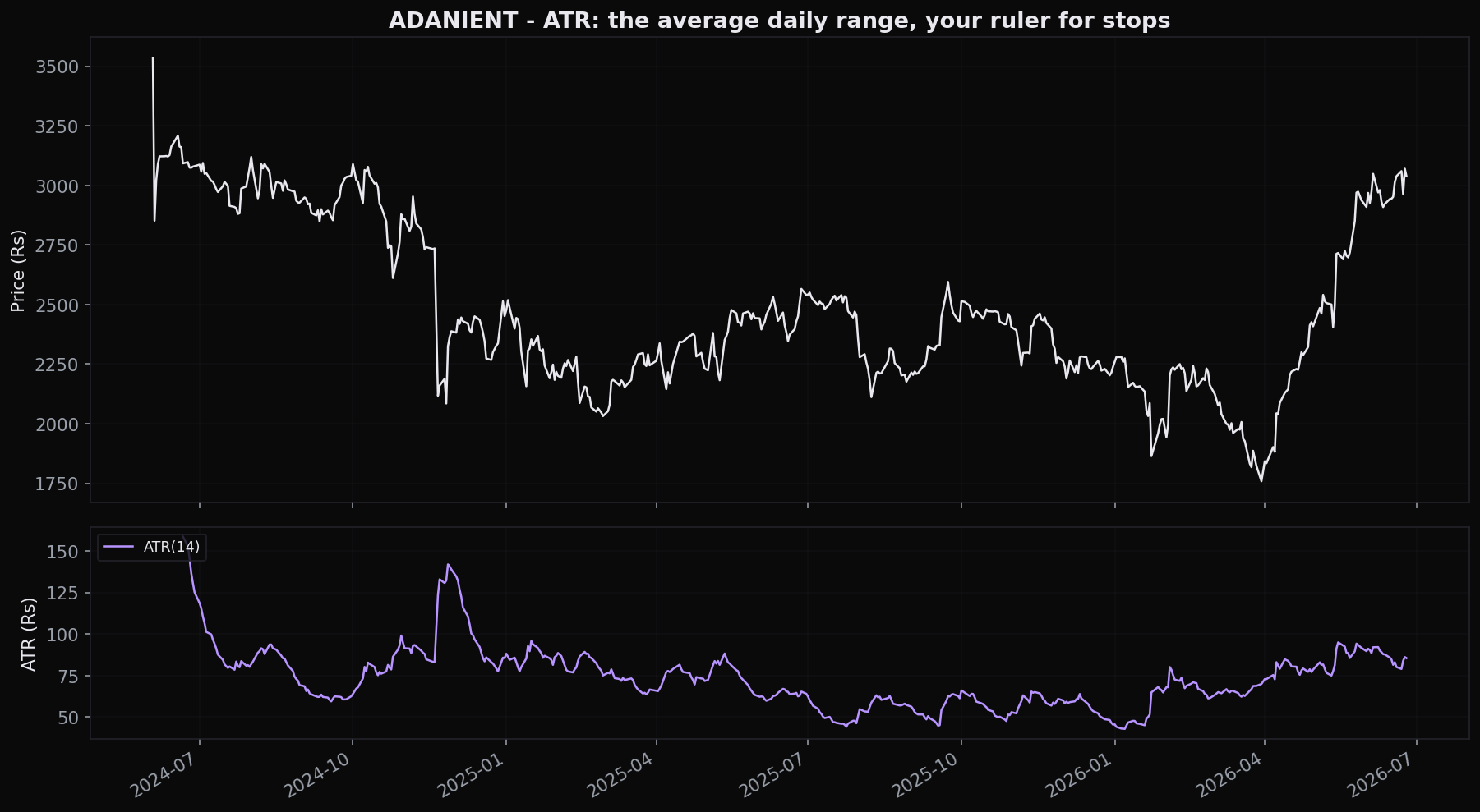
This is the real reason ATR matters to a beginner. It converts a vague worry, where do I put my stop, into a number based on how the stock actually behaves rather than a round figure you guessed. You will meet ATR again when we size positions in the risk chapter, and again inside trend tools like the Supertrend that trail a stop a fixed number of ATRs behind price. Wherever a stop needs to breathe with a stock's own rhythm, ATR is the ruler.
If you remember one thing from this chapter, make it this: let the stock's own ATR set your stop distance, not a round number you like the look of. A quiet stock earns a tight stop; a wild one needs a wide one. The ATR tells you which is which.
Keltner and Donchian channels
Bollinger Bands are one way to draw a channel around price, but they are not the only way, and two cousins are worth knowing because you will see them everywhere.
A Donchian channel is the simplest channel there is: just the highest high and the lowest low of the last N days, drawn as two lines, often over a 20-day window. The top line is the highest the stock has traded in the last 20 days; the bottom line is the lowest. A close above the top line is, by definition, a 20-day breakout, the very event you met in the channels chapter, where you also learned the sobering base rate that 56% of those breakouts faked out within five days, falling to 47% when volume confirmed. The Donchian channel is breakout trading drawn as a picture.
A Keltner channel looks like Bollinger Bands but is built differently. Its middle line is an exponential moving average, and its outer lines sit a multiple of ATR above and below that average, rather than a multiple of standard deviation. Because Keltner uses ATR, which already accounts for gaps, it tends to be smoother and steadier than the more reactive Bollinger Bands. Many traders watch the two together: when the Bollinger Bands pull all the way inside the Keltner channel, that is an especially tight squeeze, a coil within a coil.
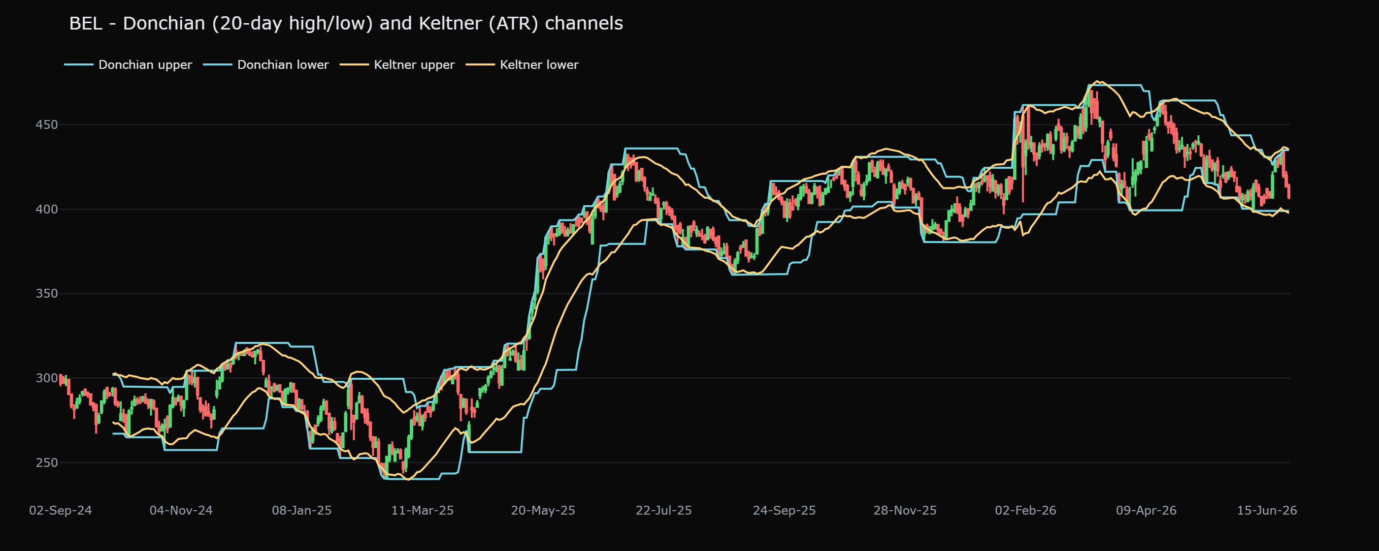
Bollinger Bands, Keltner channels, the Donchian channel and an ATR panel are all answering the same question, how much is this thing moving. Stacking all of them on one chart is not four confirmations, it is one idea drawn four times, fooling you into false confidence. Pick one volatility tool, not the whole shelf. We name this trap directly in the combining-indicators chapter.
Volatility expands and contracts
Step back and these tools reveal a rhythm. Volatility is not random; it cycles between quiet and loud and back to quiet. Bandwidth and ATR both make that cycle visible:
- Low and falling, a squeeze; the stock is coiling; expect the calm to break eventually.
- Rising and wide, volatility has expanded; a move is underway; the easy, explosive part may be maturing.
- Very wide, then contracting, the move is cooling; the stock is settling back toward balance.
Knowing which phase a stock is in changes how you act. A stock in a tight squeeze needs a different stop and a different mindset than one whose bands are blown wide open. This is why volatility tools earn their place even though they never once tell you direction. They tell you the weather, calm or stormy, so you can dress for it.
Reading volatility honestly
Put it together and the job description is clear. Bollinger Bands are a volatility instrument wearing a trend line down the middle; they show when a stock is unusually quiet or unusually stretched relative to its own recent behaviour. ATR is the ruler that turns that movement into rupees you can size a stop with. Keltner and Donchian channels draw the range in two other useful ways. Not one of these tools predicts direction, and none of them should be traded as a standalone buy or sell trigger.
Use them to answer is this market coiled or running, calm or stormy, and how much does it normally move, then let price, levels and volume answer which way and how convincingly. That division of labour is the whole skill.
Quick recap
- Volatility is just how much price jumps around, and it is measurable. Bollinger Bands, ATR and channels all measure movement, never direction.
- Bollinger Bands are a 20-day average plus and minus two standard deviations; the middle line is trend, the gap between the outer lines is volatility.
- A squeeze flags an unusually quiet market and a likely bigger move, but says nothing about which way. BEL squeezed to ~4.7% bandwidth on 4 September 2024 before expanding.
- In a trend, price walks the band: repeated touches confirm strength. A close above the upper band still returned +0.58% over 10 days, not a sell.
- ATR is the typical daily move in rupees, about Rs 85 (~2.8%) on ADANIENT; it is the ruler you size stops with, commonly 2x to 3x ATR from entry.
- Donchian channels mark the N-day high and low (a breakout box); Keltner channels are an EMA with ATR bands. Use one volatility tool, not the whole shelf.
Bands and ATR tell you how much price is moving. The next chapter adds the other half of conviction, how many people are behind the move. We turn to volume, the market's fuel gauge.