Volume Indicators: OBV, MFI and Money Flow
Price tells you what; volume tells you how convincingly. Beyond raw volume, meet On-Balance Volume, the Money Flow Index, Chaikin Money Flow and the A/D line, and see what real NSE volume did at big turns.
- ·Volume as conviction
- ·On-Balance Volume (OBV)
- ·The Money Flow Index (MFI)
- ·Chaikin Money Flow and the A/D line
- ·Volume spikes and divergence
- ·Delivery vs traded volume in India
Price tells you what happened. Volume tells you how many people meant it. A stock can rise on a thin, sleepy session where almost nobody traded, or rise on a session where the whole market piled in, the same green candle, completely different conviction behind it. Volume, simply the count of shares that changed hands, is the one input on the chart that is not worked out from price at all. It is the closest thing a chart gives you to a crowd's body language.
That makes volume powerful and also easy to over-read. A big volume bar feels important, so beginners treat every spike as a signal. The data is more careful. Volume confirms; it raises or lowers your confidence in a move price is already making. On a real test, breakouts backed by heavy volume failed less often than quiet ones, but they still failed plenty. And the biggest volume day of all can mean the opposite of a clean signal: a flood of trading with almost no price progress is two crowds fighting to a draw, not a green light. This chapter starts with raw volume, then turns it into a small family of indicators, On-Balance Volume, the Money Flow Index, Chaikin Money Flow and the Accumulation/Distribution line, that read the crowd for you.
Volume as conviction
Think of every candle as a vote and volume as the turnout. A 2% up-day on triple the usual volume means a large, motivated crowd of buyers overwhelmed sellers; that is conviction. The same 2% up-day on half the usual volume means price drifted up because nobody was around to sell, not because demand was fierce. Identical candles, opposite stories, and only the volume bar tells them apart.
This is why volume is read in relative terms, almost never in absolute ones. Five million shares means nothing on its own; it could be a quiet day for one stock and a record for another. What matters is volume compared to the stock's own recent average, and a common, honest way to do that is to compare today against the 20-day average volume. OpenAlgo's library can work out that average and today's ratio to it for you, so the comparison is automatic. A ratio near 1.0 is an ordinary day, 2.0 is twice the usual participation, and above 5 or 6 is a genuine event, the kind of day where something happened.
Volume is always read relative to a stock's own recent average, never as a raw number. The question is never is this a lot of shares, it is is this a lot for this stock, right now.
Confirming breakouts and trends
Volume earns its keep at the moment of a breakout. When price pushes through a level the whole market is watching, the question is always is this real or a trap. You met the brutal base rate in the channels chapter: across the Nifty 50 over 16 years, 56% of 20-day breakouts faked out, falling back below the broken level within five days. More than half were traps.
Volume tightens those odds. Filter the same breakouts for volume greater than 1.5 times the recent average, and the fakeout rate dropped from 56% to 47%, with better forward returns on the ones that held. A breakout on heavy volume says a real crowd is behind the push; a breakout on thin volume says price wandered through the level with nobody watching, and is far more likely to be reclaimed.
Heavy volume on a breakout cut the failure rate from 56% to 47% in our 16-year Nifty 50 test, a real, useful improvement. But notice: nearly half of even the high-volume breakouts still failed. Volume tilts the odds in your favour. It does not guarantee the move.
In an established trend, the same logic runs quietly in the background. A healthy uptrend tends to see volume swell on the up-days and fade on the pullbacks; the crowd shows up to buy and loses interest to sell. When that flips, when rallies come on shrinking volume and selloffs come on rising volume, the trend is running out of fuel even if price has not yet broken. That is the early warning a price-only chart cannot give you.
Spikes, climaxes and churn
A volume spike is a single bar towering over its neighbours. It marks a moment when an unusual number of people had to act, on earnings, news, a block deal, a cascade of stops. Spikes are where information enters the chart. But a spike is a question, not an answer, and the answer depends entirely on what price did on that same bar.
On the chart below, BEL traded about 6.9 times its 20-day average volume on 27 September 2024, an enormous spike, the sort of bar that stops you scrolling. The lesson is what you do next: you read the price action on and after that bar, because the same volume can mean very different things.
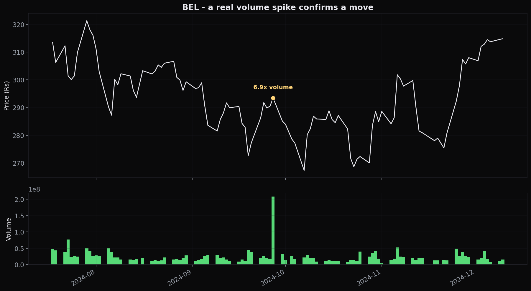
- Spike with a strong directional close, a large crowd moved price decisively. That is conviction, in the direction of the close.
- Spike near the end of a long trend, a climax, when a stock that has run for months puts in its heaviest bar at a new extreme, it can mark exhaustion: the last buyers piling in at the top, or the last sellers capitulating at the bottom. The crowd's biggest day is sometimes its final one.
- Spike with a tiny price move, churn. This is the one beginners misread. A huge-volume bar that closes almost exactly where it opened means buyers and sellers traded furiously and neither won. That is not a signal to act on; it is two crowds in a standoff, indecision at high intensity, not a launchpad.
A record-volume day with almost no price movement is churn, not a breakout. Massive turnout that produces a flat candle means the market could not agree, a balanced fight, not a winner. Do not read conviction into a volume bar until you have checked what price did alongside it.
Volume divergence
Just as price and momentum can disagree, so can price and volume, and the disagreement is informative. Volume divergence is when price makes a new high, or a new low, but volume does not confirm it.
- Price grinds to a fresh high while volume on each new push gets thinner: the rally is being carried by fewer and fewer participants. The trend is narrowing, a quiet caution flag.
- Price slides to a new low but volume dries up rather than expanding: the selling is exhausting itself; the sellers who wanted out are mostly out.
Divergence is a warning, not a trigger. Like everything in this course it shifts probabilities, it does not flip a switch. A trend on fading volume can still run for weeks before it turns. You use divergence to lower your conviction and tighten your risk, not to call the exact top.
Turning volume into a line: OBV
Reading individual volume bars is useful but tiring. The volume indicators do the reading for you by folding volume into a single running line you can compare against price. The oldest and simplest is On-Balance Volume, or OBV.
The recipe is plain. On every up-day, add that day's volume to a running total; on every down-day, subtract it. The result is a cumulative tally of whether volume has been flowing into the stock on up-days or out of it on down-days. OpenAlgo's library can build the OBV line for you from a stock's closing prices and volume.
You do not read OBV's value; the number itself is meaningless. You read its slope and its agreement with price. When price makes a new high and OBV makes a new high too, buying volume is confirming the move. When price makes a new high but OBV refuses to follow, the up-days are coming on lighter volume than the down-days, the same divergence warning, packaged as one clean line instead of a row of bars.
Read every volume indicator the way you read OBV, as a confirmation line, not a number. The only questions worth asking are: is the line trending the same way as price, which is confirmation, or are the two pulling apart, which is divergence. The absolute level tells you nothing.
The Money Flow Index
OBV has one blind spot: it counts a whole day's volume as either all buying or all selling, with nothing in between. The Money Flow Index, or MFI, is more nuanced. The easiest way to think of it is a volume-weighted version of RSI. Like RSI it runs on a 0 to 100 scale, but where RSI looks only at price, MFI weights each day's move by how much money actually changed hands, the day's typical price multiplied by its volume. An up-day on heavy volume pushes MFI up hard; an up-day on thin volume barely nudges it. It is momentum and conviction rolled into one number.
Because MFI swings a little more than RSI, its conventional labels are set wider: above 80 is overbought, below 20 is oversold. And here the lesson from the RSI chapter carries over exactly. Overbought means strong, not about to fall. In a powerful uptrend MFI can stay pinned above 80 for a long stretch, just as RSI does, so fading it blindly is the same expensive mistake in a new costume. Treat the 80 and 20 lines as descriptions of a stretched state, never as automatic sell and buy orders.
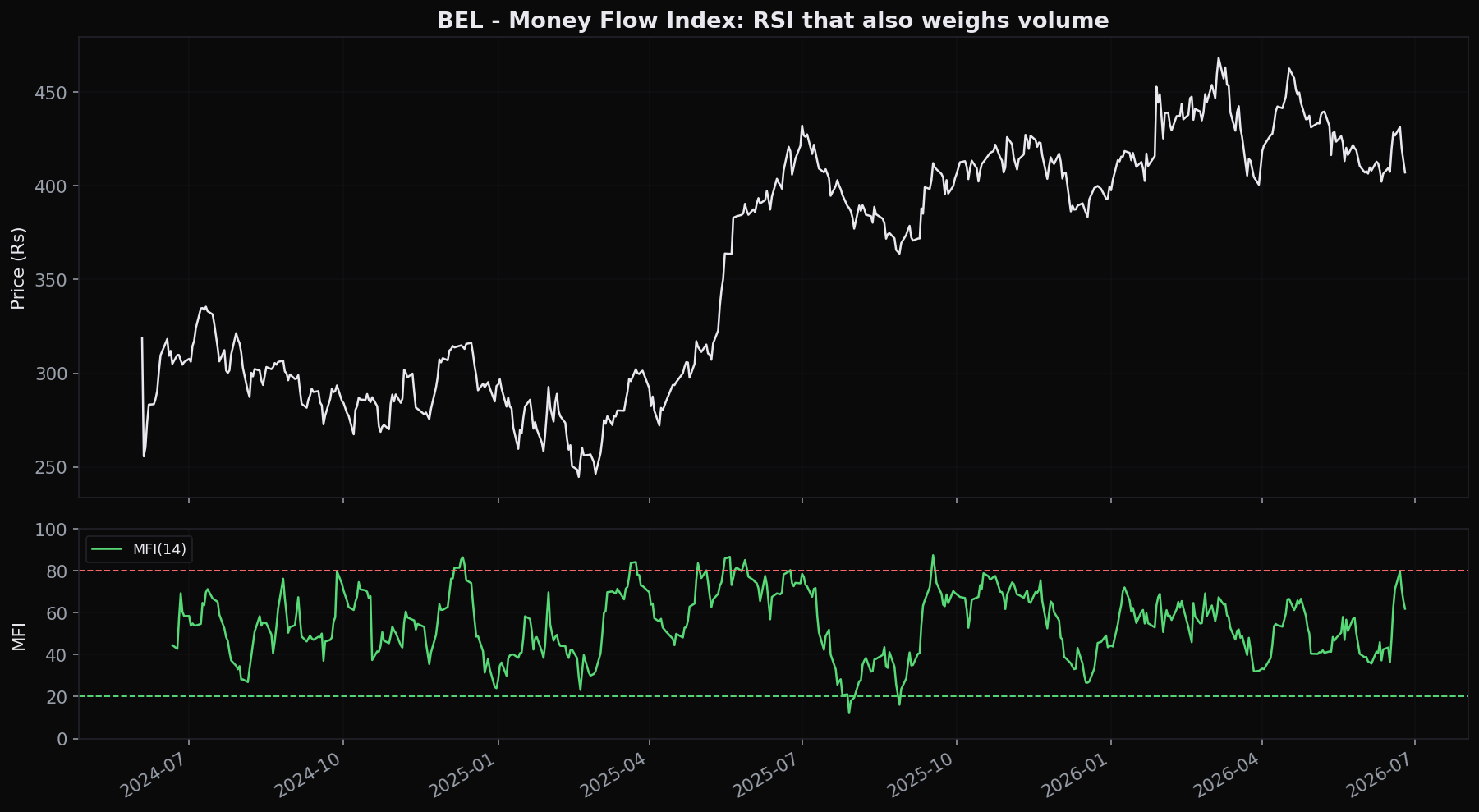
Where MFI genuinely shines is divergence. Because it bakes in volume, a divergence on MFI, price pushing to a new high while MFI rolls over to a lower high, says the money behind the move is thinning, not just the momentum. That is a slightly louder warning of exhaustion than a price-only oscillator can give, though it is still a caution to act on with a price trigger, never a standalone command.
Chaikin Money Flow and the A/D line
Two more cousins round out the family, and both refine the same idea: instead of treating a whole day as purely up or purely down, they ask where inside the day's range the close landed.
The Accumulation/Distribution line, the A/D line, is a running cumulative line like OBV, but smarter. On each bar it adds only a fraction of the volume, decided by where the close sits within the high-to-low range. A close near the day's high adds most of the volume, that is accumulation, buyers in control into the close. A close near the day's low subtracts, that is distribution, sellers in control. So a green day that closed weak, near its low, does not get full credit, which catches sneaky days that OBV would happily mark as pure buying. As with OBV, you read its slope and whether it agrees with price.
Chaikin Money Flow, or CMF, takes that same accumulation idea and turns it into an oscillator that swings around a zero line over a lookback, usually about 20 days. Above zero means buying pressure has dominated the recent window; below zero means selling pressure has. A reading that holds comfortably above zero supports an uptrend, while a slip below zero during a rally is a caution that the buying is drying up. OpenAlgo's library can calculate the A/D line and Chaikin Money Flow for you, so you can compare their direction against price without doing the arithmetic.
On-Balance Volume, the Money Flow Index, Chaikin Money Flow and the A/D line are all answering one question, is money flowing in or out of this stock. They are cousins, not independent witnesses. Loading all four on one chart is not four confirmations, it is the same idea four times. Pick one volume tool you trust and let price lead.
Delivery vs traded volume in India
One detail matters specifically for Indian stocks. The volume bar on a chart is total traded volume, every share that changed hands, including pure intraday churn where a trader buys and sells the same shares within the session. A large part of a day's volume can be speculative round-trips that net to nothing by the close.
The exchange also reports delivery volume, the portion of shares that were actually delivered into demat accounts, meaning the buyer kept them overnight rather than flipping them intraday. A high delivery percentage on a big-volume day suggests investors, not just intraday traders, were behind the move, generally a sign of stronger conviction. A heavy-volume day that is almost all intraday churn, by contrast, can evaporate the next morning. When you have it, delivery data is a useful second layer on top of the raw volume bar.
Two stocks both close up 3% on a 4 times volume spike. One shows 70% delivery, investors accumulating and holding. The other shows 15% delivery, intraday traders flipping the same shares all day. The price candles look identical; the delivery split tells you which crowd was really there, and which move is more likely to stick.
Quick recap
- Volume is the one chart input not derived from price; it counts how many people backed a move. Read it relative to the stock's own recent average, never as a raw number.
- Volume confirms; it does not trigger. Breakouts on more than 1.5x average volume faked out 47% of the time versus 56% for all breakouts, a real edge, not a guarantee.
- A spike marks forced action, but its meaning depends on price. BEL traded ~6.9x its 20-day average volume on 27 September 2024; a decisive close is conviction, a flat close on record volume is churn.
- OBV folds volume into one running line; the Money Flow Index is a volume-weighted RSI, overbought above 80 and oversold below 20, but it can stay pinned in a trend, and its real value is divergence.
- Chaikin Money Flow and the A/D line weigh where the close lands in the day's range; all of these are cousins, so use one, not the whole set.
- In India, separate delivery volume from total traded volume: high delivery means real holders; heavy intraday churn can vanish overnight.
You now have tools for direction, momentum, volatility and the conviction behind a move. But none of them answers a question that decides whether any of them will even work: does this stock have a real trend right now, or is it just drifting sideways? The next chapter measures trend strength, with the ADX, the DMI and Aroon.