Trend Tools That Sit on Price: Supertrend, SAR and Ichimoku
Some indicators plot directly on price and flip from buy to sell for you. Meet the Supertrend, the Parabolic SAR and the Ichimoku Cloud, what each does well, and where each gets chopped up in a range.
- ·Indicators that sit on price
- ·Supertrend and the ATR trail
- ·Parabolic SAR (the dots)
- ·The Ichimoku Cloud, simply
- ·Where trend-followers whipsaw
- ·Trailing a stop with them
Most of the indicators you have met so far live in a strip below the price chart. The RSI, the MACD, the stochastic, they all sit in their own little window underneath the candles, drawing a wiggly line you have to glance down at and interpret. This chapter is about a different breed of tool: the kind that draws right on top of the price itself and, instead of leaving you to read a wiggle, simply takes a side. Green means stay with the uptrend. Red means step aside. They flip the switch for you.
That sounds wonderful, and for a first-timer it genuinely is easier to read, which is exactly why these tools are so popular and so quietly dangerous. A line that says buy or sell in plain colour feels like an answer. But an answer is only ever as good as the question behind it, and all three tools in this chapter ask the very same one: is price actually trending? When it is, they are superb. When it is not, they fall to pieces, flipping back and forth and bleeding you with small losses. We will meet each one in plain terms, then face that catch honestly.
Tools that sit on the price and pick a side
A quick word first. An overlay is any indicator drawn directly on the price candles rather than in a separate panel below. A moving average, which you met earlier, is an overlay: it lays a smooth line over the candles. The three tools in this chapter are overlays too, but they go one step further. They do not just describe the trend, they take a position on it, switching between a "this is an uptrend" state and a "this is a downtrend" state and showing you which one is active right now.
That is genuinely useful for a beginner, because it removes the guesswork of interpreting a line. It is also where the trap hides. A tool that always shows either green or red will give you a green or red signal even when there is no trend at all, only noise. Keep that thought; we come back to it at the end.
These three tools are overlays that pick a side. They sit on the price and flip between a long state and a short state. That makes them easy to read, but it also means they are never silent. They will hand you a signal even when the market is just drifting sideways with nothing to say.
Supertrend: one line that turns green or red
Supertrend is the friendliest of the three. It draws a single line that sits just below the price while the trend is up, then jumps above the price the moment it decides the trend has turned down. While the line is below and coloured green, the message is "uptrend, stay long." When price closes through it and the line flips above and turns red, the message is "downtrend, stand aside."
What makes it tick is volatility, how much price jumps around from day to day. Supertrend measures that jumpiness with the Average True Range, the typical daily move you met when sizing stops, and parks its line that distance away from price. When the market is wild, the line gives price more room; when the market is calm, the line tucks in close. Because it ratchets up behind a rising price and never slides back down, it doubles neatly as a trailing stop, a stop level that follows price higher and locks in gains, only ever moving in your favour until the trend breaks.
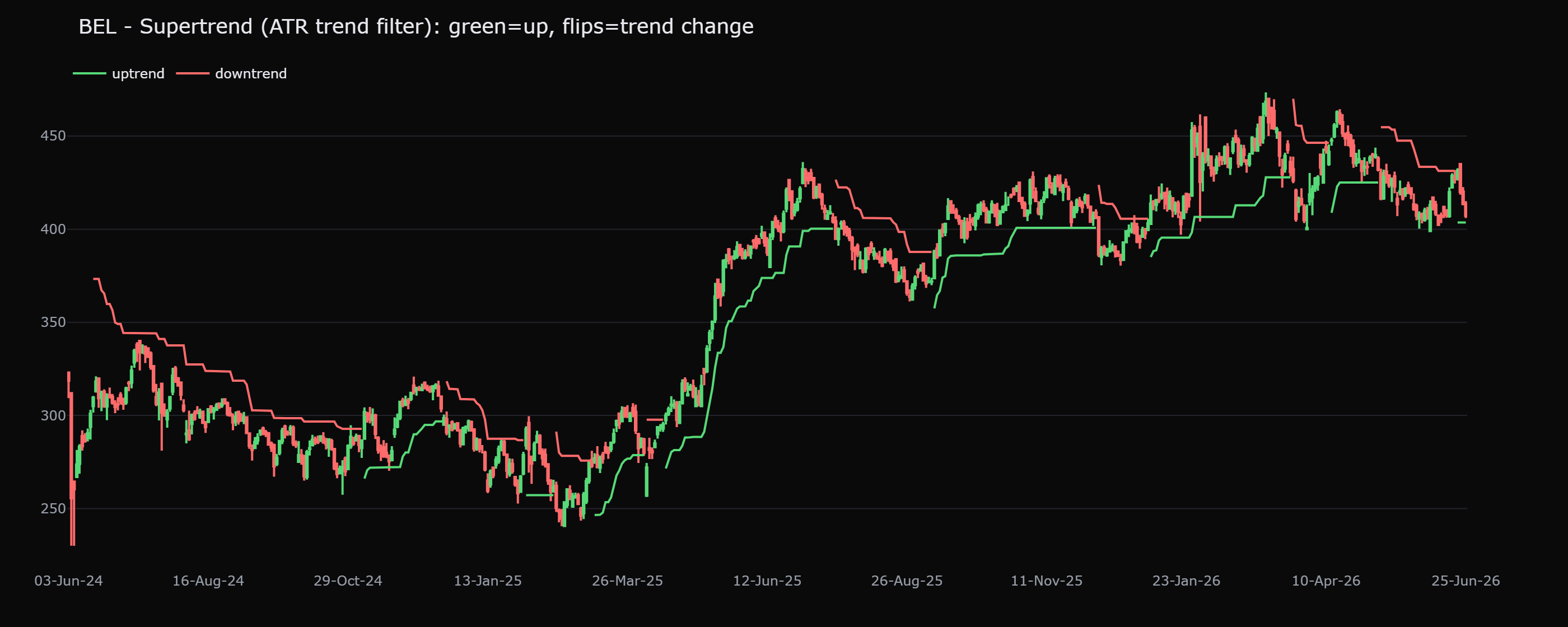
Now the honest part. On BEL, this overlay flipped direction 25 times in two years. If every flip were a real trend change, BEL would have reversed course twenty-five times, which is absurd. Most of those flips were noise: price wobbling sideways just enough to trip the line, then wobbling back. Each flip in a trendless stretch is a potential small loss. Supertrend keeps the trend beautifully when there is a trend to keep, and saws you to bits when there is not.
Parabolic SAR: a trail of dots
SAR stands for stop and reverse, which is exactly what it does. Instead of a line, it prints a small dot near each candle: dots sit below the price while the trend is up, and above the price while the trend is down. As a move runs on, the dots creep closer and closer to price, like a leash being slowly tightened. The instant price reaches the dots, SAR declares the move over, jumps the dots to the other side, and reverses its opinion from long to short or back again.
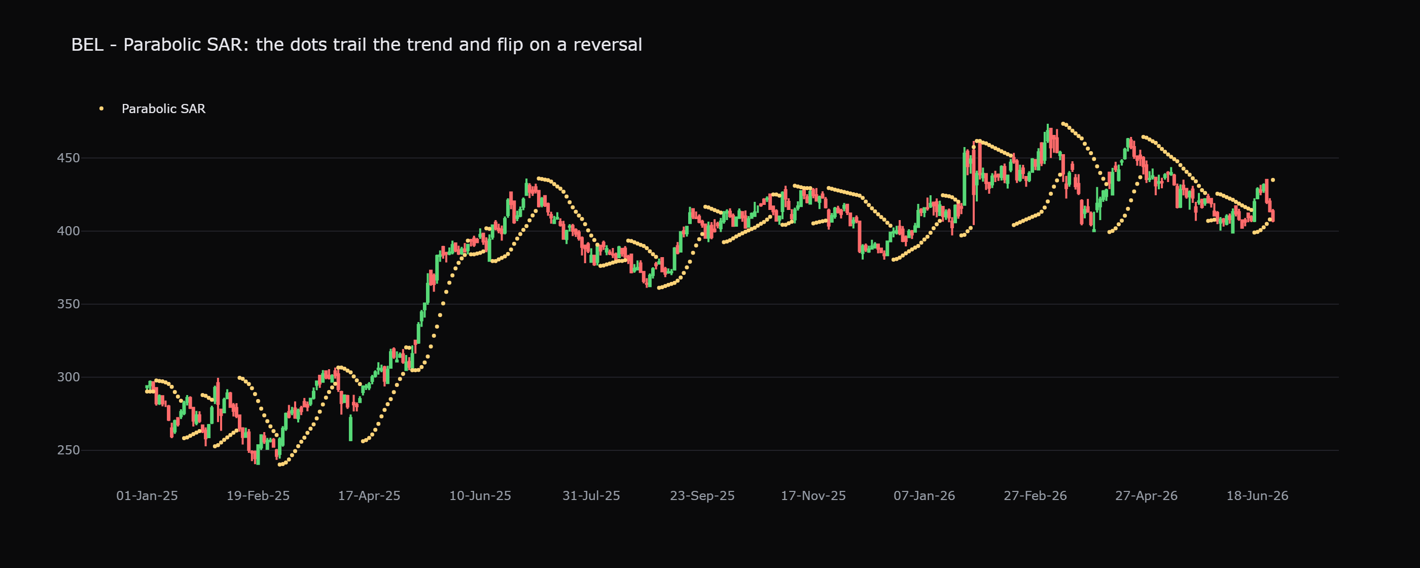
That tightening leash makes SAR a tidy trailing stop in a clean trend: you can ride a move and let the dots follow it up, exiting only when price finally touches them. But the same design that makes it neat in a trend makes it miserable in a range, a stretch where price moves sideways with no clear direction. In a range, price keeps drifting into the dots from both sides, so SAR keeps flipping, up, down, up, down. That repeated false-signal chop is called a whipsaw, and it is exactly the medicine that punishes range-bound traders the most.
Parabolic SAR and Supertrend are at their worst in a quiet, sideways market, the very condition where price keeps grazing them and forcing a flip. A string of "reverse now" signals in a range is not the market changing its mind, it is the tool reacting to noise. Treat these flips as suspect whenever price is going nowhere.
Ichimoku Cloud: a shaded map of the regime
Ichimoku looks intimidating at first glance, several lines plus a shaded band floating over the chart, but a beginner needs only one idea from it: the cloud. The cloud is a shaded zone drawn around price, and its single most useful message is the regime, the market's overall mood.
The reading is simple. When price floats above the cloud, the regime is bullish and you favour the long side. When price sinks below the cloud, the regime is bearish. When price is inside the cloud, the market is undecided, and the honest move is to stand aside until it picks a side. On top of that, the cloud acts as a moving zone of support and resistance, a thick band price tends to pause at, bounce off, or stall against rather than a thin single line.
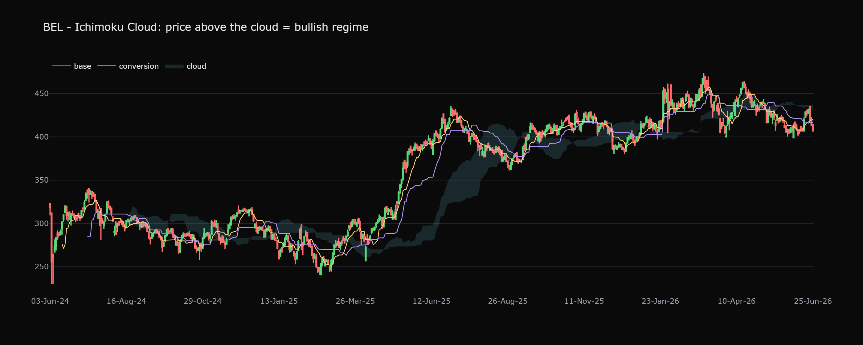
On BEL, while price stayed above the cloud the uptrend held its shape, and the cloud's upper edge worked as a moving floor that pullbacks kept respecting. You do not need to memorise the other lines to get value from this; the above-or-below-the-cloud read alone gives you a clean, slow-moving sense of which way the bigger tide is running.
The simplest first-timer takeaway of this whole chapter: these tools are best as a context and trailing-stop aid, not a blind buy-sell button. Let the cloud or the line tell you which side to lean, and let it trail your stop as a trade works. Do not act on every single flip the moment it happens.
The catch every one of them shares
By now the pattern is obvious. Supertrend, Parabolic SAR and the Ichimoku cloud are all trend tools, and trend tools have one fatal weakness: they need a trend to exist. In a real, directional move they keep you on the right side and trail your stop with little fuss. In a flat, choppy range they do nothing but whipsaw, flipping side to side and converting a quiet market into a slow drip of small losses.
This is where the previous chapter earns its keep. There you met the ADX, a gauge of trend strength on a scale of 0 to 100, where a reading above about 25 says a genuine trend is present and a reading below about 20 says the market is merely chopping. The ADX does not tell you direction; it tells you whether there is enough of a trend to bother trend-following at all. That makes it the perfect on-and-off switch for everything in this chapter.
Picture BEL with the Supertrend line green and below price. On its own that says "stay long." Now glance at the ADX. If it reads 35, the trend is strong and the green Supertrend is worth trusting, ride it and let it trail your stop. If instead the ADX reads 14, the market is going nowhere; that same green line is about to flip red and back again. The signal is identical, but the strength filter tells you one is gold and the other is a trap.
How a beginner should actually use them
Three rules keep these tools on your side:
- Pick one, not all three. They are cousins that mostly say the same thing in different shapes. Stacking Supertrend, SAR and Ichimoku together is just one opinion drawn three ways. Choose the one you find easiest to read.
- Filter with strength first. Before you act on a flip, check that a trend actually exists. If the ADX is below 20, ignore the dots, the line and the cloud. They will only whipsaw you.
- Use it to trail, not to predict. These tools earn their place as a moving stop and a sense of regime, keeping you in a good trend and walking your exit up behind it. They are followers of price, not forecasters of it. Price moves first; the overlay reacts.
That last point ties back to the lesson under every indicator: each of these is calculated from the price that already happened, so it can only ever react a step late. Read the trend and the levels with your own eyes first; let the overlay confirm and trail, never decide for you.
Quick recap
- These three tools are overlays that pick a side, drawn on the price and flipping between a long state and a short state, so they are easy to read but never silent.
- Supertrend trails a single volatility-based line below price in an uptrend and above it in a downtrend; on BEL it flipped 25 times in two years, most of them noise.
- Parabolic SAR prints dots that flip from below price to above it; a tidy trailing stop in a trend, a whipsaw machine in a range.
- The Ichimoku cloud marks the regime: above the cloud is bullish, below is bearish, inside is undecided, and the cloud acts as moving support and resistance.
- All three shine in trends and whipsaw in ranges. Use the ADX strength filter from the previous chapter as an on-and-off switch, and ignore them when no real trend exists.
- Pick one, filter it by strength, and use it to trail a stop and read context, not as a blind buy-sell button. Price leads; the overlay follows.
You now have trend tools that sit on the price and trend-strength tools that grade it. But a single tool, however clever, only ever looks at one thing. Next, we learn how to combine a small handful of indicators that look at different things, so they confirm each other instead of just repeating the same opinion louder.