MACD: Trend and Momentum in One
The MACD blends two moving averages into a single momentum tool with a signal line and histogram. Learn to read crossovers and divergence, with dated examples and the honest hit rate from real charts.
- ·How MACD is built, gently
- ·The signal line crossover
- ·The histogram
- ·Zero-line context
- ·MACD divergence
- ·Its honest hit rate
Picture two runners on a track, a fast one and a slow one. You do not even need to watch the leader's speed directly. Just watch the gap between them. When the fast runner pulls away, the race is accelerating. When the slow one starts catching up, the leader is fading. And the moment they cross, something has changed.
That simple idea is the whole of the MACD. The name stands for Moving Average Convergence Divergence, which sounds intimidating but only describes two moving averages drifting apart (diverging) and back together (converging). It folds trend and momentum into a single panel, which is exactly why it became one of the most-watched tools on every trading screen. And it does this with no new mathematics at all, just two moving averages and the distance between them.
As with the golden cross from the moving-averages chapter, the data has a sobering opinion about the MACD's famous buy signal. Across the Nifty 50, the celebrated MACD crossover beat a modest +5% gain only 37% of the time. Let us build the tool first, then look honestly at what that crossover is really worth.
A quick reminder about averages
Two of the pieces below use an exponential moving average, or EMA, which we met earlier. It is just an average of recent closing prices that gives the most recent days the most weight, so it turns and reacts faster than a plain average. That is all you need to carry into this chapter. MACD is built entirely from EMAs, which means, like them, it follows price rather than predicting it.
How the MACD is built
There are three pieces, and they stack together neatly:
- The MACD line is a faster average (12 days) minus a slower one (26 days). When the fast average is above the slow one, this line is positive; when it is below, the line is negative. It measures how far the short-term trend has separated from the medium-term trend, the gap between our two runners.
- The signal line is a smoothed, slower version of the MACD line itself (a 9-day average of it). It trails the MACD line and reacts a beat behind it.
- The histogram is the MACD line minus the signal line, drawn as a row of bars rising and falling around a centre line. It simply pictures the gap between the first two lines, showing whether they are pulling apart or closing in.
You never calculate any of this by hand; your charting software draws all three pieces for you from the closing prices.
The settings 12, 26 and 9 are the defaults nearly everyone uses, and just like RSI's 14, a lot of their power comes from the fact that the whole crowd watches the same numbers. You can change them, faster settings react sooner but whipsaw more, slower settings smooth out noise at the cost of even more lag, but most traders leave the defaults alone precisely so they are all reading the same picture.
One quirk worth knowing early. The MACD is measured in the price units of the stock, in rupees, so a 4,000-rupee stock will show much bigger MACD numbers than a 200-rupee one. That means you cannot compare MACD values across two stocks the way you can compare RSI's 0-to-100 readings. Only the shape, the crossings, the rise and fall of the histogram, the divergences, carries meaning. The raw number does not.
The MACD is nothing more than the distance between two moving averages, smoothed and plotted. Everything it shows you, the crossover, the histogram, the zero line, is just a restatement of one question: how far has the fast average pulled away from the slow one, and is that gap growing or shrinking?
The signal-line crossover
Here is the headline signal. When the MACD line crosses above the signal line, momentum is turning up, a bullish cross. When it crosses below, momentum is turning down, a bearish cross. It is the MACD's version of a moving-average crossover, but faster, because it works on the difference between averages rather than on the averages themselves.
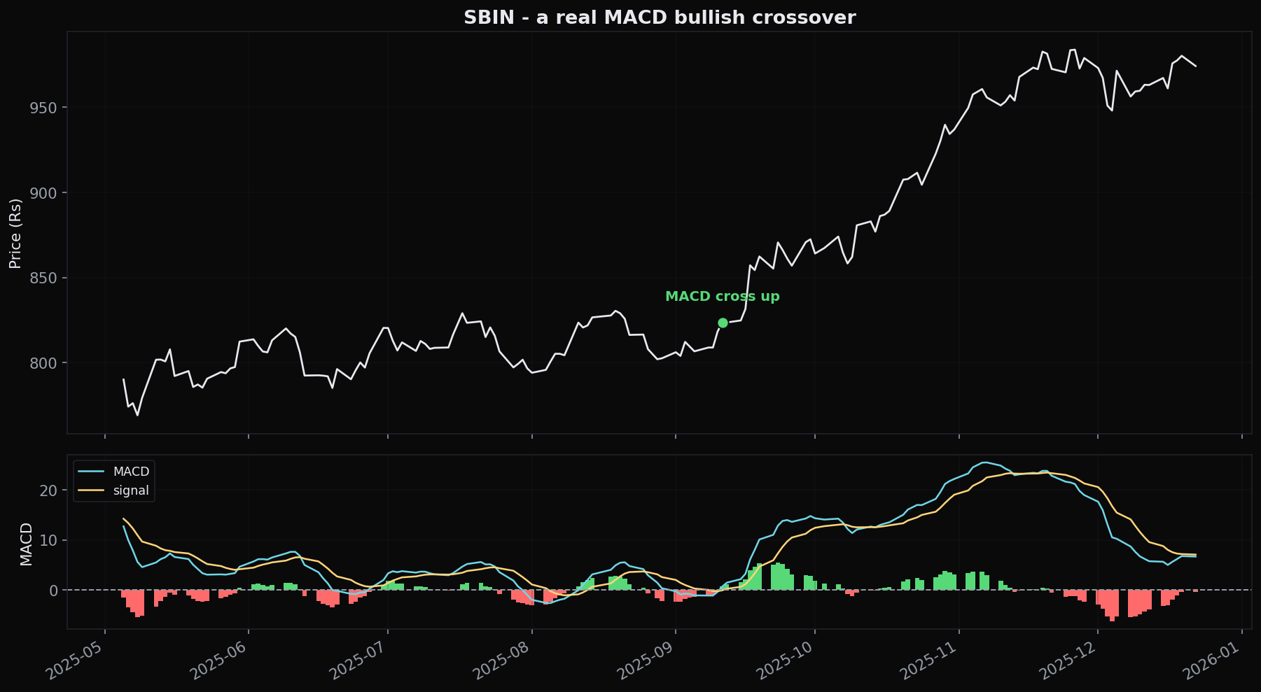
Here is one that worked beautifully. State Bank of India's MACD line crossed above its signal line on 11 September 2025 at a price of 823. Crucially, the cross happened with the MACD already above its zero line, in clearly bullish territory. Over the next 30 days the stock gained +12%.
One clean win. Now the universe. We measured 7,640 bullish MACD crossovers across the Nifty 50 over 16 years. The results are humbling:
- 58% were positive after 30 days. That is barely better than a coin flip, and only a little above the +1.48% over 20 days that the market hands you for free just by being invested.
- Only 37% beat +5% over those 30 days. Nearly two out of three bullish crosses failed to deliver even a modest gain.
Across 7,640 bullish MACD crossovers on the Nifty 50, only 37% went on to gain more than +5% within 30 days, and just 58% were positive at all. The crossover by itself is close to a coin flip. It is a starting point for analysis, not a signal to act on alone.
Why so ordinary? Because the lines cross constantly, including dozens of times during any sideways grind, and each of those crossings counts as a "signal." That sheer frequency is exactly why the standalone hit rate is so mediocre.
The zero line is the context
Here is the piece of context most beginners skip. The MACD line crossing zero is more meaningful than it crossing the signal line, because zero is the exact point where the fast (12-day) and slow (26-day) averages are equal, a genuine change in the medium-term trend.
- MACD above zero means the fast average is above the slow one, so the underlying trend leans up. A bullish cross up here (as in the SBIN example) is going with the trend.
- MACD below zero means the trend leans down. A bullish cross down here is fighting the prevailing direction, a riskier, against-the-grain bet.
You might reasonably expect "only take bullish crosses while MACD is above zero" to sharply improve your odds. It is a sensible instinct. And on this data it did not help. Filtering the bullish crosses to only those above zero did not meaningfully lift the win rate.
Do not assume a clever-sounding filter fixes a weak signal just because it feels rigorous. Requiring MACD to be above zero before a bullish cross sounds safer, but on the Nifty 50 it did not improve the outcome. Test a filter before you trust it. An untested rule is just a comforting story.
The lesson is not that context is useless. It is that this one mechanical filter, on its own, does not rescue a near-coin-flip signal. Real edge comes from combining the cross with actual structure, a support level, a clear trend, confirming volume, not from stacking another flavour of the same momentum reading on top.
The histogram: an early tell
The histogram, the bars showing MACD minus signal, is often the most useful part, because it starts changing before the lines actually cross. When the bars are tall and growing, the two lines are pulling apart and momentum is accelerating. When the bars start shrinking while still above the centre line, the lines are closing in, momentum is fading even though no cross has happened yet. A shrinking histogram is an early warning that the current move is running out of steam, giving you a heads-up well ahead of the slower crossover.
The simplest habit for a beginner: watch the histogram for the change, not the height. Bars that stop growing and begin to shrink are telling you momentum is decelerating, often the very first crack in a move, visible before price rolls over and long before the signal-line cross confirms it.
When MACD disagrees with price
Just like RSI, the MACD can diverge from price, meaning the two disagree, and this is arguably its most respected use. A bearish divergence is when price pushes to a higher high while the MACD makes a lower high: the new peak was reached with less underlying momentum, hinting the trend is tiring. A bullish divergence is the opposite: price makes a lower low while the MACD makes a higher low, so selling pressure is weakening beneath a still-falling price. Because the MACD measures the acceleration of a trend, a divergence on it is a clean picture of a move quietly running out of fuel. As always, divergence is a warning, not a dated trigger. It tells you to tighten your risk and wait for price to confirm, not to reverse on the spot.
Strengths and blind spots
The MACD's strength is genuine. In a trending market it keeps you reading momentum and trend at the same time, the histogram flags fatigue early, and divergence catches exhaustion. Its blind spot is just as real. In a sideways, choppy market the two lines cross back and forth endlessly, each cross a small loss, and the tool turns into a whipsaw machine. Built from lagging averages, it is always a step behind price, by design.
This is the recurring theme of this whole module. The moving averages, RSI and MACD are all squeezed out of the same price you can already see on the chart. They repackage it in useful ways, but none of them know the future, and each has a market where it shines and a market where it misleads. That 37% figure is not a knock on the MACD specifically; it is a reminder that no single indicator, used mechanically, carries an edge on its own. The edge lives in combining a momentum read like the MACD with trend, structure and disciplined risk control.
A grounded way to use the MACD: let price and a moving average decide the trend first. In a confirmed uptrend, treat a bullish MACD cross as the timing for a continuation entry near support, not as a reason to buy out of nowhere. Use the histogram to judge whether momentum is still building, and divergence to warn you when to step aside. The cross is one input among several, never the whole decision. On its own, remember, it is barely better than a coin flip.
Quick recap
- The MACD is two EMAs distilled: the MACD line (12-day average minus 26-day average), the signal line (a 9-day average of the MACD line), and the histogram (the gap between the two).
- The signal-line crossover is the headline trigger, but across 7,640 Nifty 50 events only 37% beat +5% in 30 days and 58% were positive, close to a coin flip on its own.
- The zero line gives trend context (above means uptrend, below means downtrend), but a mechanical "MACD above zero" filter did not improve the cross on this data.
- The histogram changes before the cross; a shrinking histogram is an early warning that momentum is fading.
- Divergence between price and the MACD flags a trend losing fuel, a warning to manage risk, not a dated signal.
- The MACD shines in trends and whipsaws in ranges; it always lags, because it is built from lagging averages.
Moving averages, RSI and MACD all describe direction and momentum, but none of them measure volatility, the width of price's daily swings. Next, Bollinger Bands wrap price in a volatility envelope, and we will see why "touching the band" is one of the most misread signals in all of technical analysis.