Timeframes, Scales & Why a Chart Can Mislead
The same stock looks bullish on one timeframe and bearish on another. Learn how daily, weekly and monthly views differ, why log scale beats linear over years, and how chart settings quietly change the story.
- ·Daily, weekly, monthly views
- ·Why this course uses daily data
- ·Linear vs logarithmic scale
- ·How timeframe changes the signal
- ·Choosing the right timeframe
- ·How settings can distort a chart
Here is a small trick you can play on yourself. Pull up a stock on a 15 minute chart and it can look like it is collapsing: every recent bar red, the price tumbling off a cliff. Switch the very same stock to a weekly chart and it can look magnificent: a clean staircase of higher highs marching up the page. Nothing about the company changed in the half second it took to click. Only the timeframe changed, and we will define that word in a moment. Both pictures are true. They are simply answering different questions.
This is the chapter where charts stop being innocent. The candle you learned to read does not have one fixed meaning. Its meaning depends entirely on the timeframe it is drawn on and the scale it is drawn against. A trader who does not control those two settings is not really reading the market; the chart's default settings are reading it for them. So before any indicator or pattern, you have to master the frame around the picture.
One stock, many timeframes
A timeframe is simply how much trading each bar represents. On a daily chart, one candle is one trading day. On a weekly chart, one candle bundles a whole week into a single open, high, low and close. On a monthly chart, one candle is an entire month. The price data underneath is identical, you are just choosing how coarsely to slice it.
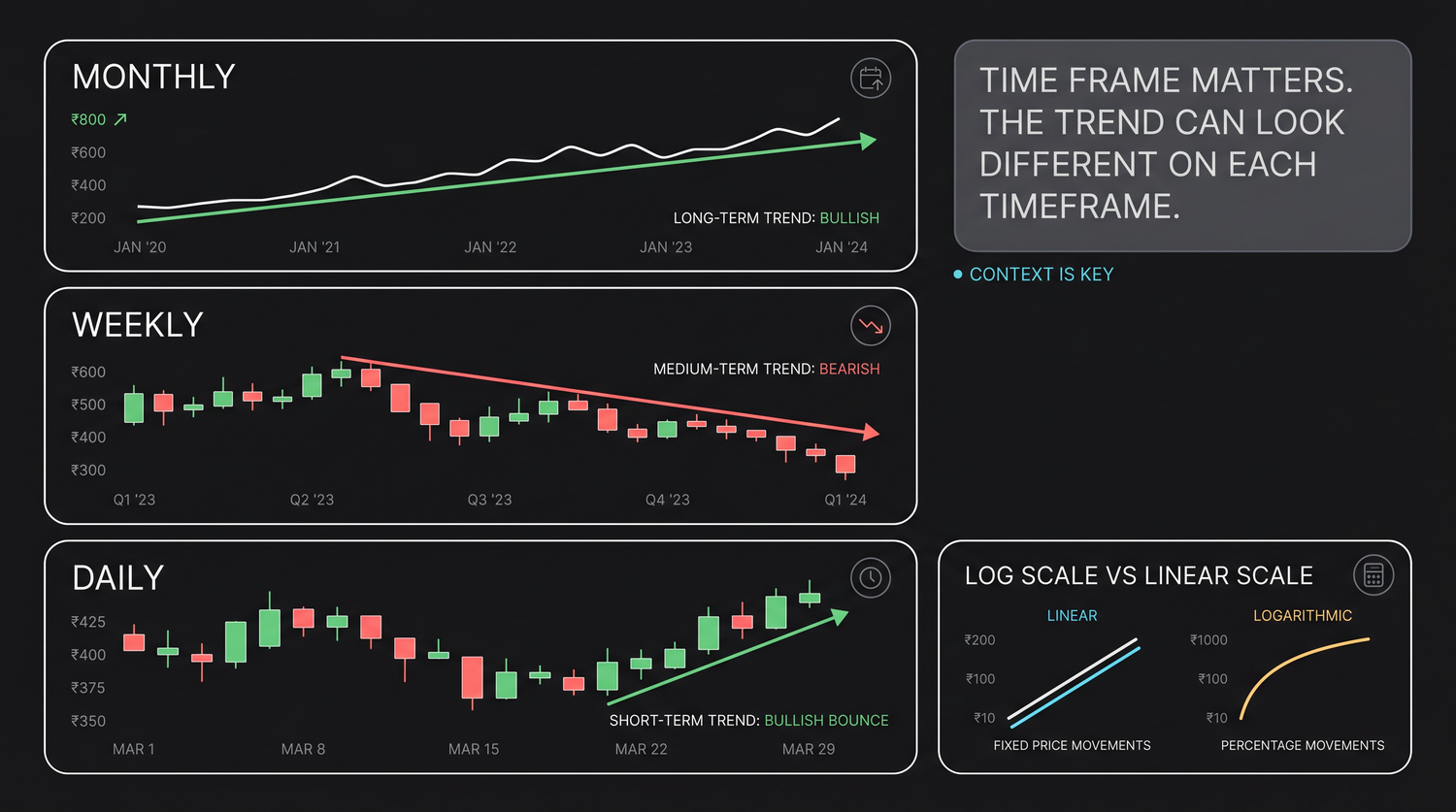
Think of it like a map. The monthly chart is the country-level view, it shows the long, slow tide of where a stock has been over years. The weekly chart is the state-level view, the multi-week swings that make up that tide. The daily chart is the city-level view, close enough to see individual days fight it out. None of these is "the real" chart. They are zoom levels, and a complete picture needs more than one, which is exactly why a later chapter is devoted to reading several at once.
How the timeframe flips the signal
The reason this matters so much is that a signal on one timeframe can be the opposite of the signal on another, and both can be correct.
A stock in a powerful multi-month uptrend on the weekly chart will, within that climb, still have plenty of ugly red days on the daily chart. Those red days are not the trend reversing. They are the small, normal pullbacks that every uptrend is made of, where a pullback just means a temporary dip against the main direction. A trader staring only at the daily chart sees danger. A trader who checked the weekly first sees a dip inside strength.
A bearish-looking lower timeframe sitting inside a bullish higher timeframe is the single most common reason new traders get shaken out of good positions, and talked into bad ones. The fix is not a better indicator. It is the discipline to always know which timeframe you are reacting to, and to check the bigger one before you trust the smaller one.
This cuts both ways. Day traders deliberately live on intraday charts, the ones built from minutes inside a single day, because they want to catch moves too small to register on a daily bar. Long-term investors deliberately ignore the daily noise and act on weekly or monthly signals. Neither is wrong. What is wrong is mixing them by accident: taking a long-term decision based on a five minute panic, or a quick trade based on a multi-year trend. The timeframe must match what you intend to do.
Higher timeframes set the direction; lower timeframes set the timing. The weekly tells you which way the tide is running; the daily tells you when to step in. When they disagree, the higher timeframe usually wins the argument, and trading against it is like swimming against the tide.
Why this course uses daily data
With so many timeframes available, this course deliberately teaches on daily charts, and the choice is not arbitrary.
Daily bars sit at the sweet spot for learning. They are slow enough to be calm, one decision point per day rather than hundreds, so you can actually think, and so a pattern has room to mean something. Yet they are fast enough that a meaningful number of signals builds up over a few years, which is what let us measure every claim in this course.
Intraday data, by contrast, is dominated by noise and tiny mechanical quirks of how orders match, which drown out the simple price behaviour a beginner needs to see. And every number we cite, the golden-cross base rates, the gap-fill rates, the RSI buckets, was computed on 16 years of real daily Nifty 50 bars, because daily data over that long a window gives honest, repeatable statistics rather than a handful of lucky anecdotes.
Master the daily chart and the skills carry over cleanly. A candle is a candle, a trend is a trend, support is support, whether the bar is a day, a week or a minute. Learn the grammar on the daily timeframe, where it is clearest, and you can apply it anywhere later.
Linear versus logarithmic scale
The second hidden setting is the price axis itself, and it fools people for years without their noticing.
A linear scale, also called arithmetic, spaces prices by equal rupee amounts. The gap from 100 to 200 looks exactly the same as the gap from 1,000 to 1,100. Both are 100 rupees. A logarithmic scale, usually shortened to log, spaces prices by equal percentage amounts. The gap from 100 to 200, a 100 percent gain, looks the same as the gap from 1,000 to 2,000, which is also 100 percent. For a single day's chart the two look identical. Over years of compounding, they tell wildly different stories.
Consider a real example. BEL ran from about 175 to 468 over roughly two years, a gain of around 168%. On a linear chart, the early move from 175 to 250 looks like a flat, boring crawl near the bottom, while the later move from 400 to 468 looks like a dramatic surge, even though in percentage terms the early move was far bigger and far more important to anyone who owned it from the start. The linear axis literally hides the strongest part of the trend and exaggerates the weakest. A log chart fixes this: equal percentage moves get equal vertical space, so a steady trend looks like a steady straight line and you can compare the slope of the early gains with the later ones fairly.
Use a logarithmic scale whenever a chart covers a large percentage range, such as a multi-year stock chart, or any holding that has multiplied several times over. Use a linear scale for short windows or tight ranges where percentage and rupee moves are nearly the same. Getting this one setting right changes how a long-term trend looks, and stops you mistaking ordinary early gains for a flat, dead base.
How settings quietly distort a chart
Beyond timeframe and scale, a handful of innocent-looking display settings can quietly change the story a chart tells. Knowing them keeps you honest.
- A truncated price axis. If the vertical axis does not start near a sensible reference and instead zooms into a narrow band, a one percent wobble can be stretched to look like a crash. Always read the actual numbers on the axis before reacting to the shape.
- Auto-scaling. Most platforms re-fit the axis to whatever is on screen. Scroll or change the date range and the same candles suddenly look bigger or smaller. The price did not move; the frame did.
- The chosen date window. Start a chart at a crash low and everything looks like a heroic recovery. Start it at a bubble peak and the same stock looks broken. The window you pick is an editorial choice, so pick it honestly.
- Aggregation boundaries. A weekly candle depends on where the week is cut. The same days grouped differently can change which weekly candles look bullish or bearish. It is a reminder that even the bars are a construction, not a fact of nature.
None of these settings is dishonest by design, but together they mean two traders can look at the "same" stock and see opposite things purely because of timeframe, scale and window. Whenever a chart provokes a strong reaction in you, check the frame first. Half the time the drama is in the settings, not the stock.
Choosing the right timeframe
So which timeframe should you use? The honest answer is the one that matches how long you intend to hold and how often you intend to act. A long-term investor who checks in weekly has no business reacting to a 15 minute chart. A short-term swing trader holding for days anchors on the daily chart and perhaps glances at the weekly for direction. An intraday trader works on minutes but should still know where the daily trend points. The principle is constant: decide your holding period first, then pick the timeframe that fits it, never the other way around. Letting an exciting intraday chart talk you into a long-term decision, or the reverse, is how timeframes mislead.
Quick recap
- A timeframe is how much trading each bar holds; daily, weekly, monthly are zoom levels on the same price history, like country, state and city maps.
- The same stock can look bullish on one timeframe and bearish on another, and both can be true; higher timeframes set direction, lower ones set timing.
- This course teaches on daily charts because they are calm enough to think on, rich enough to measure, and where every statistic here was computed (16 years of Nifty 50 data).
- A linear axis spaces equal rupees; a logarithmic axis spaces equal percentages, use log for long, large-percentage moves (a stock running about 175 to 468 looks honest only on a log scale).
- Truncated axes, auto-scaling, the date window and aggregation can all quietly change the story, so check the frame before reacting.
- Pick your timeframe from your holding period, not from whichever chart looks most exciting.
With the chart, the candle, the timeframe and the scale all under control, you are ready for structure. Next, we meet the 120-year-old framework, Dow Theory, that quietly underpins everything chartists still do today.