The Trend Is Your Friend, Until It Bends
An uptrend is just higher highs and higher lows, until it isn't. Learn to spot, draw and trust a trend, where trendlines break, and how to tell a real change of trend from noise on a real chart.
- ·Uptrend, downtrend, sideways
- ·Drawing a valid trendline
- ·How many touches make it real
- ·When a trendline breaks
- ·Trend strength and angle
- ·Change of trend vs a pullback
"The trend is your friend" is the most repeated line in all of trading. Most people stop quoting it right there, but the original has a tail: until the bend at the end. A trend, the general direction price is travelling, will carry you further than any clever forecast, right up to the day it quietly stops, usually while you are still patting yourself on the back.
So the real skill is not spotting a trend. A child can see a line going up. The skill is deciding, ahead of time and by a clear rule, the exact point at which you will admit the trend has bent and step aside.
This chapter turns Dow's vague idea of a "direction" into something you can actually draw, count, and act on. We will name the three states a market can be in, learn to draw a trendline that means something rather than one bent to flatter a position you already hold, and, most importantly, tell an ordinary pullback (a normal dip you can buy) apart from a real change of trend (your cue to get out). Get that one distinction right and you are already ahead of most people staring at charts.
Three states: up, down, sideways
Everything price does fits into one of three shapes, and we met the definitions last chapter:
- Uptrend, higher highs and higher lows. Buyers keep paying more, and dips keep finding a floor above the previous low.
- Downtrend, lower highs and lower lows. Rallies run out of steam earlier each time, and falls cut deeper.
- Sideways (a range), roughly equal highs and lows, with price drifting inside a flat corridor. Markets spend a surprising amount of their life here, which is why ranges get their own chapter next.
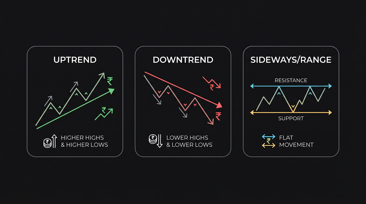
Why does naming the state matter so much? Because the same move means opposite things depending on the state. In an uptrend you buy weakness, the dips. In a range you buy weakness at the floor and sell strength at the ceiling. In a downtrend, buying weakness is how trading accounts quietly die. So step one of any analysis is simply naming the state, out loud and honestly, before you touch anything.
Drawing a trendline that means something
A trendline is just a straight line, drawn along the lows in an uptrend or along the highs in a downtrend, then stretched forward to act as a moving floor or ceiling. The rules for a good one are simple, and worth being strict about:
- In an uptrend, connect the rising swing lows. (A swing low is a valley where price turned back up.) The line sits below price and acts as support, a floor.
- In a downtrend, connect the falling swing highs. The line sits above price and acts as resistance, a ceiling.
- You need at least two points to draw a line, but it takes a third touch to trust it. Two points are a guess; the third is the market agreeing with your guess.
The cardinal sin is forcing the line. If you catch yourself slicing through the candles, ignoring a touch that does not fit, or redrawing the line every few days to keep a losing trade looking "valid," you are not analysing, you are making excuses. A trendline you had to fight the chart to draw is telling you the trend is not really there.
How many touches make a line real? More touches mean more traders are watching the same line, which makes it more meaningful, but also more obvious, so the eventual break draws a bigger crowd. Three to four clean touches is the sweet spot, enough to be real, not so many that the line is worn out. A line touched eight times is not "stronger"; it is tired, and the next test often snaps it.
One practical note carries over from the chapter on scales. On a long chart, draw your trendlines using a logarithmic scale, a scale where equal percentage moves take up equal space, rather than a plain linear one. On a linear scale, a line drawn under the early lows of a multi-year rise will look hopelessly broken halfway up, because the same percentage gain covers more and more points as price grows. A move of 10 percent from 100 is 10 points; the same 10 percent from 400 is 40 points. A log scale keeps the percentage rise looking constant, so a trendline that genuinely tracks the rise stays useful for its whole length instead of appearing to "break" just because the price got bigger.
A real uptrend, measured
Here is what a textbook uptrend looks like in real life, with nothing tidied up.
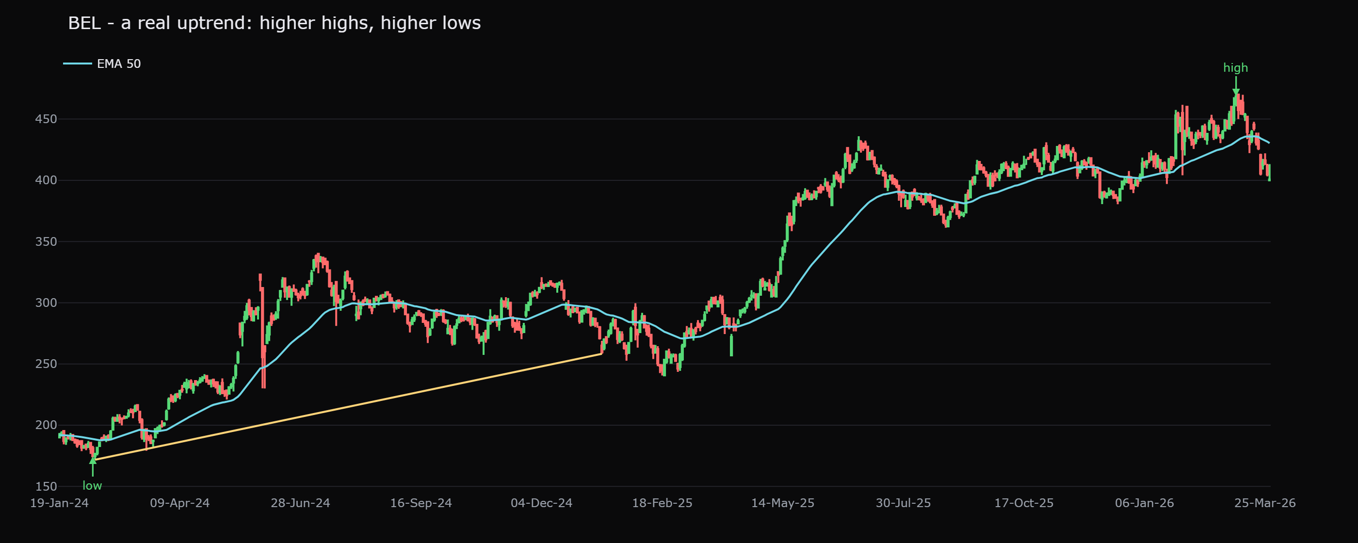
BEL rose 168.2 percent, from 174.7 on 12 February 2024 to 468.4 on 6 March 2026. That is the whole point of trends: one well-built primary uptrend did more than most clever in-and-out trading would have managed over the same stretch. But notice what the chart does not show, a straight line. It is a staircase, full of pullbacks that each looked frightening at the time. Every one of those dips was a "is the trend over?" moment, and every one of them, until the structure finally broke, turned out to be just another higher low.
The slope of a moving average gives you an objective read on direction and strength. A steadily rising 50-day line sitting under price points to a healthy, intact uptrend, while a flattening line warns that the move is losing steam.
Trend strength and angle
The angle of a trend tells you about its health, and here steeper is not better.
- A gentle, sustainable slope, price grinding up at a calm angle and repeatedly climbing back above a rising average, is the kind of trend that lasts for months.
- A near-vertical slope is a warning, not a cause for celebration. Straight-up moves are emotional, fuelled by the last wave of buyers, and they tend to collapse as fast as they rose. A trendline you keep having to redraw steeper and steeper is describing a market running out of buyers, not gaining them.
A simple, objective read on strength is the slope of that moving average, or just the spacing of the staircase: are the higher lows still sitting comfortably above the rising average, or is each dip cutting closer to it? Dips that keep puncturing the average are the trend loosening its grip, even before the structure formally breaks.
When a trendline breaks, and the pullback trap
This is the part that separates traders from spectators. Not every dip is a reversal, and not every broken trendline is the end of the world.
A change of trend is a structural event. In an uptrend, it is the day price closes clearly below the previous higher low, not merely below the line you drew. A trendline can break while the staircase of higher highs and higher lows stays perfectly intact; often that is just the trend changing its angle and settling into a gentler climb. The broken swing low is the real signal.
A pullback is a smaller move against the trend that still holds above the prior higher low and then resumes. The whole BEL staircase above was a series of pullbacks that each resolved upward. And here the data hands us a sober reality check on the popular "buy the dip to the moving average" tactic. Across 16 years of Nifty 50 stocks, buying a dip into a rising 50-day average returned about 0.67 percent over the next 10 days, against a 0.58 percent baseline for any day in an uptrend. That is a real, positive edge, and a tiny one. The rising average is a sensible place to look for support; it is not a magic floor that pays you just for showing up.
A broken trendline tells you the angle changed. A broken swing low (or swing high) tells you the trend changed. Anchor your exit to the structure, the prior higher low, not to a line you drew by hand. Lines are for grabbing your attention; structure is for making decisions.
At every dip, ask three plain questions. One: is the prior higher low still intact? Two: is volume on the dip light, the way a calm, healthy pullback should be? Three: is the bigger-picture trend still up? Three yeses, and it is probably just a pullback. A no on the first one, a broken higher low, and you treat it as a change of trend until proven otherwise.
Putting it together
The routine is unglamorous, and that is the point. Name the state, up, down, or sideways. Draw the line under the lows or over the highs, and refuse to force it. Wait for the third touch before you trust it. Watch the angle for health, not for excitement. And when a dip arrives, as it always does, judge it against the prior swing point, not against your hopes. A trend really is your friend, but friendship here means following, not predicting. You let the staircase carry you, and you have decided in advance the single step whose breach ends the relationship.
Quick recap
- Three states: uptrend (higher highs and higher lows), downtrend (lower highs and lower lows), sideways (roughly equal highs and lows). Name the state before doing anything.
- Draw a trendline along the rising lows (up) or the falling highs (down). Two points to draw it, a third touch to trust it. Never force it through the candles.
- BEL's real uptrend ran up 168.2 percent (174.7 on 12 Feb 2024 to 468.4 on 6 Mar 2026), a staircase of pullbacks, not a straight line.
- Angle signals health: gentle and sustained lasts; near-vertical is a warning, not a win.
- A broken trendline means the angle changed; a broken swing low or high means the trend changed. Anchor decisions to structure.
- Buying a dip to a rising 50-day average earned about 0.67 percent over 10 days versus a 0.58 percent baseline, a tiny edge, not a guaranteed floor.
Next: the horizontal levels where price keeps turning, support and resistance, the zones the crowd remembers until, eventually, they break.