Reading a Chart Without Getting Lost
Line, bar and candlestick, the three ways to draw the same price, and why candlesticks win. Decode the axes, OHLC and what a real RELIANCE daily chart is telling you at a glance.
- ·Line vs bar vs candlestick
- ·The OHLC of every bar
- ·Price axis and time axis
- ·Why candlesticks dominate
- ·Reading a real daily chart
- ·Common chart-reading mistakes
The first time you open a price chart it can look like noise: a jagged forest of red and green sticks, numbers crawling up one side, dates running along the bottom. An experienced trader looks at the very same screen and reads it like a sentence. The difference is not a sharper eye or a special talent. It is simply knowing what each mark on the chart means, and learning to ignore the ninety percent that does not matter today.
The good news is that a price chart only ever shows two things. Price runs up the vertical side, and time runs along the bottom. Everything else is just a choice about how to draw the price: as a line, as a bar, or as a candlestick. Those three styles plot the exact same data, yet they tell the story with very different richness. Get them straight and the wall of noise turns into information.
Three ways to draw the same price
Picture a single trading day for a stock. It opened at one price, traded as high as a second, dipped as low as a third, and finally closed at a fourth. That is four numbers for one day. The three chart styles differ mainly in how many of those four numbers they bother to show you.
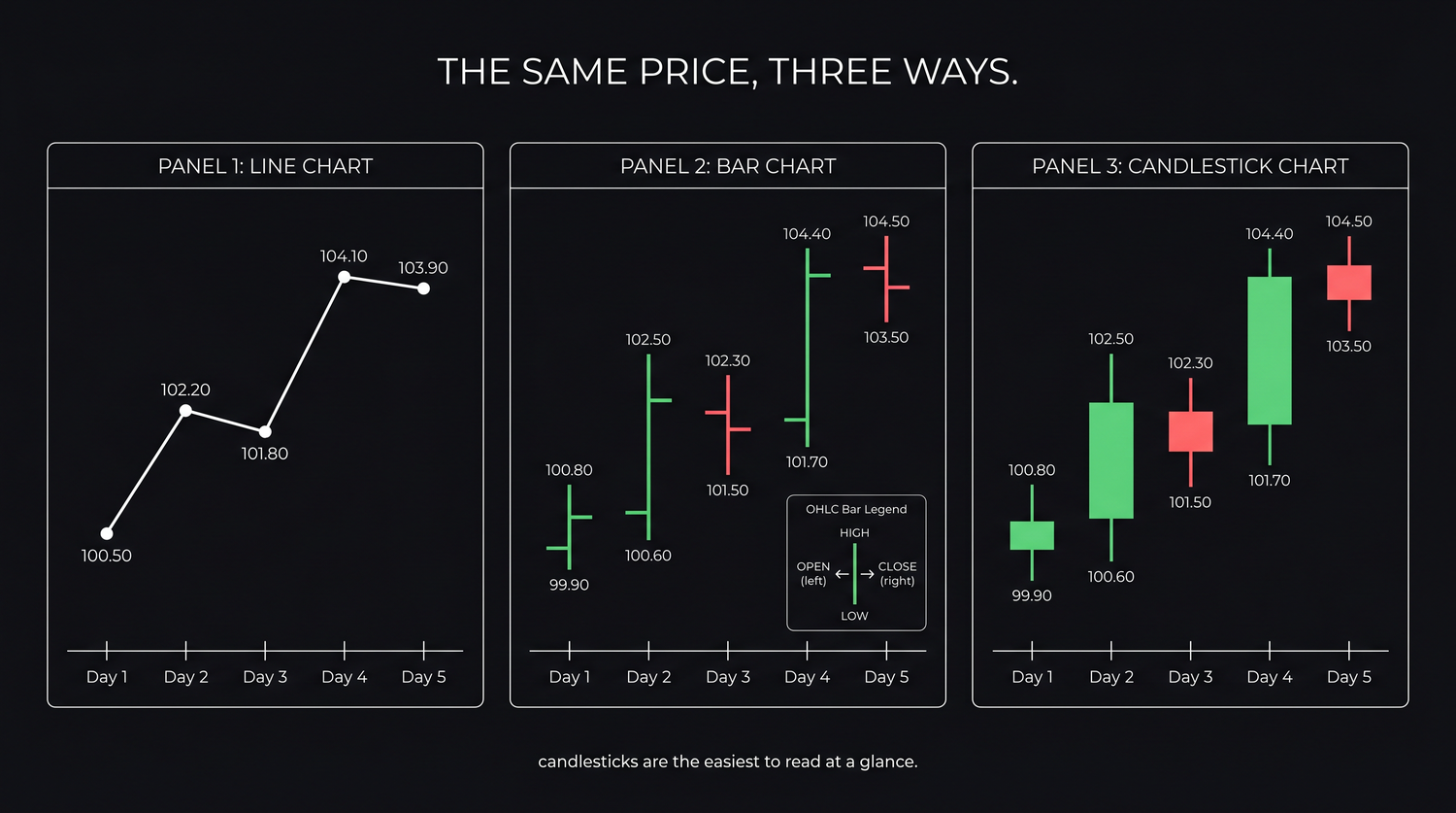
A line chart is the simplest. It plots only the closing price of each period, the last price before trading stopped, and joins the dots. It throws away three of the four numbers. That sounds wasteful, but the close is the most important price of the day, the level where the market settled after everyone had their say. So a line chart is wonderful for seeing the big-picture direction without distraction. It is the wrong tool the moment you need to know how the price got there.
A bar chart, often called an OHLC bar, keeps all four numbers. Each period is a vertical stick that runs from the low up to the high, with a small tick poking out on the left for the open and another on the right for the close. It is complete and compact, and for decades it was the professional's chart of choice.
A candlestick chart shows the same four numbers as a bar, but it draws the distance between the open and the close as a filled or hollow rectangle, called the body, with thin lines above and below for the high and low. That one design choice, which we take apart in the next chapter, makes the balance between buyers and sellers leap off the screen. It is why almost every trader today reads candles.
OHLC: the four numbers in every bar
Whatever style you pick, the data underneath each period is the same four prices, always in the same order.
| Field | Meaning |
|---|---|
| Open | The first traded price of the period |
| High | The highest price reached during the period |
| Low | The lowest price reached during the period |
| Close | The last traded price of the period |
This is the famous OHLC, short for open, high, low, close. On a daily chart each bar is one trading day. On a weekly chart each bar is one week. The four numbers are not decoration, they are the complete factual record of what happened in that period. When you pull historical price data for a stock, these are exactly the columns you get back, one row per period.
There is also a fifth number, volume, the count of shares traded in the period. Price tells you what happened; volume tells you how convincingly. We give volume a whole chapter of its own later, but keep it in the corner of your eye from the start.
Reading the axes
Two axes, two jobs. The vertical axis, the price axis, sits on the right or left and tells you the rupee level of every point on the chart. The horizontal axis, the time axis, runs along the bottom and tells you when each bar happened.
They sound too obvious to mention, and that is exactly why they trip people up. The axes are where a chart can quietly mislead you, a problem we devote a whole later chapter to. For now, build two habits. Always check what period one bar stands for, because a daily bar and a five minute bar look identical at a glance. And always read the price scale before reacting to a "huge" move, because a chart squeezed into a narrow range can make a one percent wiggle look like a crash.
Before you form any opinion about a chart, answer three questions out loud. What stock is this? What does one bar stand for, a day, a week, a minute? And what is the price range from top to bottom? Skipping this is the single most common way a beginner misreads a perfectly normal chart as dramatic.
Why candlesticks win
If a bar and a candle carry the same numbers, why has the candle taken over? Because of how fast the human eye reads it.
A candlestick uses colour and a solid body to show the one thing traders care about most: did buyers or sellers win this period, and by how much? When the close is above the open, the body is drawn hollow or green, which means buyers were in control. When the close is below the open, the body is filled or red, which means sellers won.
The length of the body shows the size of that win at a glance, and the thin lines above and below, the wicks, show how far price travelled before being pushed back. You can scan fifty candles in a second and feel the rhythm of the battle. The same fifty bars force you to compare left ticks and right ticks one by one. Same data, far less effort, and in a fast market effort is everything.
A line chart shows you where price went. A candlestick shows you how hard it was fought over to get there. That extra layer, open against close, plus the rejection stored in the wicks, is why candlesticks rule modern charting, and why the next chapter is devoted entirely to reading a single candle.
Reading a real daily chart
Theory is cheap. Here is an actual daily candlestick chart of RELIANCE, 140 trading days from December 2025 into June 2026.
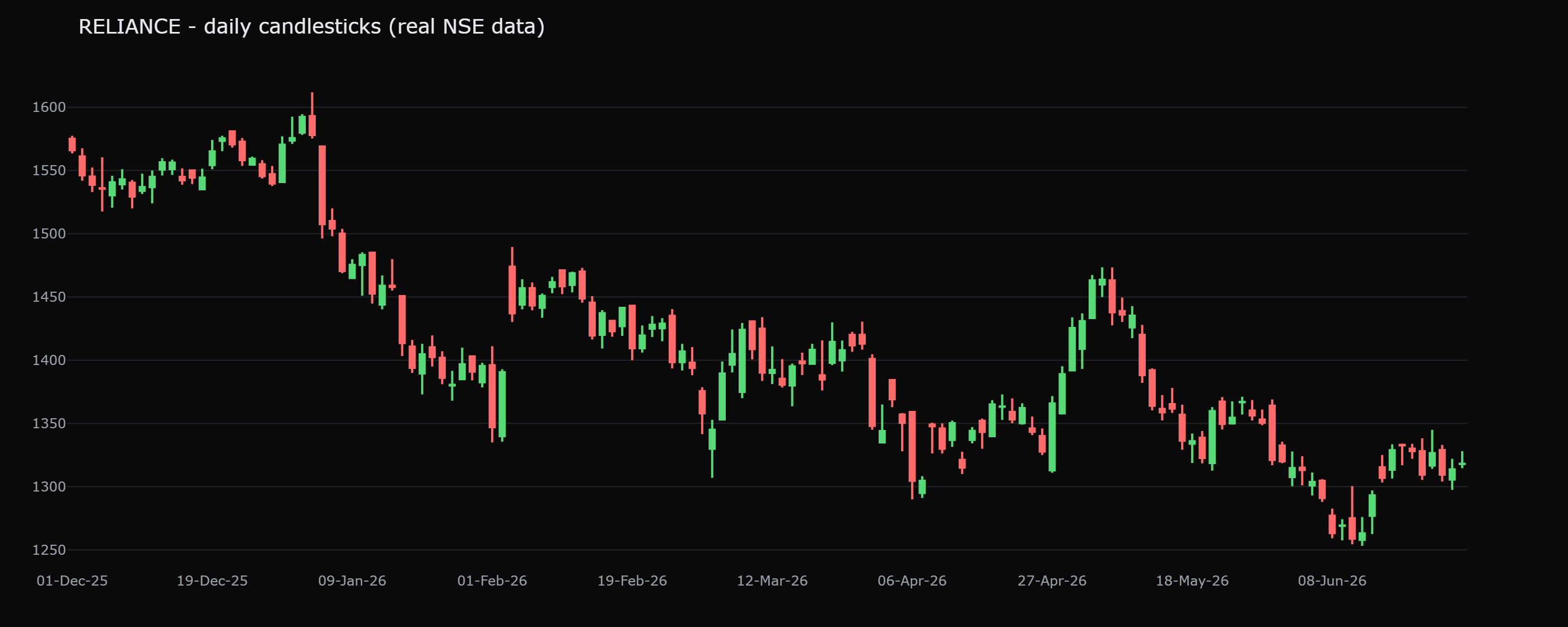
Read it the way the checklist taught you. The stock is RELIANCE. Each bar is one trading day. The price scale runs from roughly 1,253 at the bottom to 1,612 at the top, a span of under 30 percent, so this is a normal, heavily traded large company doing normal things, not a crisis. Now the story. Price pushed up to a high near 1,612, then spent the second half of the window grinding lower, finishing around 1,318, well below where it peaked. No prediction is needed to see it. The chart simply records that buyers ran out of room near the top and sellers had the upper hand into the close of the period. A line chart of the same data would show you that drift down. The candles add the texture, which days were fought hard and which gave up easily, that we learn to read next.
Common chart-reading mistakes
A few errors trip up almost everyone at the start. Name them now and you will catch yourself doing them.
- Reacting before reading the scale. A move that looks violent is often one percent on a squeezed axis. Read the price range first.
- Confusing the timeframe. A daily chart and an intraday chart look the same; the conclusions are not. Always know what one bar stands for.
- Treating the latest bar as the whole story. A single red candle is one day in a year. Zoom out before you decide anything.
- Seeing patterns in pure noise. The eye is a pattern-making machine and will find a "head and shoulders" in random wiggle. Demand context. A later chapter is entirely about this trap.
- Forgetting volume exists. Price without volume is half the picture. Glance at the bars underneath.
The chart is a record, not a forecast. Everything to the left of the latest bar has already happened; everything to the right is unknown. Reading a chart well means describing what has occurred accurately and honestly, not narrating a confident story about what comes next.
Quick recap
- A chart plots price (vertical) against time (horizontal); everything else is a choice of how to draw the price.
- Line charts show only the close (great for direction), bar charts show all four OHLC prices, and candlesticks show the same four but make the buyer-versus-seller balance visible at a glance.
- Every bar carries Open, High, Low, Close, plus Volume, and on a daily chart one bar is one trading day.
- Candlesticks dominate because colour and body length let the eye read the outcome of each period instantly.
- On the real RELIANCE chart, price ran to about 1,612 then faded to close near 1,318, strong stocks give gains back too.
- The classic mistakes are reacting before reading the scale, confusing the timeframe, and over-weighting the latest bar, fix these first.
Next, we zoom all the way in to a single candlestick and learn how five numbers and one shape tell a complete story of conviction, rejection and doubt.