Moving Averages: The Trend, Smoothed
Your very first indicator. A moving average turns jagged price into a clean line you can lean on. Meet the SMA and EMA (and the faster WMA, HMA and VWMA), dynamic support, and the famous golden and death crosses, dated and measured on real charts.
- ·Why we smooth price at all
- ·Simple vs exponential MA, in plain words
- ·The faster cousins: WMA, HMA, VWMA
- ·Common lengths (20, 50, 200)
- ·MA as dynamic support and the golden/death cross
- ·The lag trade-off
Imagine you are trying to work out whether the weather is genuinely warming up as spring arrives. One day is hot, the next is cold, the day after is hot again. Any single day tells you almost nothing. So you do the obvious thing: you take the last several days and average them. The daily jumps cancel out, and the real direction quietly appears.
Stock prices behave in exactly the same way. A price can close up, then down, then up again inside a single week and leave you squinting at the chart with no idea which way things are really heading. A moving average is the tool that does the averaging for you and turns that jitter into one calm line. The jagged becomes smooth, and a direction shows up.
What a moving average actually is
A moving average takes the average closing price of the last few days, redraws it as a single dot, and then does the same thing again tomorrow, and the day after, forever. Each new day, the newest close is added and the oldest one is dropped. Because the window keeps sliding forward, the line moves along with price. That sliding is where the name comes from.
You choose how many days go into the average. We will call that number the length. A short length follows price closely; a long length is slower and steadier. That single choice is the heart of everything in this chapter.
That smoothing is the whole appeal, and also the whole catch. A line built only from past prices can only ever describe the past, and always a little late. The two most famous moving-average signals, the "golden cross" and the "death cross," are sold as simple buy and sell buttons. When we measured them on 16 years of real Nifty 50 data, the buttons turned out to be wired almost backwards from what the textbooks promise. Let us build the tool properly first, then look at what it actually delivers.
Two ways to average: simple and exponential
There are two common recipes, and the difference is just how much each day counts.
A simple moving average, often shortened to SMA, adds up the last several closes and divides by how many there are. Every day in the window counts equally. The close from 50 days ago matters exactly as much as yesterday's. That makes it calm and steady, which is also its weakness: a sharp move today gets watered down by all the older, sleepier days.
An exponential moving average, or EMA, fixes that lag by giving recent days more weight. Yesterday's close pushes the line around more than a close from a month ago. The word "exponential" just means the importance of each day fades smoothly the further back you go. So the EMA hugs price more tightly and turns sooner. The cost is that it also reacts to random noise sooner, more responsiveness in exchange for more false twitches.
Neither one is "better." The EMA trades lag for jumpiness, the SMA trades jumpiness for lag. You are simply choosing which annoyance you would rather live with.
A moving average is a follower, never a leader. It can only tell you what price has already done, smoothed out. Treat it as a description of the trend's direction and tilt, not as a prediction of the next bar.
The lengths everyone watches: 20, 50, 200
Three lengths have become a shared language, simply because so many traders watch them:
- 20 days, roughly a trading month. A fast line for short-term swing direction.
- 50 days, about a quarter of a year. The classic gauge of the "intermediate," or medium-term, trend.
- 200 days, close to a full trading year. The line big institutions cite when they say a stock is "above its 200-day average," their shorthand for a healthy long-term trend.
There is nothing magic in these numbers. They work partly because the crowd watches them, which turns them into self-fulfilling levels of attention. One more thing to keep straight: a 50-day average on a daily chart and a 50-day average on a weekly chart describe completely different trends, so always know which timeframe you are looking at.
A line you can sometimes lean on
In a clean uptrend, price often dips back to a rising moving average and bounces off it, as if the line were a floor that drifts upward over time. Traders call this "dynamic support," dynamic because the floor keeps moving. It is a real effect, but a small one.
Across the Nifty 50, when a stock in an uptrend dipped to its rising 50-day average, the next 10 days returned +0.67% on average, against +0.58% for any ordinary day in an uptrend. That is an edge of less than a tenth of one percent.
The rising-average "floor" is a tendency, not a wall. The +0.67% versus +0.58% gap is real but tiny, barely more than a rounding error. Price slices straight through these averages all the time. A moving average is a zone of interest, not a guaranteed bounce, and never an excuse to skip your stop-loss, the price level where you admit you were wrong and get out.
The tilt of the line is the real message
Before you worry about any crossover, just look at the tilt, or slope, of the line. An average angling upward means the typical buyer of the last several days is sitting in profit and the trend leans up. A line flattening out means the trend is stalling. A line rolling over and pointing down means control is shifting to sellers.
The angle often tells you more than the exact price touch. A stock can sit above its 200-day average while that average flattens, momentum draining away even though price is still technically "above the line."
The golden cross and the death cross
The headline signals come from two averages crossing each other. A golden cross is the 50-day average crossing above the 200-day, which is supposed to be bullish. A death cross is the 50-day crossing below the 200-day, supposed to be bearish. The dramatic names alone tell you which one the financial news gets excited about.
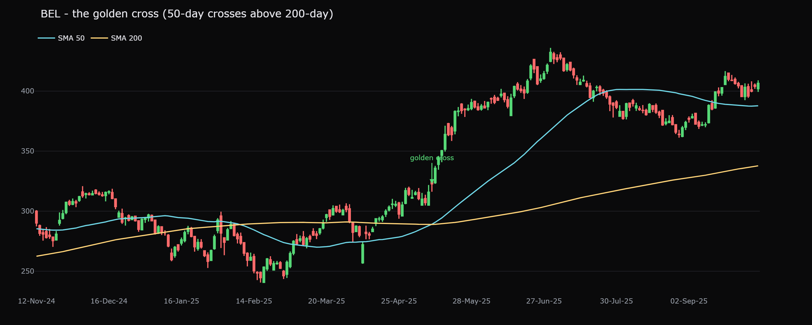
Here is a textbook-perfect golden cross. BEL's 50-day average crossed above its 200-day on 12 May 2025 at 322.8, and the stock then gained 19.8% over the next 60 sessions. Exactly what the story promises.
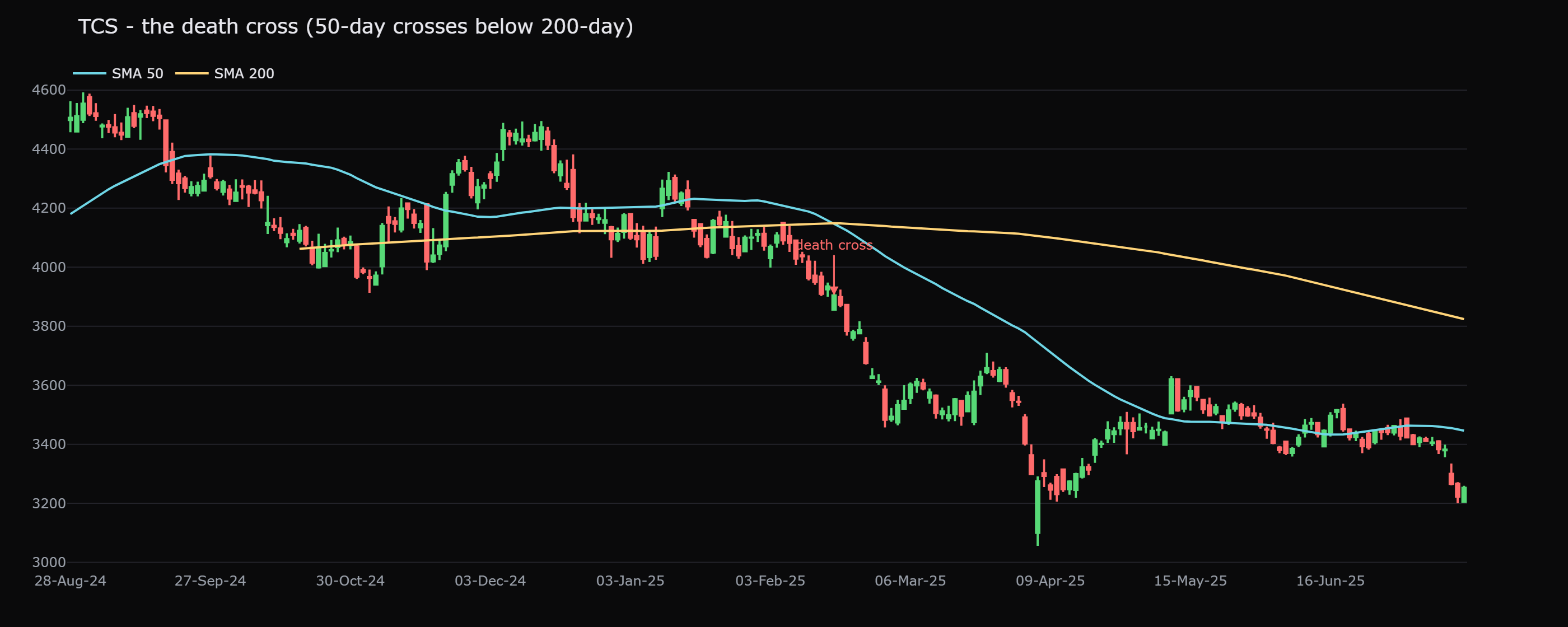
And here is a death cross doing its job. TCS's 50-day average crossed below its 200-day on 17 February 2025 at 3904, and the stock fell 9.7% over the next 60 sessions.
Two clean wins for the textbook. But two charts are an anecdote, not evidence. So we measured every cross across the Nifty 50, all 527 golden crosses and 529 death crosses over 16 years, and the result flips the folklore on its head.
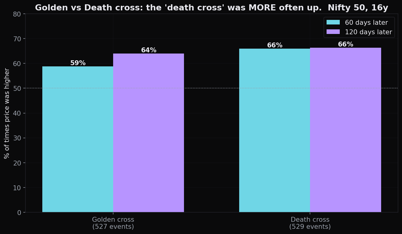
The golden cross was positive only 59% of the time at 60 days, with a typical gain of just +2.7%, and even the winning paths usually made you sit through a −7.3% dip before they worked. Stretch out to 120 days and the typical gain is +6.4%, which is actually below the roughly +9% you would have earned just by holding the stock through the same stretch. The signal lags so badly that by the time the 50-day has crawled above the 200-day, much of the move is already behind you.
Now the punchline. The death cross, the one you are told means "sell," was positive 66% of the time at 60 days, with a typical gain of +4.8%. The supposedly bearish signal was more often up, and rose more, than the supposedly bullish one. Why? A death cross usually fires after a long decline, often near a washed-out, oversold low, which is precisely when the next bounce tends to be brewing.
On the Nifty 50, the death cross beat the golden cross on both how-often-up (66% versus 59% at 60 days) and typical return (+4.8% versus +2.7%). "Golden cross equals buy, death cross equals sell" is not a rule. On this data it is closer to backwards. A cross tells you a trend changed recently; it does not tell you what happens next.
It helps to know the baseline. The average Nifty 50 day drifts +1.48% over the next 20 days, roughly +4.5% over 60 days, just from the market generally going up over time. Measured against that free drift, the golden cross's +2.7% over 60 days is barely an improvement, while the cost of acting on it (the lag, the −7.3% dip along the way) is very real.
When the line turns too often
The deeper problem with any trend line shows up in choppy, sideways markets. The averages cross back and forth, handing you a string of small losses with each false turn. Traders call this whipsaw, the feeling of being thrown one way and then the other.
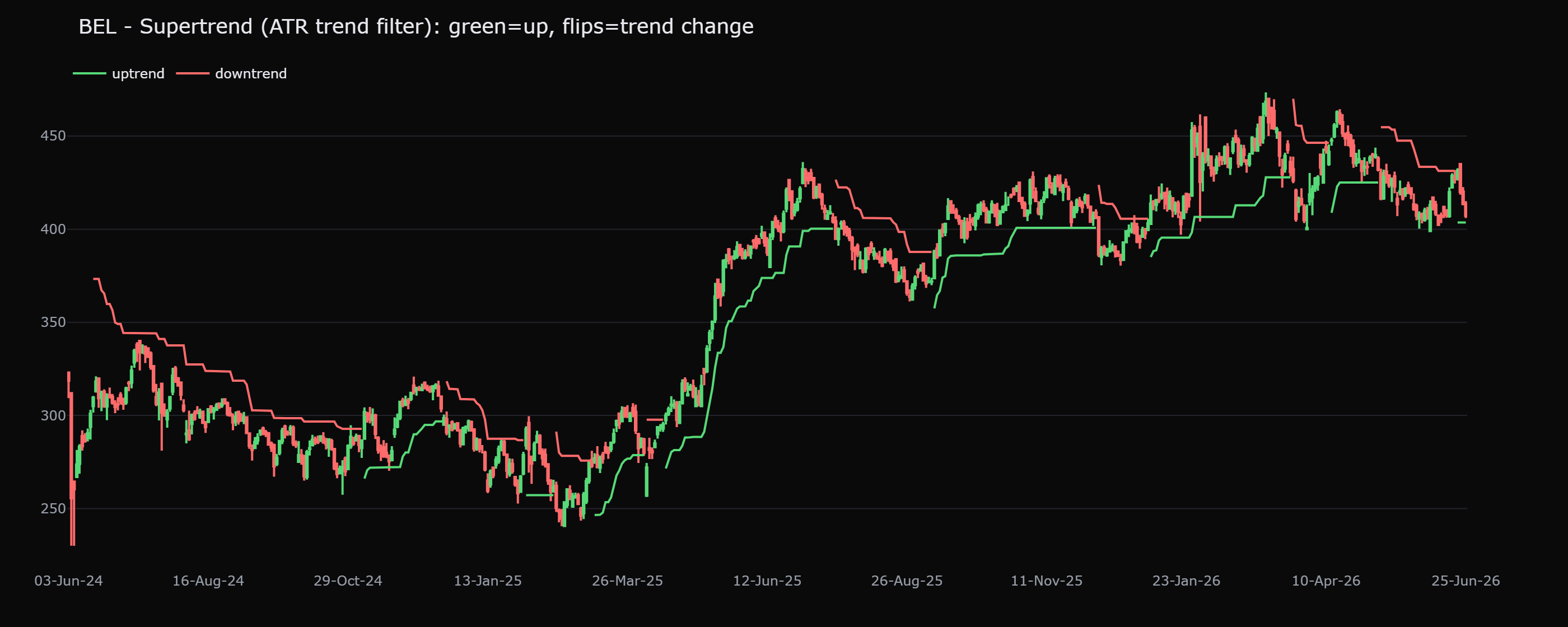
Some tools try to react faster. Supertrend, for example, is a line that trails just below price in an uptrend and just above it in a downtrend, adjusting itself by how much the stock is swinging around, and flipping sides when price crosses it. Faster reaction sounds like an upgrade, but it pays the same tax. On BEL, Supertrend flipped direction 25 times in two years. Most of those flips were noise, not real trend changes.
This is the lag trade-off, stated plainly. Slow averages (a 200-day line, a long SMA) give few signals, late: you keep most of a big trend but give back a chunk at every turn. Fast averages (a short EMA, a tight Supertrend) give many signals, early: you catch turns sooner but get chopped to pieces when there is no real trend. There is no setting that removes the trade-off. You can only choose which side of it to pay for.
The single simplest takeaway: use a moving average to read the direction of the trend, not as a button that says buy or sell. If price is above a rising average, the trend leans up and you favour the long side. If it is below a falling average, the trend leans down. That is what these lines are genuinely good at. A lone crossover, on this data, barely beats just being invested.
A practical, honest way to use the 50/200 relationship is as a filter, not a trigger: only go hunting for long entries while the 50-day is above a rising 200-day, and stand aside when it is not. As a later chapter's backtest will show, this kind of filter does not make more money than simply buying and holding, it usually makes less, but it can meaningfully cut your worst drawdowns and the time your money sits at risk. That is a risk decision, not a profit machine.
Quick recap
- A moving average smooths price into a single trend line; the simple version weights all days equally (calmer, slower), the exponential version weights recent days more (faster, jumpier).
- The watched lengths, 20, 50 and 200, matter largely because the crowd watches them. Always know the timeframe.
- A rising average acts as loose dynamic support (+0.67% versus +0.58% baseline on a 50-day dip), a tendency, never a guaranteed floor.
- The tilt of the line beats the exact touch: a flattening average warns of a stalling trend before any cross.
- The golden cross was positive just 59% at 60 days (+2.7% typical, after a −7.3% dip) and lagged buy-and-hold by 120 days; the death cross was more often up (66%, +4.8%). "Golden equals buy, death equals sell" does not survive the data.
- Every trend tool pays the lag trade-off: slow means late but smooth, fast means early but whipsawed (BEL's Supertrend flipped 25 times in two years).
Moving averages smooth the trend but say little about momentum, how forcefully price is pushing right now. Next we put a number on that pulse with the RSI and its cousins, and discover that "overbought" does not mean what you have been told.