Top-Down: Multiple-Timeframe Analysis
The pros decide direction on the higher timeframe and time entries on the lower one. Learn the top-down routine, weekly for the map, daily for the move, aligned on a real chart.
- ·Why one timeframe isn't enough
- ·Higher timeframe = direction
- ·Lower timeframe = timing
- ·Aligning weekly and daily
- ·Avoiding timeframe conflict
- ·A simple top-down checklist
Imagine you are driving to a town you have never visited. Zoom the map all the way in and you can read the name of the very next street, but you have lost all sense of whether you are even heading the right way. Zoom the map all the way out and you can see the whole route at a glance, yet you cannot tell which turn comes next. Neither view is wrong. They simply answer different questions, and you need both.
A price chart, which is just a picture of how a stock's price has moved over time, works exactly the same way. Look at one company over a couple of years and it can look like a strong, steady climb. Look at the very same company over the last few hours and it can look like it is falling apart. Both pictures are true at the same moment. They are just zoomed to different distances.
That contradiction is the whole reason to use more than one timeframe. A timeframe is simply how much time each step on the chart covers. The habit that keeps experienced traders out of trouble is to never trade off a single one. They zoom out to decide which way they want to lean, then zoom in to decide when to act. This chapter teaches that top-down routine: the bigger picture for direction, the closer view for timing, and how to refuse the trades where the two disagree.
Why one chart is never enough
A chart is built from candles. A candle is one small symbol that sums up the price action over a fixed slice of time. The timeframe just sets how big that slice is. On a daily chart, one candle is one trading day. On a weekly chart, one candle is a whole week, roughly five daily candles squeezed into a single shape. On a monthly chart, one candle swallows about four weekly ones.
Here is the consequence that catches beginners off guard. A move that looks enormous on a small timeframe can be a tiny, meaningless flicker on a large one. A 4% drop over two days feels like a disaster when you are staring at the daily chart. Zoom out to the weekly view and that same drop is one small dip on a candle that is still climbing. Same price, same week, opposite emotion.
If you only ever look at one timeframe, you are blind to the context that decides whether your signal even matters. The trader who sells every red hour inside a year-long climb is fighting the tide. The investor who buys a "cheap dip" without noticing that the bigger trend broke down months ago is catching a falling knife, grabbing at something that is still dropping. Neither has done anything wrong on their own chart. They have just looked at only one.
The higher timeframe is the ocean; the lower timeframe is the wave. You can ride the wave, but if you ignore which way the tide is running you will get dragged out. Direction comes from the big picture; timing comes from the small one.
The higher timeframe sets the direction
Start at the top, with the bigger picture. For a swing trader, someone who holds a position for days or weeks, the "higher timeframe" is usually the weekly chart. Your one and only job here is to answer a simple question: is this market in an uptrend, a downtrend, or going sideways? An uptrend is a series of higher peaks and higher dips; a downtrend is the reverse; sideways is neither. You are not hunting for an entry yet. You are deciding which side of the trade you are even allowed to take.
You already have every tool you need from earlier chapters. On the weekly chart, ask three things:
- Is price making higher highs and higher lows (up), lower highs and lower lows (down), or neither (sideways)?
- Is price above or below a long moving average, a line that smooths out the daily noise to show the underlying direction, and is that line sloping up or down?
- Where are the major weekly support and resistance levels, the big floors and ceilings price has bounced off before?
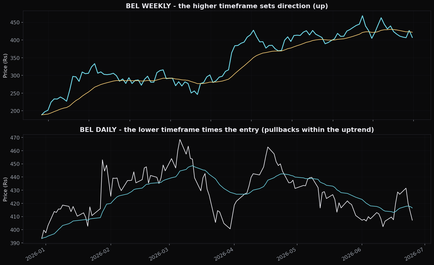
Look at BEL on the weekly view and the answer is not subtle. From a low of 174.7 on 12 February 2024, the stock climbed to 468.4 by 6 March 2026, a gain of 168.2%, built from a clean series of higher highs and higher lows. On the weekly timeframe, this is an uptrend, plain and simple. The rule that follows is blunt: in a market that looks like this, you go looking for buys, not sells. The tide is rising.
The lower timeframe times the entry
Once the weekly chart has told you the direction, drop down to the daily chart to find the moment. The higher timeframe says "lean toward buying"; the lower timeframe answers "but not at any price, wait for a pullback, a level, a trigger." A pullback is a temporary dip against the bigger trend.
This matters because even the strongest climbs do not go straight up. Inside BEL's 168% weekly advance there were dozens of daily pullbacks, stretches where the stock fell for days and every short-term signal looked weak. Those daily dips are not the trend ending. In a bigger uptrend, they are the discount window, the place where you get to join the move at a better price than chasing a fresh high.
The data gives this a real but modest edge. Across the Nifty 50, India's index of 50 large companies, when a stock pulled back to a rising 50-day average it returned +0.67% over the next 10 days, versus +0.58% for any day already in an uptrend. That is a genuine edge, but a thin one. A dip to a rising average is a slightly better than average place to buy, not a magic floor that guarantees a bounce. The higher timeframe earns you the right to buy the dip; it does not promise the dip will hold.
On the daily chart, BEL's 50-day average crossed above its 200-day on 12 May 2025 at 322.8, and the stock then gained 19.8% over the next 60 sessions. That entry worked partly because it agreed with the weekly trend, a buy signal pointing the same way the bigger tide was already flowing.
This is also why you should resist using the very smallest timeframes to judge direction. On the daily chart, BEL's Supertrend, a tool that flips between "uptrend" and "downtrend" as price moves, changed its mind 25 times in two years, twenty-five flips inside one clean weekly climb. The smaller the timeframe, the more random noise you see, and the more often you get whipsawed, knocked in and out by moves that mean nothing. Use the small chart to time, never to decide direction.
The simplest version of this whole chapter: pick two charts, a slow one and a fast one. Let the slow one tell you which way to lean, and use the fast one only to find a good moment to act. If you remember nothing else, remember that the big picture decides direction and the small picture decides timing.
When the timeframes disagree
The most useful thing this approach does is tell you when to stand aside. The cleanest setups happen when the two timeframes agree: weekly trending up and the daily giving you a dip that is starting to turn back up. The most dangerous trades happen when they fight.
There are three states to recognise:
- Aligned, so act. Weekly uptrend, daily pulling back to support or a rising average and starting to turn up. This is your best-quality buy. Both tides push the same way.
- Conflicted, so wait. Weekly up but daily breaking down hard, or weekly down but daily ripping up. One of them is misleading you, or a real turn is underway but not yet confirmed. The honest move is usually no trade, because you have no edge when your own charts argue.
- Aligned down, so avoid. Weekly downtrend and daily weak. If you only ever buy, this is simply "do not buy here," no matter how tempting and beaten down the daily looks.
The classic beginner mistake is letting the exciting small timeframe overrule the boring big one. A thrilling daily breakout inside a weekly downtrend is exactly the kind of move that fails. You are buying a small bounce in a market that wants to go lower. When in doubt, the larger timeframe wins, because it represents more money, more people, and more conviction.
A signal on a small timeframe that contradicts the big one is not a brave contrarian bet, it is usually just early and wrong. If the weekly says down and your daily chart says buy, you are not smarter than the market; you are looking at noise. Demote the smaller chart to timing only.
Aligning weekly and daily in practice
You do not need three monitors and ten charts. For most swing traders, two timeframes are enough, one to set direction and one finer one to time the entry. A common, sensible pairing is the weekly for the map and the daily for the move, which is exactly the daily-chart approach this course teaches. The rule of thumb is simple: pick two timeframes about four to five times apart, and give each one a single job.
Working this out is straightforward. You read the trend from the weekly chart, then time the entry on the daily chart itself. A weekly moving average sets the direction, while a short daily average and the 50-day average on the daily handle the timing and give you a pullback reference.
Read the slope of the weekly average for direction, and use the daily averages to find a dip and a turn. The tools are the same ones you learned for a single chart. You are just using them at two zoom levels and only acting when both agree.
A simple top-down checklist
Run this in order, top to bottom, before every trade:
- Weekly, direction. Up, down, or sideways? Higher highs and lows? Above or below the long average, and which way is it sloping? This decides whether you may buy, sell, or do nothing.
- Weekly, the walls. Mark the major weekly support and resistance. Is price arriving at a wall (be careful) or breaking free of one (be interested)?
- Daily, location. Is price at a sensible spot to enter, a pullback to support or a rising average, or has it stretched far away from one? Never buy into thin air just because the weekly is up.
- Daily, trigger. Is there an actual signal to act on, a turn off the level, a confirming candle, a momentum cross, pointing the way the weekly allows?
- Conflict check. Do the two timeframes agree? If they fight, the answer is no. Stand aside.
Notice what this checklist quietly does: it stops you taking most trades. That is a feature, not a flaw. By the time a setup survives all five questions, you are entering with the bigger tide behind you and a clear spot to act, not chasing a single exciting candle on a single chart.
Quick recap
- A timeframe is just how much time each candle covers; the same move can look huge on a small chart and trivial on a big one. Never decide off one chart alone.
- Higher timeframe equals direction. On the weekly, BEL ran +168.2% in a clean higher-high, higher-low uptrend, and that decides which side you may trade.
- Lower timeframe equals timing. Use the daily to buy pullbacks into the trend; a dip to a rising 50-day average gave a thin +0.67% over 10 days edge, not a guaranteed bounce.
- Smaller timeframes are noisier. BEL's daily Supertrend flipped 25 times in two years inside one weekly uptrend. Use small charts to time, never to set direction.
- When the timeframes disagree, the larger one wins and the honest move is usually no trade.
- Run the five-step top-down checklist; its job is to reject most setups and only pass the aligned ones.
You now know how to read direction and time an entry. Next, we turn that judgement into something you can test: a rule-based plan with an entry, an exit, and a stop, and an honest check of whether the edge is real.