
Reading a report
Every figure the Backtest panel reports, the equity and drawdown chart, the trade list and the marks on the chart, which numbers flatter a strategy, and how to tell a real improvement from noise.
On this page
A backtest report is a trade list and an equity curve, with a handful of figures derived from them. This page goes through everything the Backtest panel in /trading shows after a run: what each figure measures, which ones flatter a strategy while saying nothing, and how to decide whether the difference between two runs is an improvement or luck.
Read in this order: the curve, then the trades, then the summary figures, and never the other way round. The figures are what a strategy says about itself. The curve and the trade list are what it did.
A strategy to read
Any strategy produces a report. This one also draws its open trade's result in a pane of its own, marked to each close the same way the report's equity curve marks it, so the chart shows the path of every trade that the summary compresses into one number:
version 1

strategy("EMA cross, with its open result", overlay = true, precision = 2,
         capital = 500000, qty = 1,
         fillOn = "nextOpen", slippage = 1,
         commissionType = "percent", commission = 0.023)

fast = ema(close, 9)
slow = ema(close, 21)
goLong = crossUp(fast, slow)
goFlat = crossDown(fast, slow)

if goLong and pos.isFlat
    buy()
else if goFlat and pos.isLong
    close()

// The open trade's result in money, before charges, marked to this bar's close
// the way the equity curve marks it. Absent while flat, so the pane shows a gap
// between trades rather than a zero.
openResult = pos.isFlat ? none : (close - pos.avgPrice) * pos.size

plot(fast, "Fast", aqua)
plot(slow, "Slow", orange)
plot(openResult, "Open result", silver, style = "histogram", overlay = false)
Run it from the Backtest panel on a 5 minute chart of an NSE stock. The report appears under the panel's controls.
Every figure in the panel
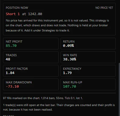
The eight tiles are all folded from the run's own fills: the orders this strategy placed and what they filled at. Nothing in them comes from your account.
| Tile | What it measures | Counted over |
|---|---|---|
| Net profit | The sum of every closed trade's result after its charges. Green when it is zero or above, red below | Closed trades |
| Return | Net profit as a percentage of the capital the declaration states, 100,000 when it states none | Closed trades |
| Trades | How many trades closed | Closed trades |
| Win rate | Winning trades divided by winning plus losing trades. A trade whose net is exactly zero counts as neither. Shows - when nothing has closed | Closed trades |
| Profit factor | The winning trades' gross profit divided by the losing trades' gross loss, both taken before charges. Shows - when no trade lost, or when the losing trades lost nothing before charges | Closed trades |
| Expectancy | Net profit divided by the number of closed trades: the average result of one trade, in money. 0.00 when nothing has closed | Closed trades |
| Max drawdown | The deepest fall of equity below its own running peak, in money, shown as a negative number | The equity curve, every bar |
| Max run-up | The largest rise of equity above its own running low, in money | The equity curve, every bar |
A trade wins or loses on its net result after charges. A trade whose gross move was positive and whose charges took it under counts as a loss, so on a strategy with thin trades the win rate falls as soon as costs are filled in, which is the point of filling them in. Gross in this page means before charges and net means after them.
Under the equity chart, one line states what the figures rest on: how many fills were marked on the chart, how many bars the run covered and how long it took, and the tick size and lot size of the instrument, for example Tick 0.05, lot 1. When the platform holds no tick or lot size for the instrument, the line says the run assumed a tick of 0.05 and a lot of 1, and that every figure in money rests on those.
Open trades at the last bar
A trade still open when the run reaches its last bar is not closed by the report. The panel says how many there were, and the trade list shows open in its Exit column. Net profit and every tile derived from it leave the open trade out, because its profit has not been realised. The equity curve includes it: its entry charge was paid on the bar it opened, and its open result is marked to every close.
When the run ends holding a position, a box headed Position now shows it: the side and size, the entry price, and its result marked to the latest price of the instrument, with a tag saying whether that price is still arriving (Live), is the last one received (Last known), or has not arrived yet (No price yet). It is a position nobody holds. The chart draws and does not trade, so nothing is held at your broker because of it. To trade the strategy, deploy it under Strategies, as Sandbox and live describes.
The equity curve and the drawdown
Under the tiles, a chart draws two panes on one time axis. The top pane is equity. The bottom pane is drawdown, drawn as an area below zero, so looking straight down from a peak finds the trough under it.
Equity is the declared capital, plus the gross result of every closed trade, less every charge paid, plus the open trade's result marked to this bar's close. Two details decide its shape:
- All of a trade's charges land on the bar it opened, the exit charge included, and its gross result lands on the bar it closed. While it is open, its result is in the curve as open profit, marked to each close. So the curve steps down by the whole round trip's cost the moment a trade opens.
- It is marked bar by bar, not trade by trade. A position that is 40,000 down in the middle of a week that ends flat shows that fall, because the curve is marked at every close. A curve drawn only from closed trades would not show it at all.
It is also marked to the close, not to the price you could have got out at. On an instrument with a wide spread that understates every drawdown by roughly half a spread per unit held.
The curve is this strategy's alone. It starts at the declared capital, counts only this strategy's fills, and knows nothing about your other strategies or the margin your account is carrying.
What to look for before reading any figure:
| What you see | What it usually means |
|---|---|
| One steep section carrying the whole run | The result is one period, not a strategy |
| Steps of equal height | A fixed size and a fixed target. Check the size was realistic |
| A long flat stretch | The rules stopped firing. Find out which regime that was |
| Smooth to the point of unreality | Look for fillOn = "close" or a higher timeframe read that looks ahead |
| A curve that only rises when the market rises | The strategy is long exposure with extra steps |
How drawdown is measured, and why it matters
A drawdown is the fall from the highest equity the run has reached so far to the lowest point after it, before a new high. The panel's Max drawdown is the deepest such fall, measured on every bar, including open positions, in money.
That definition has two choices in it, and a report that does not say which it made cannot be compared with another:
| Choice | This panel | The other way | Effect |
|---|---|---|---|
| What is marked | Every bar, open positions included | Closed trades only | Closed-trade drawdown is never larger, and often much smaller |
| How it is stated | Money | Percent of the preceding peak | Percent shrinks late drawdowns on a growing account |
A worked illustration of how much the first choice matters. Three trades, starting equity 1,00,000:
| Trade | Worst point while open | Closed at |
|---|---|---|
| 1 | -18,000 | +6,000 |
| 2 | -4,000 | -3,000 |
| 3 | -22,000 | +14,000 |
Measured on closed trades only, the worst fall is 3,000: from 1,06,000 after the first trade to 1,03,000 after the second. Measured bar by bar, it is at least 25,000: from that 1,06,000 peak down to 81,000 at the worst point of the third trade. Same trades, same net profit of 17,000, and two numbers that lead to two different decisions about position size. The bar-by-bar figure is the honest one, because it is the number you would have been looking at while it was happening, and that is the number that decides whether a strategy gets switched off.
To read it as a percentage, divide it by the peak equity just before it, which is the top pane's height at the start of the deepest valley in the bottom pane.
Time under water
Depth is half of a drawdown. The other half is how long it lasted. A 12 percent drawdown that recovers in nine days and one that takes seven months are the same number and very different experiences. Read the widest valley in the drawdown pane, from where it leaves zero to where it returns, alongside the deepest one.
Win rate against expectancy
Win rate on its own is close to meaningless, because it says nothing about size. The figure that means something is expectancy, the average result of a trade:
expectancy = winRate * averageWin - (1 - winRate) * averageLosswhere averageLoss is a positive number. The panel computes it as net profit over closed trades, which is the same figure whenever no trade scratched at exactly zero. Three strategies with the same expectancy of 400 a trade:
| Strategy | Win rate | Average win | Average loss | Expectancy | Longest losing run to expect |
|---|---|---|---|---|---|
| A | 75% | 1,200 | 2,000 | 400 | Short |
| B | 50% | 2,400 | 1,600 | 400 | Moderate |
| C | 25% | 6,400 | 1,600 | 400 | Long |
All three make the same money per trade over a large enough sample, and they are not interchangeable. C spends most of its life losing, so it needs a size small enough that ten losses in a row is an inconvenience, and a trader who will still place the eleventh. A has the opposite problem: its losses are larger than its wins, so one run of bad luck undoes many wins.
Two derived numbers are worth having beside it:
- Profit factor is on the panel. Above 1 means the winners' gross beat the losers' gross. It is taken before charges, so a run can show a profit factor above 1 and still lose money once costs are paid: read it beside Net profit. It is a useful shape check and fragile on small samples, because one large win moves it a long way. On fewer than fifty trades, treat it as a description rather than a measurement.
- Payoff ratio, average win over average loss, is not on the panel. Work it out from the trade list. It tells you which of the three shapes above you are holding, and so what a normal bad week looks like.
The trade list
Under the chart, Trades lists every trade the run made, one row per trade, in the order they opened.
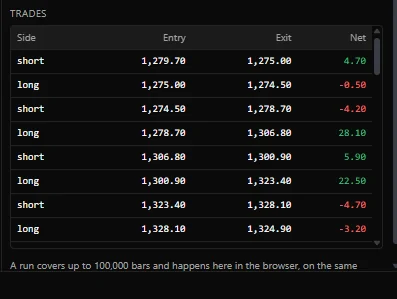
| Column | Holds |
|---|---|
| Side | long or short |
| Entry | The average price the trade was entered at, after slippage |
| Exit | The average price it was closed at, or open for a trade still held at the last bar |
| Net | The trade's result after its charges, green at zero or above and red below |
A trade is one position from flat back to flat. A strategy that adds to a position before closing it has one row for the whole position, entered at the average of its entries. Reading the books shows how the list is built from the orders underneath it.
The summary figures are all averages, and an average describes a set of trades badly, because a minority of trades usually carries the result. Five tests, in order of how often they change someone's mind:
- Remove the best five trades. If the run is still profitable, the result does not rest on a handful of trades. If not, it is five lucky trades with a long tail of noise attached. Do the same with the worst five to see how concentrated the risk is.
- Compare the median trade with the mean. A median far below the mean says a few large wins are doing the work.
- Look at the largest win as a share of net profit. Above about a third, the result is one trade.
- Count the longest run of losses. Then ask whether you would have kept the strategy running through it. A strategy you would have switched off has an expectancy of zero, whatever the report says.
- Split the trades by anything that is not the rules. Long against short, by weekday, by time of day, by month. If the whole edge lives in one bucket, you have a filter you have not written down.
The marks on the chart
Every fill of the run is marked on the price, on the bar the run records it on, from the same list of fills the trade list is built from. The marks of a long trade sit below the bars and the marks of a short trade sit above them, so the two ends of a round trip are on the same side of the price. The colour is the order's side: green for a buy, red for a sell.
| Label | Mark | What the fill did |
|---|---|---|
Long +1 | Green arrow up, below the bar | Opened a long |
Exit long -1 | Red arrow up, below the bar | Closed a long |
Short -1 | Red arrow down, above the bar | Opened a short |
Exit short +1 | Green arrow down, above the bar | Closed a short |
The signed number is the size of the fill in units, plus for a buy and minus for a sell. A reversal is two fills on one bar, an exit and an entry, so it draws two marks there. A new run replaces the previous run's marks rather than adding to them, and a run that made no trades clears them, so what is on the chart is always the latest run. If the chart has not finished loading its bars, the panel says it had no price series to mark.
Numbers that flatter a strategy while meaning nothing
| Figure | What it hides | Read it next to |
|---|---|---|
| Return over a short range | That a lucky quarter is still a quarter | Trades and the length of the range |
| Win rate | Trade size | Expectancy and the payoff ratio |
| Profit factor on 30 trades | Sampling noise | The result with the best five trades removed |
| Net profit | Position size, which you chose | Net profit against the capital actually at risk |
| Expectancy | The distribution | The median trade and the largest win's share |
| The largest winning trade | Nothing. It is a lottery result | Whether the run survives without it |
| Percent of profitable months | Size again: eleven small wins and one ruinous loss is 92 percent | The worst month |
| A result since a start date you chose | That the start date was chosen after seeing the data | The same run started a year earlier and a year later |
One comparison deserves its own paragraph. Run the strategy once with slippage and commission at zero and read Expectancy: that is the average trade before costs. If it is smaller than what one round trip costs, the strategy is not marginal, it does not exist. An average trade of 180 before costs against a round trip that costs 200 means every improvement you find will be inside the cost model. Check this first, because it saves weeks. Costs and fills shows how to work out the cost of a round trip.
Telling a real improvement from noise
This is the part of comparing two runs that people get wrong.
Change one thing
Both runs use the same symbol, exchange, interval, range, inputs and cost settings, except the single thing under test. If you changed a parameter and extended the range in the same step, you have measured nothing, and the only fix is to run it again. The Backtest panel keeps only the latest run on screen, so write down the figures and the trade list of the first before you run the second.
The unit of evidence is a trade, not a day
A run that covers four years is not four years of evidence. It is however many trades it took. Sixty trades is sixty observations, whether they arrived over a month or a decade.
The noise band, with arithmetic
Take the Net column of the trade list, leaving out any trade marked open, compute its mean and its standard deviation, and divide the deviation by the square root of the number of trades. That is the standard error of the mean trade: roughly how far the measured average sits from the true one by luck alone.
A concrete case. Run A: 120 trades, mean trade 420, standard deviation 3,800.
standard error = 3800 / sqrt(120) = 347So run A's true mean trade lies somewhere around 420 plus or minus about 700 at two standard errors: roughly from -280 to 1,120. Run B comes back with a mean trade of 700 over a similar number of trades. The difference is 280, smaller than the error on either run taken alone. There is no evidence here. Run B is not better, it is differently lucky.
How large does a difference have to be? Compare it with the standard error of the difference, which for two independent runs of similar spread is about 1.4 times one run's standard error, close to 500 here. Anything under about 1,000 per trade is inside the noise at two standard errors. With a noisy strategy and a hundred trades, only a very large improvement is detectable at all, and the way to make a smaller one measurable is more trades, not more confidence.
When the two runs overlap, compare the trades that differ
Most changes do not alter every trade. If 92 of 100 trades are identical in both runs, the comparison is really about eight trades, and the whole-sample standard error is far too generous a test. Pair the runs instead: list the trades that differ, take the difference in result for each, and ask whether that set of differences has a mean away from zero. Everything the two runs share cancels out, which makes a paired comparison much more sensitive.
A change that alters no trade is not an improvement. It is a preference.
Four checks that are not arithmetic
- Is the improvement a plateau or a spike? Run the neighbouring parameter values too. A length of 21 that beats 20 and 22 by a wide margin is a fit to this history. A length of 21 on a broad region that all works about equally well is a finding.
- Does it survive the section you held back? An improvement that appears on the tuning section and vanishes on the held-back one describes the tuning section.
- Does it survive double the slippage? If it disappears, what you improved was the cost assumption.
- Was it the twentieth thing you tried? Twenty tests at a one in twenty threshold produce one impressive result from pure noise, on average. Count your tests honestly and raise the bar as the count rises.
Symptoms and their usual causes
| Symptom | Likely cause | Test |
|---|---|---|
| A large gain from a tiny parameter change | Fitting to one period | Run the neighbours |
| Improvement in one year only | Regime, not edge | Split the range by year |
| Win rate up, net profit down | The change cut winners short | Compare payoff ratios |
| More trades and a better average | Usually a cost or fill assumption | Double the slippage |
| Better on the tuning section only | Overfitting | Run the held-back section |
| Both runs identical except two trades | Nothing was measured | Pair the differing trades |
Related. Backtesting, Costs and fills, Reading the books, Sandbox and live, Exits and brackets