
Plots
plot() and plotCandles() draw one value per bar as a line, a step, an area, a histogram, columns or candles, with a colour per bar, a width, an offset, a pane and a price axis.
On this page
A plot is one value per bar, drawn. That is the whole idea, and everything else on this page is an argument that decides how those values look: the shape, the colour on each bar, the thickness, the pane and axis they land on, how far they are shifted along the time axis, and how their numbers are formatted. plot computes nothing itself. The values come from wherever you calculated them: a library function, an expression, or a var that carries state from bar to bar.
Most studies are built from plots, and a fill always names two of them, so this is the drawing call you will use most.
A first example
Two exponential moving averages drawn over the candles of any NSE stock or index future:
version 1
study("Two averages", overlay = true)

fastLen = input(9,  "Fast length", min = 1, max = 500)
slowLen = input(21, "Slow length", min = 1, max = 500)

plot(ema(close, fastLen), "Fast EMA", aqua, width = 2)
plot(ema(close, slowLen), "Slow EMA", orange)
The picture shows the same two lines at 20 and 50 bars on a daily SBIN chart, with two additions from later pages: the band between them, shaded with fill(), and a label on each crossing from signal():
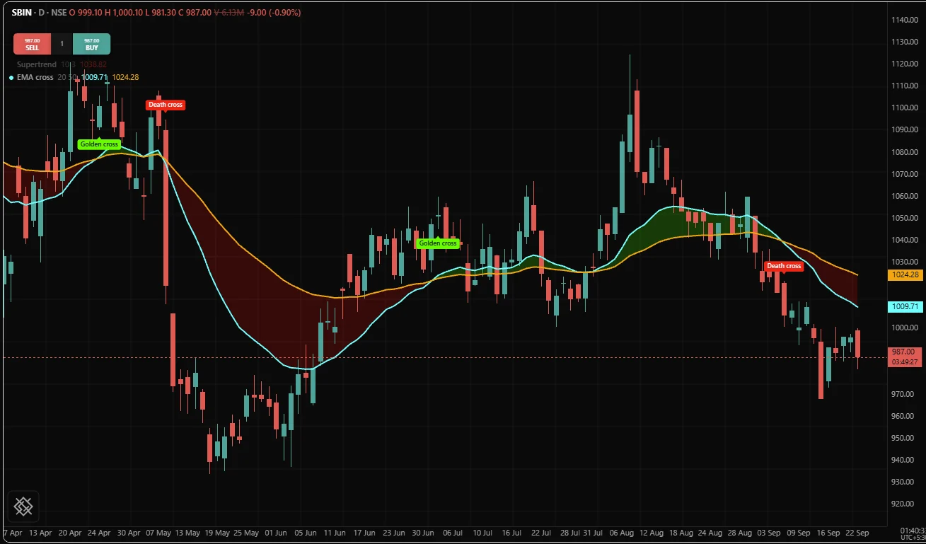
Each plot call adds one line to the chart and its current value to the study's legend, the row at the top of the pane that carries the study's name. It also adds a group to the Style tab of the settings dialog, named by the plot's title, where the user can change the line's colour, opacity, thickness, line style and plot style later.
The call
plot() takes the value and a title, then optional arguments by name:
| Argument | Default | Means |
|---|---|---|
value | required | The number to draw on this bar. none draws nothing on that bar |
title | required | Names the plot in the Style tab of the settings dialog. No two plots in a file may share one |
color | none: the chart's default colour, the same for every plot that names none | One colour, or a different colour on each bar |
width | 1.5 | Line thickness |
style | "line" | One of six shapes, listed below |
offset | 0 | A whole number of bars to shift the drawing: positive to the right, negative to the left |
overlay | the declaration's | true puts this one column on the price pane |
precision | the declaration's, in a study with its own pane | Decimals on the price scale this plot maps to |
format | the declaration's, in a study with its own pane | "price", "percent" or "volume", on that same scale |
scale | "right" | "right", "left" or "none" |
Only value and color are read on every bar. The rest (title, width, style, offset, overlay, precision, format and scale) describe the column itself and are fixed before the first bar. Write each one as a literal in the call, or pass an input() so the user can change it. A name you computed, even from constants, counts as bar data and raises OS3003:
thick = 1 + 1
plot(close, "Close", aqua, width = thick)
thick = input(2, "Line width", min = 1, max = 5)
plot(close, "Close", aqua, width = thick)Two plots in one file may not share a title (OS3017), because the Style tab tells plots apart by their titles.
The handle a plot returns
plot returns a handle that names the column. You need it only when a fill() has to shade against this column, and then you keep it in an ordinary name at the top level:
basis = sma(close, 20)
pUpper = plot(basis + 2 * stdev(close, 20), "Upper", aqua)
pLower = plot(basis - 2 * stdev(close, 20), "Lower", aqua)
fill(pUpper, pLower, color = aqua, opacity = 0.08)
A handle exists only while the script compiles. It cannot be held in a var (OS2003), passed to a function, stored in an array or read with [], because the set of plotted columns is fixed before bar 0 and a handle that could travel at run time would let a script decide halfway through the chart which columns exist.
Top level only
plot declares part of the study's fixed shape, so it must sit at the top level of the file. Inside an if, a loop or a function it is OS3006. The fix is always the same: plot none on the bars you want hidden, as shown in Hiding a plot.
The six styles
style | Draws | Use it when |
|---|---|---|
"line" | A line joining consecutive values | The value changes every bar and the slope between bars means something. The default, and right most of the time |
"lineWithMarkers" | The same line with a mark at every value | The values are sparse, or read one bar at a time rather than as a curve |
"step" | A flat segment per bar, with a vertical jump where the value changes | The value changes only occasionally: once a session, once a day, once per trade |
"area" | A line with the region below it shaded down to the bottom of the pane | One quantity whose level, rather than its shape, is the story |
"histogram" | A bar from zero to the value | A signed quantity that reads above and below a zero line |
"column" | A column from zero to the value, like a volume bar | A quantity that is never negative, such as volume |
Any other string is OS3008.
The choice with a real reason behind it is "step". A value that changes once a day and is drawn as a line slopes gently from yesterday's reading to today's, and every point along that slope is a price the script never read. The step says the truth: the value was this, then it became that. Use it for a higher timeframe value, a session's opening range, a stop held constant between trades, and anything else that is piecewise constant (flat for a stretch of bars, then a jump).
// Read once per day. A sloping line would imply intraday readings that never existed.
plot(req.timeframe("1D", high), "Previous day high", aqua, width = 2, style = "step")
The six names are the same six the Style tab offers under Plot style, so the user can restyle any plot afterwards. Your choice is the sensible default, not a lock.
Colour: one colour, or a colour per bar
A constant colour and a per-bar colour are the same argument. Pass a fixed colour and it becomes the plot's style colour, with no per-bar cost. Pass an expression that gives different colours on different bars and the compiler stores a colour beside each value.
fast = ema(close, 9)
hist = macd(close, 12, 26, 9)[2]

plot(fast, "Fast", aqua)                                                     // one colour
plot(hist, "Histogram", color = hist > 0 ? lime : red, style = "histogram")  // a colour per bar
One argument covers both on purpose: a script that starts with one colour and later wants two should not have to switch functions, rename its plot and lose the user's saved styling.
Four things about the per-bar form are worth knowing:
- The colour is only used where the value exists. On a warmup bar the value is absent, the line is broken, and whatever the colour expression produced there is never drawn.
- The colour is an ordinary expression, so absence reaches it too. An absent condition takes the false branch of a ternary, so
x > 0 ? lime : redgives red on bars wherexis absent. When the look of those bars matters, test for absence explicitly withisNone()ororElse(). - An absent colour does not hide anything. On a bar where the colour is
nonebut the value exists, the bar is drawn in the plot's own colour. To hide a bar, make its valuenone. - A per-bar colour is drawn exactly as computed. The colour setting in the Style tab does not change it. A colour held in a name counts as per bar too, even when the name holds a constant, so write a fixed colour in the call itself. Colors has the full rule.
Named colours, hex literals, fade(), rgb(), mix() and the rest are covered on Colors.
Width and visual weight
width defaults to 1.5. Two plots at the same width read as equally important, which is the one rule worth following:
basis = sma(close, 20)
upper = basis + 2 * stdev(close, 20)

plot(basis, "Basis", orange, width = 2)                  // the line that matters
plot(upper, "Upper", aqua)                               // supporting
plot(close[1], "Previous close", fade(silver, 55))       // reference
Thickness and transparency do different jobs. Thickness says "follow this". Transparency says "this is here if you need it". A study that reaches only for thickness ends up with five heavy lines and no hierarchy.
Offsetting a plot
offset shifts where the column is drawn, never what it contains. A positive offset pushes the drawing right, into the empty space past the newest bar. A negative offset pushes it left, back over history. It must be a whole number (OS3004 otherwise), written as a literal or passed as an input.
Keeping the values unshifted is the point: a later line of the script can still compare them with today's close without a correction a reader has to check. Two cases cover almost every use.
A projection drawn into the future. The cloud of ichimoku() is computed on the current bar and drawn 26 bars forward:
i = ichimoku(9, 26, 52)

// Drawn 26 bars to the right. i[2] and i[3] themselves are untouched.
pA = plot(i[2], "Span A", lime, offset = 26)
pB = plot(i[3], "Span B", red,  offset = 26)
fill(pA, pB, colorUp = fade(lime, 88), colorDown = fade(red, 88))
A value drawn back where it belongs. A pivot is only known right bars after the bar it formed on, which is why pivotHigh() reports it there. To draw the mark on the pivot bar itself, shift the column left by the same amount:
// A pivot with 5 bars each side is reported 5 bars late,
// so the drawing is pushed back 5 bars to where it formed.
ph = pivotHigh(high, 5, 5)
plot(ph, "Pivot high", orange, style = "lineWithMarkers", offset = -5)
This does not make the script know the pivot any earlier. The lag is real and stays real; offset only stops the picture lying about which bar the value belongs to.
If you want the shift as a setting, give the input the exact value to pass, such as input(-5, "Shift"). Arithmetic on an input inside the call, such as putting a minus sign in front of it, is refused, because the value must be fixed before the first bar.
Pane and scale
Every plot lands in the pane the declaration chose. overlay = true on one plot moves that column to the price pane and leaves the rest of the study where it was, which is how a study with its own axis still puts one line where the trader is looking:
version 1
study("Trend strength", precision = 2, range = [0, 100])

plot(adx(14, 14)[0], "ADX", purple, width = 2)
plot(ema(close, 20), "EMA 20", orange, width = 2, overlay = true)
Within a pane, scale picks the axis:
scale | Means | Use it for |
|---|---|---|
"right" | The right-hand price axis. The default | Everything, normally |
"left" | The left-hand axis, which appears when a plot uses it | A second series in different units on the same pane |
"none" | A hidden scale of its own, fitted to this column alone | A column whose size would otherwise flatten everything else on the pane |
A second axis is the honest answer when two series share no units. Volume is counted in shares and the close in rupees; on one axis, one of them would be a flat line at the edge of the pane:
version 1
study("Close and volume", precision = 2)

// Declared first, so the columns sit under the line.
plot(volume, "Volume", fade(aqua, 50), style = "column", scale = "left", format = "volume")
plot(close, "Close", orange, width = 2)
The format on the volume plot formats the left axis only, which is exactly what a plot's own formatting is for. The next section explains.
Formatting the numbers
Two options control how a plot's numbers read, and they work at two levels. On the declaration they set the formatting of a study with its own pane:
| Option | Default | Means |
|---|---|---|
precision | 4 | Decimals on the study's axis and legend, a whole number from 0 to 10 |
format | "price" | "price", "percent" or "volume": axis and legend formatting |
What each format shows:
format | Reads as |
|---|---|
"price" | The number with precision decimals |
"percent" | The number with precision decimals and a percent sign after it |
"volume" | Large numbers shortened, so 1250000 reads 1.25M. precision is not used |
version 1
study("Volume and its average", format = "volume")

len = input(20, "Average length", min = 2, max = 500)

// Columns, because volume is never negative, coloured by the bar's direction.
plot(volume, "Volume", color = close > open ? fade(lime, 35) : fade(red, 35), style = "column")
plot(sma(volume, len), "Average", orange, width = 2)
On a plot, the same two names set the formatting of the price scale the plot maps to, not of that one line, because formatting belongs to an axis and an axis is shared by everything on it. In a study with its own pane that is useful for a second axis, as in the Close and volume example above.
Over the price pane leave them off. The axis there is the instrument's own, so in a study declared with overlay = true the compiler raises warning OS8007 for any plot that sets either option, whichever scale the plot maps to. The declaration's own precision and format do not reach the price pane either: an overlay study keeps the instrument's formatting. When a reading needs its own format, draw it in a study with its own pane.
Formatting is display only. format = "percent" adds the sign and changes no number, so a change of one and a half percent must be computed as 1.5, not 0.015. precision = 2 rounds nothing either: the numbers your script computed are the numbers it computed, and precision only decides how many digits a reader sees. To change the value itself, use round().
Candle plots
plotCandles() draws candles rather than a line: four source columns (open, high, low, close), one plot slot, and colours that split on whether the close is at or above the open.
| Argument | Default | Means |
|---|---|---|
open, high, low, close | required | The four prices of each candle |
title | required | The name in the Style tab |
colorUp | lime | Body colour where the close is at or above the open |
colorDown | red | Body colour where the close is below the open |
wickColor | none | The wick colour. none gives each wick its body's colour |
borderColor | none | The body outline colour. none gives each outline its body's colour |
The four colours may change from bar to bar. plotCandles has no width, style or overlay argument: its candles land in the study's pane.
Its everyday use is a candle built from your own prices. Here each candle is smoothed from the bar before it, which turns a choppy run of mixed candles into longer runs of one colour. It is drawn in a pane of its own so it is never mistaken for the real candles:
version 1
study("Smoothed candles", precision = 2)

// The close is the average of the bar's four prices.
smoothClose = (open + high + low + close) / 4

// The open is the midpoint of the previous smoothed candle's body.
var smoothOpen = none
smoothOpen = isNone(smoothOpen) ? (open + close) / 2 : (smoothOpen + smoothClose[1]) / 2

// The wicks still reach the bar's real extremes.
smoothHigh = max(high, max(smoothOpen, smoothClose))
smoothLow  = min(low, min(smoothOpen, smoothClose))

plotCandles(smoothOpen, smoothHigh, smoothLow, smoothClose, "Smoothed")
On bars where the values are absent, such as during warmup, no candle is drawn, by the same gap rule as every other surface.
Hiding a plot, and what absence draws
There is exactly one way to hide a plot on a bar: give it none.
version 1
strategy("Entry and stop lines", overlay = true)

fast  = ema(close, 9)
slow  = ema(close, 21)
atr14 = atr(14)

if crossUp(fast, slow)
    buy()
if crossDown(fast, slow)
    close()

// pos.avgPrice is absent while the strategy is flat, and so is anything
// computed from it, so both lines exist only while a position is open.
plot(pos.avgPrice, "Entry", orange, style = "step")
plot(pos.avgPrice - 2 * atr14, "Stop", red)
The average true range is computed at the top level on every bar. Written inside a ternary or an if that runs only while a position is open, it would advance only on those bars and warn with OS8001.
Absence is not a special case added for this. It is the same value a library function returns during warmup, that a division by zero produces, and that close[1] has on bar 0. A plot draws a gap wherever its value is absent, so every one of those cases gives a line that starts where the data starts and breaks where the data breaks, with no extra code from you. A plot whose value is absent on every bar can never draw anything, and the compiler warns about it with OS8009.
A related pattern comes up whenever a line changes sides. A trailing stop that flips from below price to above price is two plots, each absent while the other is in use:
version 1
study("Supertrend lines", overlay = true)

factor = input(3.0, "Factor", min = 0.5, max = 10)
atrLen = input(10, "ATR length", min = 1, max = 100)

st     = supertrend(factor, atrLen)
stLine = st[0]
dir    = st[1]

// direction is -1 while the trend is up and 1 while it is down.
plot(dir == -1 ? stLine : none, "Supertrend, up",   lime, width = 2)
plot(dir == 1  ? stLine : none, "Supertrend, down", red,  width = 2)
Here is the pattern on a BHEL 15 minute chart, from a Supertrend study with the same settings that also shades between the line and the candles and labels each flip BUY or SELL. The green line runs below price and the red one above it, and each flip is a clean break from one to the other:
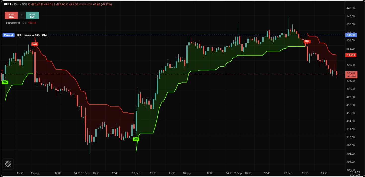
Two plots rather than one line with a per-bar colour, because a single line that jumped from one side of price to the other would draw a vertical segment through the candles on the flip bar, at prices the stop never was.
Markers and events
A plot draws a value on every bar. An event happens on one bar. Two tools cover the middle ground.
style = "lineWithMarkers" puts a mark on every value of an ordinary plot. Use it where the values are sparse, such as a pivot series that is absent on most bars, so the few values that exist read as points.
signal() puts one named marker on the bar it runs on, and it may appear anywhere in the file, including inside an if, because it is a per-bar event rather than a declared column:
fast = ema(close, 9)
slow = ema(close, 21)

if crossUp(fast, slow)
    signal("BUY", at = "below", shape = "triangleUp")

if crossDown(fast, slow)
    signal("SELL", at = "above", shape = "triangleDown")
A marker's at, shape and color are fixed before the first bar, so each must be a literal or an input; only its text is read per bar. A signal also waits for the bar to close unless the declaration sets onUnconfirmed = true. Labels and shapes covers every position and shape.
Plotting a function with several outputs
A function with more than one output returns an array holding this bar's outputs, in the order its reference entry lists. One call, one piece of state, and as many plots as you want to draw:
version 1
study("MACD", precision = 2)

fastLen = input(12, "Fast",   min = 1, max = 200)
slowLen = input(26, "Slow",   min = 1, max = 400)
sigLen  = input(9,  "Signal", min = 1, max = 100)

// One call, shared by all three plots. Three separate calls would be three
// independent pieces of state doing the same smoothing three times per bar.
m = macd(close, fastLen, slowLen, sigLen)

level(0, "Zero", fade(gray, 55), style = "solid")

plot(m[2], "Histogram", color = m[2] > 0 ? lime : red, style = "histogram")
plot(m[0], "MACD",   aqua,   width = 2)
plot(m[1], "Signal", orange, width = 2)
The returned array is never absent and never changes length. Each element carries its own warmup and is none until it has a value, so m[1] is a legal read on bar 0 and simply has nothing there.
Note the order of the three plots: the histogram is declared first so that it sits under the two lines. Declaration order is the cheapest control you have over what covers what within one pane.
Common mistakes
| Mistake | What happens | Fix |
|---|---|---|
An if wrapped around a plot | OS3006 | plot(cond ? value : none, "Title") |
A stateful call such as ema inside the branch that uses it | Warning OS8001, and a line with holes in it | Compute it at the top level and use the result in the branch |
width, style or offset taken from a computed name | OS3003 | Write a literal, or pass an input() |
| Two plots with the same title | OS3017 | Give every plot its own title |
precision or format on a plot in an overlay study | Warning OS8007, and the instrument's axis is reformatted | Leave them off, or draw the reading in a study with its own pane |
Expecting format = "percent" to multiply by 100 | A fraction such as 0.015 reads as 0.015 percent | Compute the percentage yourself |
Hiding a bar by giving it a none colour | The bar is drawn in the plot's own colour | Give the value none instead |
Expecting offset to change the values | It never does, and nothing warns | Shift the values yourself with [] if that is what you meant |
| A sloping line for a value that changes once a day | The picture implies readings that were never taken | style = "step" |
Five lines all at width = 2 | No hierarchy; a reader cannot tell what to follow | One heavy line, the rest at the default, references faded |
Related: Visuals overview, Fills, Levels, Colors, Labels and shapes, Plotting reference.