
Fills
fill() shades the region between two plots, for volatility bands, crossovers shaded by which line leads, oscillators shaded to a midline, and bands that switch on and off.
On this page
A fill paints the region between two plotted columns. It costs no plot slot of its own: it names two plots that already exist and tells the chart to colour the space between them. This page covers how to write one, how to give each side of a crossing its own colour, how strong to make the shading, how to make a band start and stop, and how to shade between a line and a fixed value.
Why a shaded region reads better than two lines
Two lines on a chart ask the reader to do work. To know whether the fast average is above the slow one somewhere on the left of the screen, the reader has to find both lines at that point, tell which is which by colour, and compare their heights, again for every part of the chart they look at.
A shaded region between them does that work once and turns it into a colour. The band is green where the fast line leads and red where the slow one does, and the reader sees the answer the moment they see the chart. The width of the band carries a second fact for free: how far apart the two lines are.
The same argument applies to a volatility band, where the band's thickness is the reading and the edges are incidental, and to an oscillator shaded to its midline, where the shaded mass above and below is the story.
It does not apply to two unrelated series that happen to share a pane. Shading between them invents a quantity, the gap, that means nothing. Fill between two lines only when the region between them is itself a fact.
A first example
Two exponential moving averages, the band between them coloured by which one leads, and a marker on each crossing:
version 1
study("EMA cross, shaded", overlay = true)

fastLen = input(9,  "Fast length", min = 1, max = 500)
slowLen = input(21, "Slow length", min = 1, max = 500)

fast = ema(close, fastLen)
slow = ema(close, slowLen)

pFast = plot(fast, "Fast", aqua,   width = 2)
pSlow = plot(slow, "Slow", orange, width = 2)

// pFast is the first argument, so colorUp is the colour where the FAST
// average is the higher of the two.
fill(pFast, pSlow, colorUp = fade(lime, 85), colorDown = fade(red, 85))

if crossUp(fast, slow)
    signal("BUY", at = "below", shape = "triangleUp")

if crossDown(fast, slow)
    signal("SELL", at = "above", shape = "triangleDown")
The same idea with 20 and 50 bar averages on a daily SBIN chart, with the crossings labelled Golden cross and Death cross in place of the triangles:
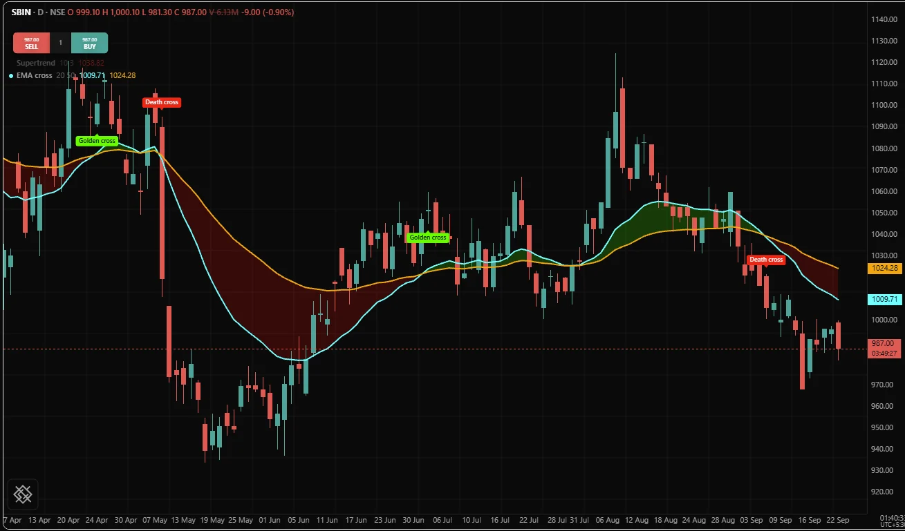
The band and the markers say the same thing at two distances. The markers give you the exact bar when you look closely. The band gives you the regime from across the room.
The call
fill() takes two plot handles, then optional arguments by name:
| Argument | Default | Means |
|---|---|---|
plotA | required | The first plot. "Up" is measured against this one |
plotB | required | The second plot |
color | none | One colour for the whole band |
colorUp | none | The colour where plotA is at or above plotB |
colorDown | none | The colour where plotB is above plotA |
opacity | 1 | A dimmer over the colours, from 0 to 1 |
overlay | the declaration's | true draws the band on the price pane |
With none of the three colours given, the band takes plotA's colour at twelve percent strength, faint enough not to drown what is behind it, and it follows that plot if the user restyles it. opacity and overlay are fixed before the first bar, so write them as literals or pass an input().
Give a band fixed colours. A colour counts as fixed when it is written in the call (a named colour, a hex literal, or a colour built from literals such as fade(lime, 85)) or when it is a colour input passed by its own name, which then follows the settings dialog. The language also accepts a colour worked out per bar, such as cond ? orange : none or a colour held in a name, but the /trading chart in this release draws each band in fixed colours and does not draw a per-bar one: such a band falls back to its first plot's colour at twelve percent. To switch a band on and off, use its ends, as Where a fill stops shows.
color sets both sides at once, so giving it together with colorUp or colorDown is OS3010:
pFast = plot(ema(close, 9), "Fast", aqua)
pSlow = plot(ema(close, 21), "Slow", orange)
fill(pFast, pSlow, color = aqua, colorUp = lime)
fill declares part of the study's fixed shape, so it is top level only, like plot and level. Inside an if it is OS3006. To make a band appear and disappear, give it absent ends on the bars where it should be off.
A fill names plots, not series
The two positional arguments are plot handles, the value plot() returns. A band is written in three lines, not one:
basis = sma(close, 20)
band  = 2 * stdev(close, 20)

pUpper = plot(basis + band, "Upper", aqua)
pLower = plot(basis - band, "Lower", aqua)
fill(pUpper, pLower, color = aqua, opacity = 0.08)
Passing a series instead is OS3020, whose message says the argument must be a plot declared by plot() or plotCandles():
fast = ema(close, 9)
slow = ema(close, 21)
fill(fast, slow)
A fill has no values and no column of its own. The region is worked out, bar by bar, from the two columns the plots already carry. Three consequences follow:
- A fill inherits its ends' warmup. If both ends have no value for the first 20 bars, the band starts at bar 20 with no code from you. You never write a warmup guard for a fill.
- A fill keeps no values of its own. It adds nothing to the legend and has no group in the Style tab.
- You cannot fill to something that is not a plot. A level is not a plot, and neither is a bare number. The workaround is one line, covered in Filling between a plot and a fixed value.
A plotCandles() call returns a plot handle too. A band drawn to one follows its close column.
One colour
The simplest band: one colour, one opacity.
version 1
study("Bollinger band", overlay = true)

len  = input(20,  "Length", min = 2, max = 500)
mult = input(2.0, "Deviations", min = 0.1, max = 10)

b = bollinger(close, len, mult)

pUpper = plot(b[1], "Upper", fade(aqua, 45))
pLower = plot(b[2], "Lower", fade(aqua, 45))
plot(b[0], "Basis", orange, width = 2)

// The band's thickness is the reading, so the shading carries it and the two
// edges are faded out of the way.
fill(pUpper, pLower, color = aqua, opacity = 0.07)
Note the hierarchy: the basis is the heavy line, the edges are faint, and the shading is fainter still. A band drawn with three equally strong elements has three things competing for attention where there is only one reading.
Two colours, for which side leads
colorUp and colorDown replace color when the two ends cross each other.
colorUp is the colour where the first plot is above the second. That is the only thing to remember, and it is worth a comment in the script the first few times, because a band that is green on the wrong side says the opposite of what you meant and looks entirely plausible while doing it. The chart splits the band exactly where the two lines cross, so the colours change at the crossing rather than a bar late.
The same idea works in a study with its own pane. Here the moving average convergence divergence (MACD) line and its signal line are shaded by which one leads:
version 1
study("MACD, shaded", precision = 2)

m = macd(close, 12, 26, 9)

pMacd   = plot(m[0], "MACD",   aqua,   width = 2)
pSignal = plot(m[1], "Signal", orange, width = 2)

// pMacd is the first argument, so colorUp is the colour where the MACD line
// is above its signal line.
fill(pMacd, pSignal, colorUp = fade(lime, 80), colorDown = fade(red, 80))
Opacity
Two places can make a fill see-through, and they do different jobs:
| Where | Range | What it is for |
|---|---|---|
opacity | 0 to 1, where 1 is solid | A dimmer over the colours. The default is 1, so it changes nothing until you set it |
The colour itself, through fade() or rgba() | fade takes 0 to 100 transparency, rgba takes 0 to 1 alpha | How see-through this particular colour is |
Pick one and leave the other alone. A band faded twice is a band nobody can see, and the next person to open the script cannot tell which of the two numbers to change. For a band with one colour, pass a plain colour and set opacity. For a band with colorUp and colorDown, put the transparency in the colours, so the two sides can differ, and leave opacity at its default.
Whichever you use, keep a band faint. The chart paints bands behind the candles and lines, so a band never hides them, but a strong one drowns their colours and the chart becomes hard to read. The default for a band with no colour, twelve percent, is a good guide: stay near a tenth of solid, and if you find yourself going much past a fifth, check whether what you want is really a background wash rather than a band.
Where a fill stops
A fill stops wherever either of its ends has no value, and resumes where both come back. That is the same gap rule that breaks a line, applied to a region, and it has three everyday uses.
Warmup. Neither end exists yet, so the band starts where the data does. No code.
A band that appears and disappears with its edges. Make the ends absent on the bars where the band should be off. Here the opening range of an NSE session is built during its first fifteen minutes and then drawn, edges and shading together, for the rest of the day:
version 1
study("Opening range band", overlay = true)

// A new trading day: the first bar on the chart, or a bar on a different IST
// date from the bar before it.
newDay = isNone(time[1]) or not date.isSameDay(time, time[1], "Asia/Kolkata")

// Holds for bars that open from 09:15 up to, but not including, 09:30.
forming = session.isIn("0915-0930")

var rangeHigh = none
var rangeLow  = none

if newDay
    rangeHigh = high
    rangeLow  = low
else if forming
    rangeHigh = max(rangeHigh, high)
    rangeLow  = min(rangeLow, low)

// While the range is forming both ends are absent, so the two lines and the
// band between them start only once it is complete. No guard is written.
pHigh = plot(forming ? none : rangeHigh, "Range high", aqua,   style = "step")
pLow  = plot(forming ? none : rangeLow,  "Range low",  orange, style = "step")

fill(pHigh, pLow, color = aqua, opacity = 0.09)
The day is found by a change of IST date because the /trading chart does not supply the exchange's session hours in this release, so session.isFirstBar has no value there. Sessions and time explains why the date test is right for Indian exchanges.
A band that switches off while its visible edges stay. Draw the edges as ordinary plots, then give the band a second pair of ends: invisible copies of the edges that are absent whenever the band should be off. The lines carry straight on, and the shading appears only where both copies have values:
version 1
study("Squeeze", overlay = true)

len = input(20, "Length", min = 2, max = 500)

b = bollinger(close, len, 2)
k = keltner(len, 1.5, len, "ema")

// The deviation band has contracted inside the range band: price is coiled.
// That is a state, so it is shading rather than another line.
squeezed = b[1] < k[1] and b[2] > k[2]

// The two lines are always drawn.
plot(b[1], "Upper", fade(aqua, 40))
plot(b[2], "Lower", fade(aqua, 40))

// Invisible copies that exist only during a squeeze. The band is drawn
// between them, so it switches on and off while the lines above carry on.
qUpper = plot(squeezed ? b[1] : none, "Squeeze upper", fade(orange, 100))
qLower = plot(squeezed ? b[2] : none, "Squeeze lower", fade(orange, 100))

fill(qUpper, qLower, color = orange, opacity = 0.18)
During warmup the comparison has no value and the ternary takes its false branch, so the copies are absent and no band is drawn, which is the right picture.
Filling between a plot and a fixed value
level() draws a horizontal line, but it is not a plot and has no column of values, so it cannot be one end of a fill. There is no argument that makes it one.
The fix is one line: plot the constant as a second column, and make it invisible if you do not want the line. A number used where a series is expected is repeated on every bar, so plot(50, ...) is a legal, constant column.
version 1
study("RSI, shaded to the midline", precision = 2, range = [0, 100])

len = input(14, "Length", min = 2, max = 200)

r = rsi(close, len)

level(70, "Overbought", fade(red, 40))
level(30, "Oversold",   fade(lime, 40))

pOsc = plot(r, "RSI", purple, width = 2)

// A level cannot be one end of a fill, so the midline is plotted instead.
// fade takes transparency and 100 is invisible, so it draws no line.
pMid = plot(50, "Midline", fade(gray, 100))

fill(pOsc, pMid, colorUp = fade(lime, 86), colorDown = fade(red, 86))
This reads better than three lines at 70, 50 and 30 with nothing between them, because the shaded mass above and below the midline is exactly what the oscillator measures.
Plotting the constant costs one line and keeps every option open. An invisible plot draws nothing and the legend leaves out its value, and when the "constant" later needs to move you change one expression. The same technique shades a line to any moving reference: a session open, the previous close, an entry price. Plot the reference, fade it as far as you want, and fill to it, naming the band's colour yourself: a band with no colour takes its first plot's colour, and an invisible plot's colour is invisible.
Which pane
A fill lands in the pane the declaration chose, and overlay = true moves it to the price pane. The one rule to respect is that a fill and the two plots it names must end up in the same pane. The compiler does not check this. A band in a different pane from its plots is drawn against that pane's price scale, away from the lines it was meant to join.
So when you move the plots onto the price pane, move the fill with them. Here a study keeps a reading in its own pane and draws the cloud of ichimoku() over price:
version 1
study("Cloud width", precision = 2)

i = ichimoku(9, 26, 52)

// In the study's own pane: how thick the cloud is, and which span leads.
width = i[2] - i[3]
plot(width, "Cloud width", color = width > 0 ? lime : red, style = "histogram", offset = 26)

// On the price pane: the cloud itself. Both plots and the fill carry overlay.
pA = plot(i[2], "Span A", lime, offset = 26, overlay = true)
pB = plot(i[3], "Span B", red,  offset = 26, overlay = true)
fill(pA, pB, colorUp = fade(lime, 88), colorDown = fade(red, 88), overlay = true)
fill has no offset of its own. The band is shifted by its first plot's offset, so a band drawn 26 bars forward gives both of its plots offset = 26 and the region moves with them.
Putting it together: a shaded Supertrend
A trailing stop from supertrend(), shaded between the stop and the middle of each candle, with a marker where the trend flips. The shading makes the regime readable at a glance, and it stops and restarts on its own at each flip because one end of each band is absent on the other side.
version 1
study("Supertrend, shaded", overlay = true)

factor = input(3.0, "Factor", min = 0.5, max = 10)
atrLen = input(10, "ATR length", min = 1, max = 100)

st     = supertrend(factor, atrLen)
stLine = st[0]
dir    = st[1]

// The middle of each candle, as an invisible column the bands can reach.
pMid = plot(hl2, "Candle midpoint", fade(gray, 100))

// direction is -1 while the trend is up and 1 while it is down.
pUp   = plot(dir == -1 ? stLine : none, "Supertrend, up",   lime, width = 2)
pDown = plot(dir == 1  ? stLine : none, "Supertrend, down", red,  width = 2)

// Colours named here, because the first plot of each band is invisible.
fill(pMid, pUp,   color = fade(lime, 88))
fill(pMid, pDown, color = fade(red, 88))

if dir == -1 and dir[1] == 1
    signal("BUY", lime, at = "below")

if dir == 1 and dir[1] == -1
    signal("SELL", red, at = "above")
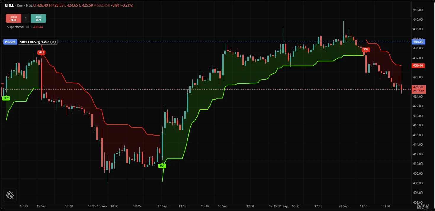
The same picture on a BHEL 15 minute chart, from a Supertrend study with a 10 bar ATR and a factor of 3 that shades to the middle of each candle's body rather than to hl2. The band is green below price while the trend is up and red above it while the trend is down, and it breaks off at each flip:
Recipes
| Picture | How |
|---|---|
| A volatility band | Two plots for the edges, then fill(a, b, color = c, opacity = 0.07) |
| A cross, shaded by which side leads | fill(a, b, colorUp = ..., colorDown = ...) |
| An oscillator shaded to its midline | Plot the midline at fade(colour, 100), then fill to it with a named colour |
| A band only while a condition holds | Invisible copies of the edges that are none while the condition is off, and the fill between the copies |
| A band that appears and disappears with its edges | Make the ends none on the off bars |
| The shading without the edges | Plot both edges at fade(colour, 100) and name the fill's colour |
| A displaced cloud | Both plots carry the same offset |
| A band on the price pane from a study with its own pane | Both plots and the fill carry overlay = true |
Common mistakes
| Mistake | What happens | Fix |
|---|---|---|
fill(fast, slow) with series rather than handles | OS3020 | Assign the plots to names and pass those |
color together with colorUp or colorDown | OS3010 | Use color alone, or the two sides alone |
colorUp on the wrong side | A picture that says the opposite, convincingly | colorUp is where the first argument is above the second |
| A band colour worked out per bar, or held in a name | The /trading chart draws the first plot's colour at twelve percent instead | Write the colour in the call, or pass a colour input by its own name |
| No colour, and an invisible first plot | An invisible band | Name the band's colour |
fade on the colour and a low opacity as well | A band nobody can see, and two numbers to guess between | Use one or the other |
Wrapping fill in an if | OS3006 | Make the ends none on the off bars |
Filling to a level | A level is not a plot | Plot the constant, fully transparent if it should not show |
| The fill in one pane and its plots in another | No compiler message; the band lands away from its lines | Give both plots and the fill the same overlay |
| Shading between two unrelated series | Invents a quantity that means nothing | Only fill where the gap is itself a fact |
Related: Visuals overview, Plots, Levels, Colors, Bar colouring and backgrounds, Lines and boxes, Plotting reference.